Email Marketing
Supercharge Your Email Campaigns with Images
Email Marketing
For email marketing campaigns, click-throughs are everything. You can generate clicks with an effective subject line, calls to action (CTAs), links, and text. But even though they say “copy is king,” a picture can be worth a thousand words.
Robust visual design and cohesive images make your emails pop and reinforce your text. Images are also a great way to convey information quickly.
Of course, there is such a thing as too much of a good thing. So what’s the right balance? Is there an ideal text-to-image ratio for email?
Let’s talk about how to enhance your email newsletters or campaigns with images, some pitfalls to avoid, and what types of images to include.
Interested in integrating images into your email designs? Here are some tips to get you started:
Not quite sure what we mean? We’ll dig into each of these recommendations below.
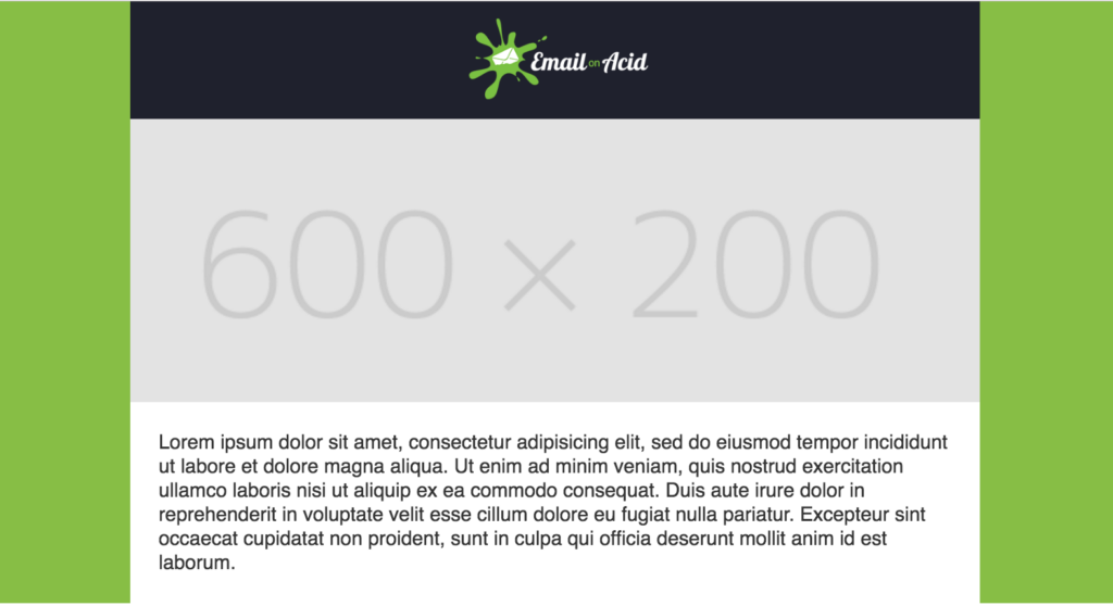
The general rule is that your image dimensions should be twice the size of the image placeholder in your email template. This makes your image look sharp even on high-definition displays, like 4k and Retina. If you’re ever unsure, check out each email service provider’s guidelines for images since the width of emails may differ between providers.
Most email marketing templates have a width of 600 pixels. So, a full-width image would need to be 1200 pixels wide for optimal appearance in Retina-quality displays.
Also, remember to choose the right image size to maintain consistency throughout your email marketing campaign. For instance, your header image and fonts should be the same size even if your email layout differs.
Bigger is better, right? Not necessarily. Spammers have been known to use images with large file sizes. So picking the right image format can protect your email’s deliverability and decrease load time. Both are important for keeping your email subscribers engaged.
Here are some common image formats we recommend, as well as some pros and cons for each format:
Alt text is the text part of the HTML alt tag attribute that describes an image. Screen readers read alt text aloud to help visually impaired users navigate web pages. Alt text also helps SEO by helping search engines “read” your image.
More importantly, when images are blocked by their email client or fail to load, alt text can help “fill in the blank.” Many email clients will display the alt text when images are blocked. In other words, alt text can improve the readability of your emails by providing context for images even when they aren’t displayed.
Check out our tutorial on inserting alt text in your HTML email designs.
Just like you maintain a brand voice in your copy, you can use strong visual designs and email templates to create an instantly recognizable visual “voice.” Consistent color schemes and cohesive image content target specific marketing demographics and build a unique brand identity.
Remember, pictures are powerful, but an off-brand meme can distract your subscribers and detract from your on-brand message.
When you use images in your emails, remember to stay on-brand and pick appropriate visuals. Also, consider coordinating with your social media and marketing teams to create a cohesive visual voice across different marketing streams that appeal to your desired user base.
Adding images to your email designs can be tricky, but we’ve got you covered. Here are some pitfalls to avoid when using images in your email design:
Once upon a time, many email clients blocked images or stopped them from displaying by default. Thankfully, most email clients now automatically load images on mobile and web apps. For instance, Gmail and Apple Mail show images by default. However, some desktop apps still block images.
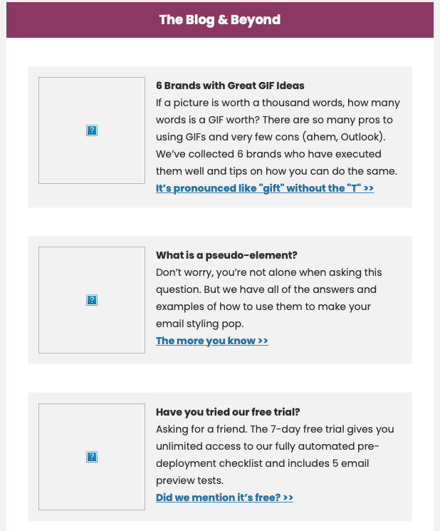
Here’s how an email newsletter might look in a desktop version of Outlook with images downloading turned off:
Here’s a table of email clients that don’t download images by default:
| Email client | Type of service |
| AOL Mail | Webmail |
| Outlook 2007-2019 | Desktop |
| Outlook (Mac) | Desktop |
| Office 365 | Desktop |
| Office 365 (Mac) | Desktop |
Keep in mind, that recipients can also choose to turn off automatic image downloading. So, you shouldn’t rely solely on imagery to communicate important stuff to your subscribers.
We know it can be tempting to use a graphic instead of text in your email. Pictures can say so much, and infographics even more. However, as we mentioned above, some email clients block images or keep them from being automatically displayed. Even if this isn’t the case, sometimes images take a long time to load, or your user’s internet connection speed could prevent images from loading at all.
When your images are blocked, your text will have to be able to stand on its own. If you’re not sure your copy is up to the task, check out our testing tools which offer image blocking previews.
The most common guideline you’ll hear is no more than 40% image coverage and a minimum of 60% text. While exceptions exist, this rule will generally keep you from any deliverability issues. In recent years, some email experts suggest an 80/20 rule for text and images in emails. That said, filters aren’t going to look at your ratio and reject it if you’re at 61/39.
More importantly, the 60/40 rule reinforces some basics for balancing your text and images. Keep in mind your subscriber base and the devices and clients on which they view your emails. For instance, image-heavy content may play well if you have a large mobile subscriber base. But if your users prefer Microsoft Outlook, you may want to focus on the text more. Strike a good balance between text and images based on your specific campaign needs.
Above, we talk about the 60/40 rule in email design. Variations on this rule exist, like 80/20 or 70/30. Regardless of exact ratios, the key takeaway is that your email should not be one giant graphic.
This is especially important because spam filters will often assess the length of your HTML code to determine whether or not your email gets placed in your recipients’ inboxes. In fact, we’ve found that if an email has 500 characters or more, the content-to-image ratio had no impact on deliverability. On the other hand, if you use too much text in the email, your subscribers’ email clients may sort your email into the Promotions folder instead of landing in the primary inbox.
So what does this all mean? We recommend not using too many images and sufficiently supplementing images with text. Use ALT text, create a bullet-proof CTA with text instead of images, and include text in your headers to increase your text to image ratio. Balance is key.
Now that we’ve covered the basics, let’s go through some types of images to use in your email campaigns. Remember, if an image isn’t your original content, always check the image licenses for usage restrictions.
Here are some ideas for adding images to your emails:
Images in email are an excellent way to convey emotion while supporting your copy. These are just some ideas to get you started. We suggest you collaborate with your marketing team to define in-house image practices and develop your brand’s visual identity.
Images can bring your campaign message home, but adding them to your email designs can be tricky! We’ve gone over some best practices, things to avoid, and what types of images to use.
For our last tip, we’ll leave you with our Email on Acid mantra: Test every email, every time! There’s no better way to get rid of “send anxiety” than using email testing. Don’t have access to our email testing platform? Get unlimited email, image, and spam testing free for seven days.
Image Validation is built into our automated email checklist. This step helps you optimize image file sizes for load time, checks borders and widths, lets you add alt text to images, and more.
This article was last updated on April 14, 2022. It was first published in October of 2017.