Email Development
Master the Art of Dark Mode Email Design and Coding

Email Development
It’s a topic that’s been keeping email geeks up at night for years now… Dark mode email design and development. As if you didn’t have enough to deal with when it comes to email rendering.
Dark mode throws yet another wrench in the gears of email development. However, if you know what you’re doing, you can optimize the inbox experience for both light and dark mode emails.
If you’re ignoring dark mode, it’s likely that some of your subscribers are opening your HTML email designs only to find an unreadable mess. So, let’s shed some light on this shadowy subject and explore how to create emails that look great, no matter the mode.
Dark mode is a display setting that can be turned on and off for many devices, applications, and operating systems. Essentially, it changes the user interface so that instead of seeing the traditional dark text on a light background, there’s light text on a dark background.
So a background with hex code #FFFFFF and text color hex code of #000000 switches.
In dark mode, the background hex code becomes #000000 and the text hex code switches to #FFFFFF.
Here’s how that might look when viewing an email in light or dark mode on a mobile device:

Dark mode UI was the norm back in the ‘70s not long after email was invented. Picture those old, boxy PCs with black screens and glowing green text. Light mode eventually became the standard along with LCD screens in the ‘90s.
Twitter and YouTube were among the first popular services to offer dark mode. In 2019, Microsoft, Google, and Apple followed the trend and began offerring dark or “night mode” options for their programs and operating systems.
In 2023, Twitter/X made the move to make its dark mode UI the default. At first, Elon Musk said it would be the only option. Apparently, he believes dark mode is “better in every way.” But backlash from users prompted the company to bring back a light mode setting for the platform.
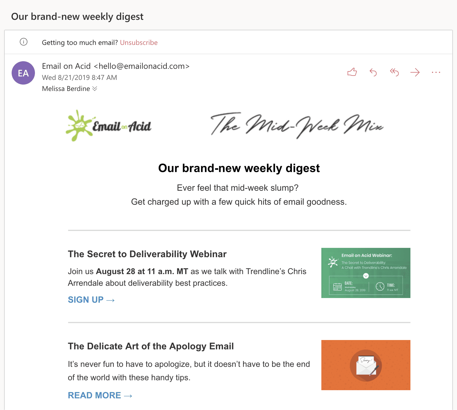
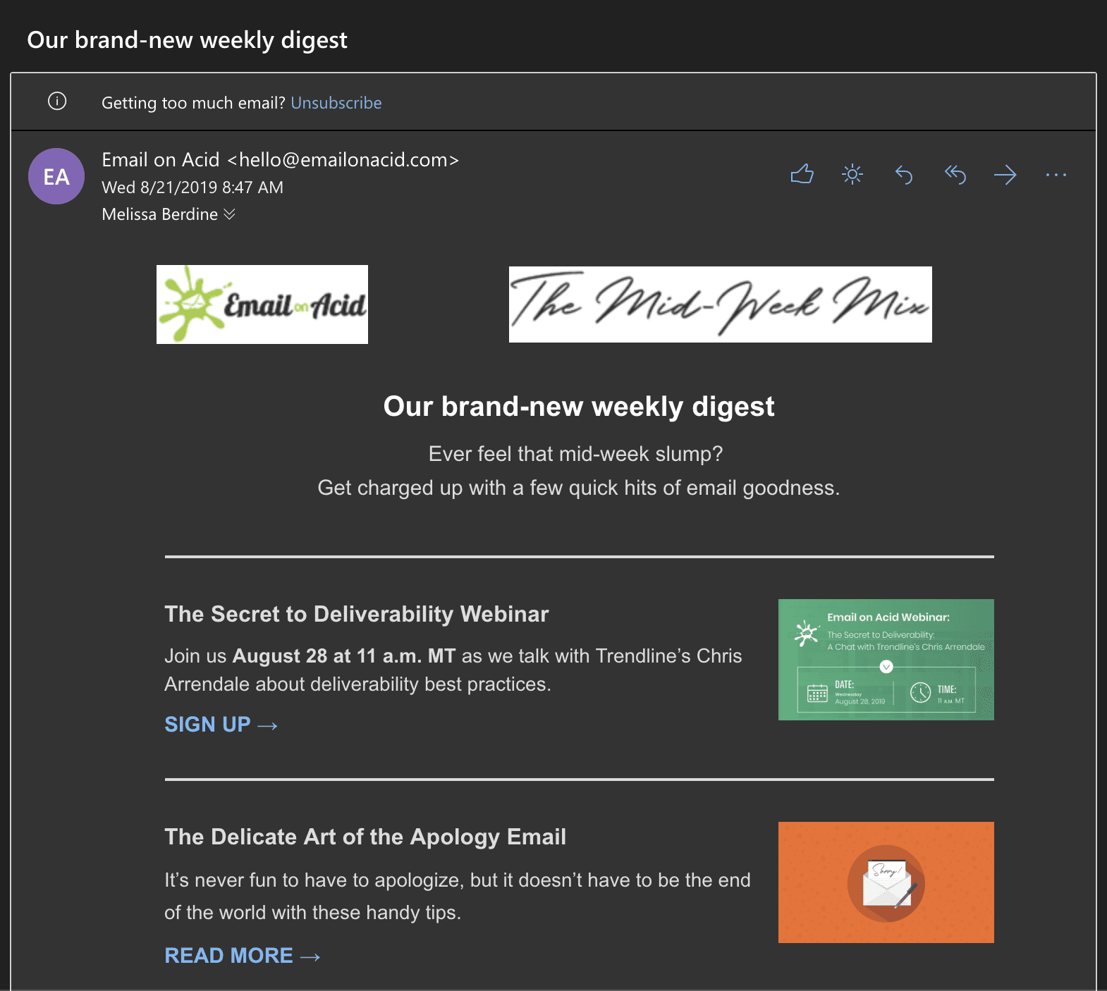
Once Gmail, Apple Mail, and Outlook started offering dark mode, email marketers began paying attention too. Here’s how an old Email on Acid newsletter looked when we first started testing our own stuff in dark mode four years ago. It’s not terrible. But it’s not ideal either.
Remember when dark mode was just a niche preference? Those days are long gone. Dark mode has rapidly become a mainstream feature, with recent studies showing that a significant portion of users prefer dark mode for at least some of their digital interactions.
Of course, those studies on consumer usage of dark mode settings vary. What you really want to know is how many of the contacts on your list are opening messages in dark mode. Advanced Email Analytics from Sinch Email on Acid let you do exactly that. Find out more about tracking dark mode opens on our platform.
But we digress… Why do people love dark mode so much? Let’s break it down:
Whatever the reason, there’s a good chance a significant portion of your subscribers are viewing your emails in dark mode. As email professionals, it’s our job to ensure our messages look great in both light and dark environments.
Before we jump into solutions, let’s break down the main challenges of dark mode emails. Understanding these hurdles is the first step in overcoming them:
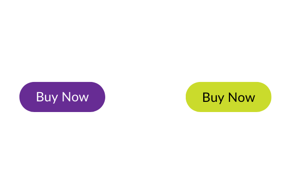
One of the primary challenges with dark mode is color inversion. Many email clients automatically invert colors when switching to dark mode, turning light backgrounds dark and dark text light. While this sounds simple in theory, in practice it can lead to some unexpected results:
In this example, purple may be a primary brand color you use for calls-to-action in emails. But the inverted green button may not fit your brand at all.
Your brand’s visual identity is crucial in email marketing. However, dark mode can mess up your email branding efforts:
Here’s what can happen if your logo isn’t optimized for viewing emails in dark mode:
For a bunch of options on how to handle this, check out our tips on fixing dark mode logo problems.
While dark mode can benefit some users with visual impairments, it can also create unexpected email accessibility issues:
Like usual in the world of email development, it’s never as simple as having a dark mode and non-dark mode, all email clients that feature dark mode will handle it slightly differently.
As explained in this excellent article from our friends at Parcel, you can break down the different dark modes to three different modes; full inversion, partial inversion and no change.
Full inversion will change both your font colors and your backgrounds, partial inversion is very similar but will largely leave your backgrounds untouched, no change won’t inverse any of your content.
| Email Client | Auto-Inverts Colors? | Common Dark Mode Challenge |
|---|---|---|
| Apple Mail (iPhone/iPad) | Yes | Auto inverts when the background is transparent or pure white (#ffffff). |
| Apple Mail (macOS) | Yes | Auto inverts when the background is transparent or pure white (#ffffff). |
| Outlook (iOS) | Partially | May make background color darker. |
| Outlook (macOS) | Partially | The only Outlook option that does support @media (prefers-color-scheme). May make background color darker. |
| Outlook (Windows) | Yes | The only Outlook option that consistently auto-inverts colors. |
| Outlook.com (webmail) | Partially | The only Outlook option where image swap works. May make background color darker. |
| Gmail (Android) | Yes (when not already dark) | Does not support the query @media (prefers-color-scheme). |
| Gmail (webmail) | No | Does not support the query @media (prefers-color-scheme). |
| AOL (webmail) | No | No current dark mode user interface. |
| Yahoo! (webmail/app) | No | Does not support the query @media (prefers-color-scheme). |
In Apple Mail’s dark mode, it tends to invert pure black (#000000) and pure white hex (#FFFFFF) codes. Apple Mail will completely disregard contrast or other-such rules if you have those hex codes and invert them regardless.
We advise to choose slightly different hex codes, such as #000001 or #FFFFFE, the difference in color is not noticeable and it’ll help you avoid any surprises.
As is often the case, Gmail can often throw a bit of a curveball when it comes to how it handles our dark mode emails, simply because there are so many versions of Gmail, ranging from iOS to Android to regular old Gmail, nailing down a solution can be quite tough. Previewing your campaigns in dark mode on Gmail helps you understand how to build the best experience for those subscribers.
If you’re struggling with Gmail on iOS dark mode, you can try this insanely clever solution by Rémi Parmentier, utilizing blends (which are supported in Gmail) to control how your email looks when dark mode has its way.
Ahh, now we get to it, the elephant in the room; Outlook. One significant issue is how Outlook handles color inversions. In dark mode, where backgrounds become dark and text becomes light, Outlook might struggle to accurately invert colors, leading to unexpected and sometimes undesirable outcomes. This can result in poor readability, visual inconsistencies, and an overall less-than-ideal user experience.
Additionally, Outlook’s dark mode implementation might not fully align with standard development practices, introducing quirks and challenges for email developers. These issues can range from the rendering of background images to the handling of certain styles, making it crucial for email designers to employ specific strategies to ensure their emails look as intended in Outlook’s dark mode.
If you’re struggling to get text readable in Outlook, Nicole Merlin has an amazing guide on tackling font colors in Outlook’s Dark Mode, includin
Now that we’ve outlined the challenges, let’s dive into some strategies to help you navigate the murky waters of dark mode email design:
The first step in creating dark mode-friendly emails is to tell email clients that your email supports both light and dark modes. You can do this by adding specific meta tags to the <head> section of your email:
                                <meta name="color-scheme" content="light dark">
<meta name="supported-color-schemes" content="light dark">
These meta tags essentially say, “Hey, email client! This email is designed to work in both light and dark modes.”
To complement these meta tags, you should also include the following in your CSS:
                                <style type="text/css">
  :root {
    color-scheme: light dark;
    supported-color-schemes: light dark;
  }
</style>
This CSS reinforces the message that your email supports both color schemes.
Once you’ve set the stage, you can use CSS media queries to detect when dark mode is active and adjust your styles accordingly. Here’s an example:
                                @media (prefers-color-scheme: dark) {
  body {
    background-color: #1a1a1a !important;
    color: #ffffff !important;
  }
  h1, h2, h3, p {
    color: #f1f1f1 !important;
  }
}
This media query says, “If dark mode is on, use these colors instead.” It’s a powerful tool that allows you to create a tailored dark mode experience.
However, it’s important to note that not all email clients support this feature. It works great in email clients that support media queries, like Apple Mail and Outlook for Mac. But some clients, like Gmail, don’t support this feature, so you’ll need to have fallback options.
Your logo is a crucial part of your brand identity. So, ensuring it’s visible in both light and dark mode is essential. Here are some strategies:
Here’s how the code might look if we wanted to display different logos in dark and light mode:
                                @media (prefers-color-scheme:dark) {
    .dark-mode-hide{
        display:none!important;
    }
    .dark-mode-show{
        display:block!important;
    }
}
                                  <img src="https://marketing.emailonacid.com/hubfs/NORMAL-EoA-Logo.png" width="150" alt="Email on Acid" border="0" style="display:block;max-width:150px;font-family:Arial,sans-serif;font-size:9px;line-height:12px;color:#ffffff;font-weight:bold;" class="dark-mode-hide">

  <!--[if !mso]><!-->
  <img src="https://marketing.emailonacid.com/hubfs/images/logos/DARK-MODE-EOA-Logo.png" width="150" alt="Email on Acid" border="0" style="display:none;max-width:150px;font-family:Arial,sans-serif;font-size:9px;line-height:12px;color:#ffffff;font-weight:bold;" class="dark-mode-show">
  <!--<![endif]-->
Note: the code under <!–[if !mso]><!–> is Microsoft Office conditional code that tells Outlook to ignore the dark mode logo. With Outlook, you can also use the tag “mso-hide:all” to keep elements hidden in dark or light modes.
This code tells email clients to use the dark mode logo when dark mode is active, and the light mode logo when it’s not. You can use this same technique for other important graphics in your email design.
Of course, there are simpler solutions, like the glow or outline trick.
Here’s how the Sinch Email on Acid logo would display in dark mode with a white stroke that outlines text and fills in gaps (Note: Graphic designers often hate this technique):
Images play a crucial role in many email campaigns, but they can be tricky to handle in dark mode. Here are some tips, many of which are similar to handling dark mode logos:
Email accessibility should always be a priority in your design choices, and dark mode adds an extra layer to consider:
Given the inconsistent implementation of dark mode across email clients, it’s crucial to have a strategy:
Now that we’ve covered the technical aspects, let’s look at some overall best practices for designing dark mode emails:
Here’s where we put on our problem-solving hat. Testing your emails in dark mode across different clients is crucial. That’s where Sinch Email on Acid comes in handy. Our email quality assurance platform lets you test and preview your emails in dark mode across various clients and devices, helping you catch rendering issues before they reach your subscribers.
With Sinch Email on Acid, you can:
Plus, track dark mode email opens in with our analytics so you can see exactly why optimizing for dark and light mode is worth the effort.
Dark mode in email doesn’t have to be a headache. With these tips, techniques, and testing strategies, you can create emails that look great whether your subscribers prefer the light side or the dark side.
Remember, the key to mastering dark mode emails is thorough testing and a willingness to adapt your design process. By considering dark mode from the start, using the right tools and techniques, and testing thoroughly, you can ensure your emails shine in any setting.
So go ahead, email pros! Embrace the challenge of dark mode and create emails that look fantastic no matter how they’re viewed. And when in doubt, test it out with Sinch Email on Acid. Your subscribers (and your peace of mind) will thank you.
Dark mode is an ever-evolving problem that email developers are tackling every day and new and exciting solutions are cropping up all the time. It’s impossible for us to cover everything about dark mode in just one article, so we have a great selection of other resources.