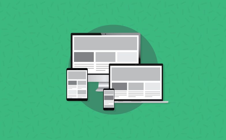
Email Development
How to Create Responsive Rollover Images for Email

Rollover or mouseover images are ubiquitous on the web. E-commerce websites often feature images of products where an alternative view of a product is displayed when the visitor hovers a cursor over an image. Rollover images allow more information to be displayed without cluttering the page.
This article will go over how to create interactive rollover images in email that will scale with the width of your email. The rollover images will be interactive in Apple Mail, Yahoo! Mail, AOL Mail, the webmail version of Gmail and some versions of Outlook.com. In other email clients the image is non interactive.
Non-Responsive Method
I demonstrated a method to create rollover images in email using background images. However the old method requires the width of the image to be fixed because the background-size property is not uniformly supported by all email clients.
This means you cannot place the image within responsive layouts as the image will not scale.
Responsive Method
The basics of responsive rollover images is pretty straightforward. You wrap a link around two images and hide the alt image by default.
                                <div class="bg-dark text-primary p-2 rounded fs-sm mb-6 overflow-auto">
<pre >
  <code>
    <a class="rollover" href="https://server/the-url">
      <img class="main" src="https://server/main-image.jpg" width="500" style="display:block;width:100%;">
      <img class="alt" src="https://server/alt-image.jpg" width="500" style="max-height:0px;display:block;width:100%;">
    </a>
  </code>
</pre>
</div>
Then in a style block you use the :hover pseudo-class to hide the main image and show the alternate image when the user hovers over the link with the class .rollover.
                                <div class="bg-dark text-primary p-2 rounded fs-sm mb-6 overflow-auto">
<pre >
  <code>
    .rollover:hover .main{
      max-height: 0px !important;
    }
    .rollover:hover .alt{
      max-height: none !important;
    }
  </code>
</pre>
</div>
Simple huh? Unfortunately it’s not so straightforward as both images will be visible in Outlook 2007+. This is because those clients don’t support max-height property. If you’re wondering why not just use height instead, well Outlook 2007+ ignores image dimensions set to zero!
Fixes for Outlook
To hide the alternative image from Outlook, we wrap it with a div and use the mso-hide:all Microsoft Office style.
                                <div class="bg-dark text-primary p-2 rounded fs-sm mb-6 overflow-auto">
<pre >
  <code>
    <a class="rollover" href="https://server/the-url">
      <img class="main" src="https://server/main-image.jpg" width="500" style="display:block;width:100%;">
      <div style="mso-hide:all;">
        <img class="alt" src="https://server/alt-image.jpg" width="500" style="display:block;width:100%;">
      </div>
    </a>
  </code>
</pre>
</div>
Adding Support for Gmail
Finally, we use the attribute selector hack for Gmail to make the image interactive in Gmail webmail as well. We add a summary attribute on the link and we also simplify the code by replacing the “main” and “alt” classes with “>” direct child selector.
<div class="bg-dark text-primary p-2 rounded fs-sm mb-6 overflow-auto">
<pre >
<code>
<!DOCTYPE>
<html>
<head>
<style>
.rollover:hover > img, * [summary=rollover]:hover > img{
max-height: 0px !important;
}
.rollover:hover > div img, * [summary=rollover]:hover > div img{
max-height: none !important;
}
</style>
</head>
<body>
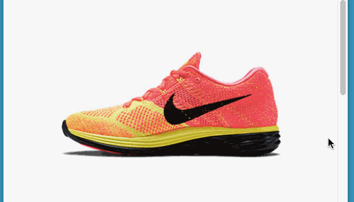
<a class="rollover" summary="rollover" href="https://store.nike.com/us/en_us/pd/flyknit-lunar-3-running-shoe/pid-10252949/pgid-1561757">
<img src="https://freshinbox.com/examples/image-swap/images/shoe-main2.jpg" width="500" style="display:block;width:100%;" alt="Nike FlyKnit 3" border=0>
<div style="mso-hide:all;">
<img src="https://freshinbox.com/examples/image-swap/images/shoe-alt2.jpg" style="max-height:0px;display:block;width:100%;" width="500" alt="" border=0>
</div>
</a>
</body>
</html>
</code>
</pre>
</div>
What About Mobile?
On mobile—specifically iOS—because a link wraps the image, when a user taps on an image, both the hover and click fire simultaneously. The rollover image will appear for a split second before the link opens in the browser.
Since this may be jarring to the user, we can disable the rollover state in mobile by using this media query
                                <div class="bg-dark text-primary p-2 rounded fs-sm mb-6 overflow-auto">
<pre >
  <code>
    @media screen and (max-device-width:1024px) {
      .rollover:hover > img,
      * [summary=rollover]:hover > img{
        max-height: none !important;
      }
      .rollover:hover > div img,
      * [summary=rollover]:hover > div img{
        max-height: 0px !important;
      }
    }
  </code>
</pre>
</div>
Mobile Image Swap
It would be a shame if we went through all this effort without also supporting mobile. However all is not lost! Even though there’s no concept of a hover state in mobile, we can try alternative approaches such as adding a separate “tapzone” to display the alternate image.
This article covers a method on how to display a rollover tapzone in mobile. In a future article I will cover a few more design techniques to support image swapping in mobile as well.