Email Marketing
6 Brilliant Email Newsletter Designs to Inspire Your Next Campaign
Email Marketing
This blog post was written by Filza Naveed, a content marketing specialist with ContactMonkey. Special thanks to Filza and ContactMonkey for sharing their newsletter inspiration with us!
Don’t you love reading email newsletters with on-point design and copy?
Whether you’re a B2C marketer creating an email newsletter design to wow your list of subscribers, or an internal communications professional looking to create an employee newsletter, email marketing works – but only if it’s done right.
What kind of newsletter design will capture the attention of your target audience? Should you go for a minimalist newsletter design or go all out with vivid imagery and eye-popping graphics? What would make your audience read the newsletter? Perhaps more importantly, what would make them keep coming back for more?
If you’re creating an external newsletter, once someone has hit the subscribe button, it’s your job to deliver. The pressure is on! Luckily, we’ve compiled a list of six types of unique newsletter design ideas to inspire you. (And there’s always more email marketing inspiration within the Email on Acid platform). While some newsletters use a minimalist bare-bones structure and prefer to speak loudly with their words, others wow their subscribers with delightful newsletter design and eye-catching imagery. Let’s have a look at some of our favorites.
Sephora knows how to draw in customers with their sleek and bold newsletter design. Not only do they have clear calls to action (CTAs), but the compelling graphics make their beauty products pop on the page.
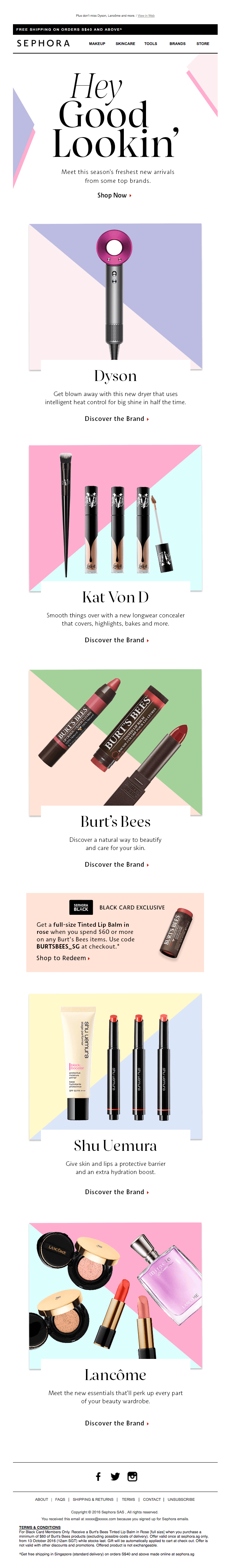
The pastel tones are meant to grab the attention of their target audience, who are primarily millennial women. The newsletter design is simple, but the colors and the cosmetics make you feel as if you’re already holding the products in your hands.
Sephora also makes good use of fonts and uses captivating copy to personalize their message. They know their audience and how to make you keep coming back for more. I don’t even shop at Sephora, but I can’t get myself to hit the unsubscribe button for fear of missing out!
(Click here to view the entire email)
Seasonal newsletters are some of my favorite reads, mainly because they offer great newsletter design inspiration. This newsletter from the mega coffee chain Starbucks stands out to me in particular. They make use of short (but captivating) descriptions paired with eye-popping visuals. I’m practically salivating looking at those winter holiday drinks and it’s not even winter!

(Click here to view the entire email)
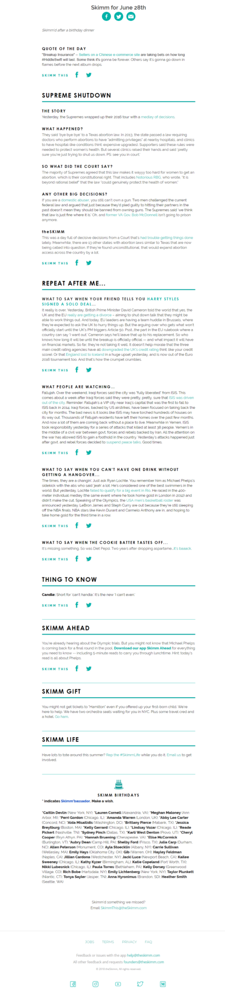
If you want a delightfully short daily roundup of what’s happening around the world, look no further than TheSkimm. They use short, punchy paragraphs to captivate their audiences and make readers feel like industry experts. TheSkimm also has an astounding 40% open rate for their email newsletter! If you’re working in the news, media or publishing industry, you need to look at this one as an excellent example of how to make your copy speak louder than your images.
TheSkimm is also great inspiration for internal communications teams looking to create engaging newsletters that employees will read. Try simulating this kind of snappy writing style to convey company-wide announcements and events. Or, if you’re looking for a simple newsletter design for your internal newsletter, look to TheSkimm for ideas.
(Click here to view the entire email)
J. Crew, the multi-brand, multi-specialist retailer, shows in their newsletter that a picture is worth a thousand words.
This J.Crew newsletter includes an eye-popping ice cream cone that immediately takes over your senses and, even though their engaging copy is telling you to scroll down for more, you’re probably going to do it anyway. This design tantalizes taste buds and engages visually.

(Click here to view the entire email)
When you’ve finally reached the tip of the ice cream cone, you’ll notice how it’s pointing you towards a CTA button, which takes you to their sales page. Clever, isn’t it?
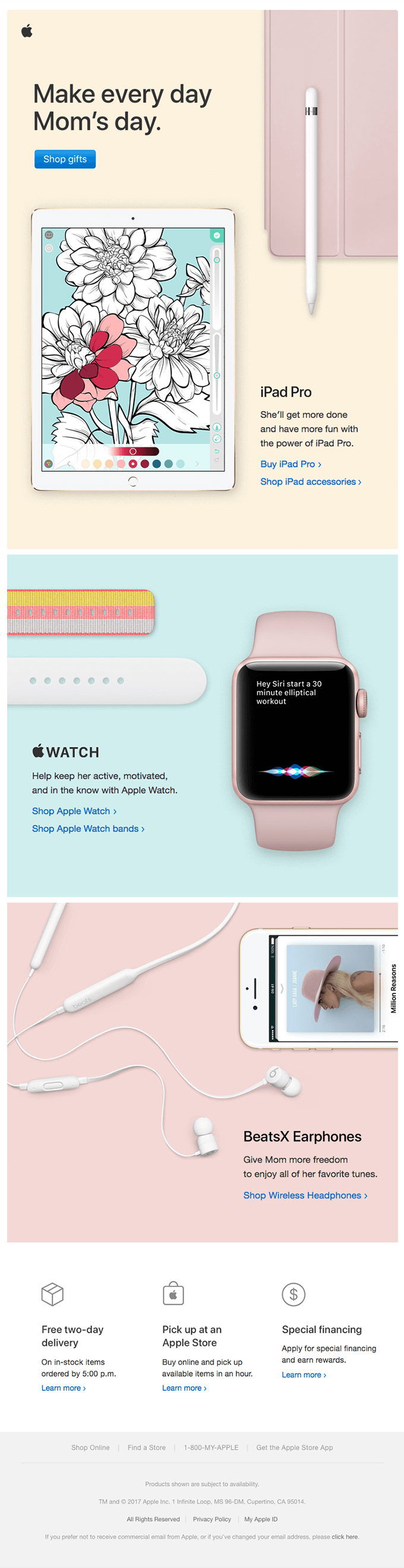
I love occasion-based newsletters where brands go out of their way to use creative imagery in the design to motivate people to make a purchase. This Mother’s Day newsletter from Apple is an excellent example.
In this newsletter, Apple effectively balances white space with their vivid product images and uses different colors to catch the eye. Their CTAs are clear and the copy is minimal, making the readers almost feel like they’re not being pressured to buy anything.
(Click here to view the entire email)
This newsletter design from BrainPickings is great for any internal communications teams looking to package company news and events that employees will want to read. If you’re a regular subscriber to BrainPickings, you’ll know it’s the go-to source for creative souls looking to read up on art, design, philosophy and psychology. It’s a long newsletter, but it engages intellectual audiences with delightful copy and adorable illustrations.

(Click here to read the entire email)
Inspired to create an epic newsletter with eye-catching visuals and engaging copy? Building an awesome newsletter that gets people to fall in love with your brand requires hard work.
First, you’ll need to be sure to avoid making these email marketing mistakes as well as these newsletter no-nos.
If you’re an internal marketer who is sending your HTML newsletters from Outlook or Gmail, it’s also important to make sure your emails are rendering correctly on this tricky client. Luckily, we have a tool for that.
Once you have your newsletter design ready to go – don’t forget to test your email. Even great email newsletters break from time to time, which is why email testing needs to be a part of your email marketing process. Email on Acid can test your email code in seconds, allowing you to preview your design across more than 70 email clients and devices.
So, what are you waiting for? Start creating kick-ass email newsletters – internal or external – with ease. Your audiences will love you for it.