Industry News
The ADA at 30: Why Email Accessibility Matters

When the Americans with Disabilities Act (ADA) became law in 1990, it focused on removing physical barriers and improving accessibility to all. You see the results every day – ramps next to stairs, levers instead of doorknobs, hotel rooms with roll-in showers, and lower peepholes.
But recent court decisions applied the law to online access, too. Email marketers must understand what’s at stake and why their emails should be accessible.
Pathwire’s report, Accessibility in the Inbox, suggests that 81% of marketers say they’re considering email accessibility. However, a deeper dive reveals there are many factors that are being ignored.
ADA and the internet: a hotbed of litigation
The ADA gives people with disabilities the right to the same opportunities as others. It prohibits bias against disabled people and requires that all organizations provide accommodations that offer accessibility.

Back in 1990 when the act went into effect, the internet was still in its infancy. Not much thought went into online accessibility. Since then, courts began interpreting the law to cover online access, including websites and mobile apps.
Lawsuits against businesses accused of having inaccessible websites or other online services are a rising trend in ADA litigation. Plus, the COVID-19 pandemic is pushing online accessibility into the forefront. That’s because more people rely on the internet for shopping, communications, entertainment, and even voting in certain states.
Although websites and mobile apps are in the hot seat now, proactive email marketers need to review how well their messages and landing pages measure up to accessibility standards. Many of those standards are outlined in the Web Content Accessibility Guidelines (WCAG).
The first public draft of WCAG 1.0 published in February 1998, more than 20 years ago. The Worldwide Web Consortium (W3C), an international working group, put together guidelines with the goal of making digital content accessible to everyone, regardless of disability. The WCAG serves as a technical standard for anyone charged with digital accessibility.
Three reasons why email accessibility matters
Besides being the right thing to do, you can’t expect customers to buy if they can’t read or act on your emails.
1. Many of your customers and subscribers live with disabilities
More than 61 million Americans have physical or mental disabilities – both temporary and permanent. That’s roughly one in four people in the United States alone. Globally, estimates range from 650 million to 1.3 billion, with spending power estimated at $8 trillion.
“While technology can create a more inclusive future, it has also created further barriers. The Americans with Disabilities Act needs to break those down,” Caroline Casey, social activist and founder of the disability-business partnership The Valuable 500, says. “With technology so embedded in our lives, digital accessibility isn’t something that would be nice to have, but is a right for everyone.”
2. Visual and physical limitations make it hard for subscribers to act on your emails
You might be thinking, “I don’t offer products or services that people with disabilities would ever use. My customers aren’t people who are blind or use a wheelchair.”
That’s one of the big misconceptions about disabilities. You don’t have to be blind to be visually impaired or in a wheelchair to be physically limited.
People often classify disabilities by individual physical traits or function of what could include:
- Visual (blindness, low vision, color blindness)
- Auditory (deafness, hearing impairment)
- Motor (paralysis, cerebral palsy, missing limbs)
- Cognitive (learning disabilities, traumatic brain injury, dyslexia)
- Seizure (epilepsy)
- Mental health (depression, anxiety, panic attacks)
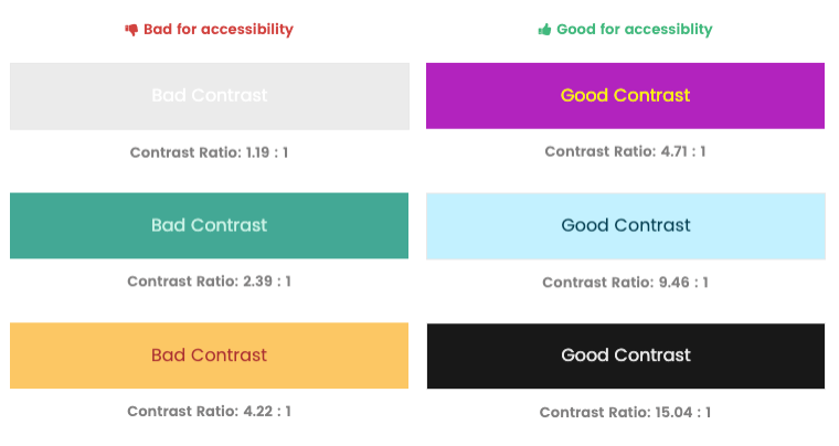
On the visual side, consider color blindness, which affects about 4.5% of the population in general and 8% of men. The wrong color combinations make your content hard or impossible for a color-blind person to see your copy, graphics, or call-to-action button.
Look at the example below. This simulates what people with color blindness or other visual impairments might see if your emails and websites use these color combinations.

Beyond color and contrast, people with visual, physical, or cognitive disabilities need to be able to view and click on your emails.
- Poor-quality images and long copy blocks are next to impossible to manage when blown up 10 to 100 times normal size on a screen reader or in-browser magnifier.
- People who have motor control issues or use assists like pens, eye trackers, or other devices to move cursors get frustrated when trying to click or tap text-based links and tiny call-to-action buttons.
- Reading emails with an assistive device like Alexa or Google Home isn’t a viable solution unless the email is set up for it.
3. Website access is key to email marketing success
Your email program relies on web-based subscriber and preference centers. Your emails send customers to landing pages on your website. Email teams need to make sure both are as accessible as possible.
Begin at opt-in. How easily can someone with impaired vision, a broken finger, or arthritis in both hands speak or type contact info into your form?
If it’s hard to view, click or tap on, you could lose the sale and end up with a disappointed, frustrated, or angry customer. That’s more than a poor customer experience. It could drive your customer to a brand that has its accessibility act together.
How to get started with accessibility
A quick review of your email templates can turn up some glaring but overlooked issues. For example, don’t overlook simple steps such as legible font size and alt image tags for screen readers.
More advanced features such as a three-bar hamburger menu can also lead to accessibility problems. That menu style is meaningless to someone viewing your site on a screen reader unless you add the command “open the menu” to the icon code.
A recent audit of 10 million websites by accessiBe, an AI-based web accessibility service, discovered which website elements are most likely to flunk accessibility tests. Check your emails and landing pages against the list below to see how they comply:
- 98% of menus failed
- 89% of pop-ups
- 83% of buttons
- 71% of forms
- 52% of images
Want to get some insights into color contrast and accessibility on your landing page designs? Check out this free contrast accessibility tool for web pages.
ADA and email: It’s good for everyone
Email developers have come a long way in creating standards for accessible emails. Unfortunately, a quick glance through the inbox shows us how far we still have to go to support people who interact with the world in different ways.
Investing in accessible email templates and web pages improve your email program’s effectiveness and ROI.
The physically able person who reads your email today might face glaucoma or a torn retina in a year. Someone who can open and click your emails easily now could break a hand in a skiing accident next winter. The customer who reads your emails but never acts could have a color disorder that makes your CTA button hard to read.
Designing with empathy is essential in our current world. Empathy is the ability to perceive and understand how another person may feel in each situation. Taking the time to design and develop with empathy and initiate the dialogue surrounding current technology as a person with a disability enables us to consider all users. As email marketers, it’s also part of our job to be as inclusive as possible.
Email on Acid resources help you make your email more accessible
We would love to see every email readable and easy to act on for every subscriber, and our mission is to help you achieve that as effortlessly as possible. That’s why accessibility is so important to us, and why we offer resources to help you get there:
Check before sending: We built an Accessibility feature and ADA compliance into our tool, Campaign Precheck. You can scan your email for these important elements and to adjust your code instantly and make your email more accessible.
Surf the blog: Our blog is a library of news and information on email accessibility. Search for yourself or start with these two recent posts:
- Email Accessibility Best Practices reflects the latest technology and coding advances to make your emails as widely accessible as possible.
- Accessibility and Dark Mode: The Latest Buzz Words is a tutorial that helps you manage accessibility in both Light Mode and Dark Mode.
- Why Email Engagement and Accessibility Go Hand-in-Hand explains how accessible emails support better performance.


