Email Marketing
Can a Plain Text Email be Better than HTML?
Flashy designs and interactive elements may try to steal the spotlight in the inbox. But is there a case to be made for the humble plain text email?
HTML email developers and digital marketers love to flex their creative muscles with branding, design, and interactivity. Let’s be honest, it’s fun to show off sometimes. Still, a simpler approach to email marketing may be a better choice in certain situations.
So, when should you go all out with HTML emails, and when should you keep it simple? Let’s explore the dynamics of HTML vs plain text email and how each can be used to your advantage.
What is a plain text email?
It may surprise you, but many of the personal, one-to-one emails people send are not plain text emails. That’s because the true definition of a plain text emails is that it is extremely… well, plain. If you add a link, bold some text, or import an image, it’s no longer plain text.
A plain text email is an email format that contains only text and no HTML or rich media elements. This means no graphics, no logos, no funky GIFs, or interactive features – just the words, baby. Plain text emails are formatted using a standard, default font and the text content-type such as this: "text/plain; charset=us-ascii". They are straightforward and focus solely on the written content. A plain text email is a lot like a basic SMS message.
What plain text emails do not include
The easiest way to understand plain text emails is to be perfectly clear about what you cannot do with them. Plain text emails lack several features that are common in HTML emails. They do not support:
- Images: You won’t find any logos, product photos, or banners in plain text. It should go without saying that GIFs, animations, and multimedia of any kind are not supported either.
- Custom fonts and colors: Text appears in the mailbox provider’s default font, without any color or size variations. A truly plain text email won’t even have any bold or italics.
- Links: You cannot hyperlink text. An email with a clickable link technically isn’t a plain text email. Of course, that’s going to include your email CTA buttons. Any call to action in a plain text email would not be clickable. You can, however, include full URLs and major mailbox providers will often transform them into something clickable.
To your subscribers, the key difference between HTML vs plain text emails lies in the presentation. HTML emails use code to create visually appealing layouts that can include various elements as well as dynamic content and personalization.
In contrast, plain text emails are stripped-down versions that focus purely on the words. Sometimes, that may be helpful. Other times, it may be very important to show something in an email marketing campaign.
Visual examples of plain text vs HTML emails
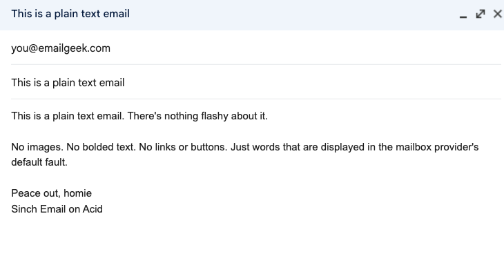
To make our point, let’s look at some examples. Below, you’ll see two screenshots of plain text emails. The first shows how a plain text email might show up with nothing but text. The next illustrates how mailbox providers may take full URLs in a plain text email and make them live so they can be clicked.
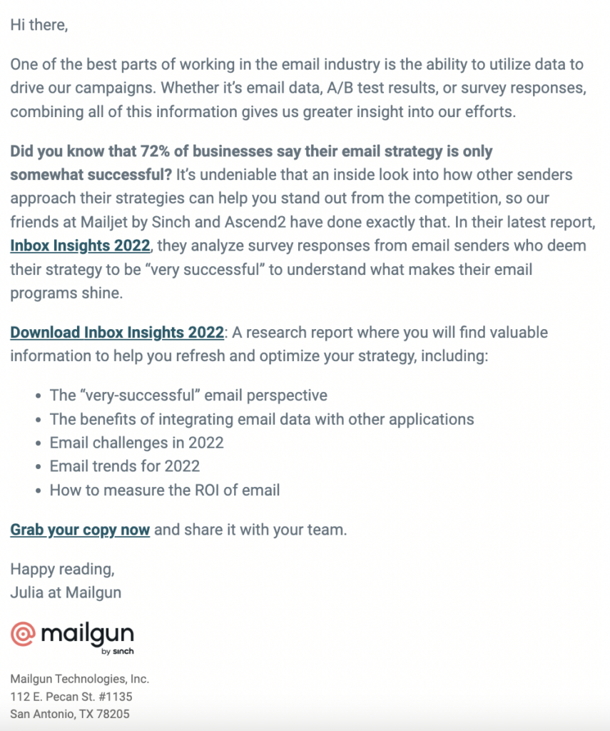
Now, here are two examples of HTML emails. The first image is a section from one of Megan Boshuyzen’s famous Sinch Email Camp emails. It has a background, images, formatted text, and clickable buttons. The second example looks like a plain text email. However, you’ll notice it has hyperlinks, bolded text, and includes a logo. So, it’s actually a simple HTML email.
HTML vs plain text emails: Pros and cons
Each of these email formats has strengths and weaknesses, making them suitable for different purposes and audiences. Let’s look at some of the specific advantages of plain text emails compared email campaigns featuring visuals, links, and interactivity.
Pros of plain text emails
- The authenticity of plain text: Plain text emails often come across as more personal and authentic. They resemble one-to-one communication, which can be effective for building trust with recipients. In short, it may feel a little less promotional.
- Simplicity and consistency: There’s less to worry about when it comes to how different email clients render the content of plain text emails. Since there’s no formatting to break, plain text emails are displayed consistently across all devices and clients. The only difference is the font will change depending on the mailbox provider.
- Accessibility: Plain text emails are more accessible for people using screen readers and other assistive technologies. The lack of complex formatting makes them easier for screen reading software to interpret for individuals with visual impairments.
- Fast loading and delivery: With no images or complex code, plain text emails load quickly and are less likely to encounter issues that can affect loading times. Plain text emails may also work better on devices like smartwatches.
Cons of plain text emails
- Lack of branding and design: Without any logos, color schemes, or other branding elements, plain text emails miss out on a significant branding opportunity. This is a disadvantage when consistency and boosting brand awareness is part of your goal.
- Limited tracking capabilities: True plain text emails can’t include tracking pixels or other elements used for monitoring open rates and email engagement metrics. This makes it much harder to measure the success of a campaign.
- Limited engagement potential: Plain text emails may struggle to capture attention or convey complex messages effectively, as they lack the visual appeal and interactivity that can engage recipients.
- Limited personalization: Unlike HTML emails, plain text emails cannot include personalized content based on dynamic data, such as the recipient’s name or purchase history, which can limit their effectiveness in targeted campaigns.
Pros of HTML emails
- Rich media and interactive elements: HTML emails allow marketers to include images, buttons, and other interactive elements. This can make emails more engaging and visually appealing, helping to convey messages more effectively.
- Brand consistency: HTML emails enable the use of brand colors, fonts, logos, and styles, ensuring that every email aligns with the company’s brand identity. This can enhance brand recognition and increase engagement. That’s a sign of a strong sender reputation.
- Advanced tracking and analytics: HTML emails can include tracking pixels and other tools to monitor open rates, click-through rates, and other engagement metrics. This provides valuable data for refining and optimizing future campaigns.
- Personalization: HTML emails can be personalized with dynamic content, allowing marketers to tailor messages based on recipient data, such as names, locations, past purchase, and more. This could significantly improve and email campaign’s relevance and effectiveness.
Cons of HTML emails
- Potential rendering issues HTML emails can be rendered differently across various email clients and devices. This can lead to design inconsistencies, with elements appearing broken or misplaced if not properly coded. Unfortunately, that could easily hurt engagement metrics and damage trust with a sender’s brand.
- Increased development time: Designing and coding HTML emails can obviously be more time-consuming than sending plain text emails. HTML email development requires specialized skills and tools. This can be a significant resource investment, especially for more complex designs.
- Accessibility challenges: While HTML emails can be made accessible, it requires a little extra consideration and work. Without proper attention to coding accessible emails, your campaigns may be challenging for people with disabilities to read and navigate.
- Dark mode and design: Another common inbox challenge for digital marketers is coding dark mode emails. While plain text emails will be easy to read in light or dark mode, and HTML email design can become messy and unreadable.
Deliverability: Plain text emails vs HTML with images
For quite some time, there was a belief that including a lot of images in an email campaign might increase the risks of being filtered into spam. That led some senders to assume that plain text emails would achieve higher inbox placement rates than those with lots of design. That is mostly untrue.
Using images shouldn’t negatively impact email deliverability. In fact, if your designs enhance the experience and drive higher engagement rates, that’s a positive sign to mailbox providers. It shows people are interested in what you’re delivering, and your sender reputation will improve.
The reason, however, that images could be spam signal is because image-only or image-heavy emails may be trying to hide something. The true intent and contents of a deceptive or malicious message aren’t as easy to notice when disguised in a graphic. Still, it works both ways. While scammers may try to spoof your brand in an email, they can also use what look like personal, plain text emails (with one malicious link).
The difference between plain text and simple HTML emails
The disadvantages of plain text emails vs the upside of HTML emails may seem pretty huge. Email marketing efforts will fall flat if your subscribers can’t click, and you can’t track much of anything. But, at the same time, the challenges of coding HTML emails with lots of design and interactivity does get overwhelming.
What if you could have the best of both worlds? Not every email campaign needs to be a digital work of art. And even if you disagree – it could be a minimalist work of art.
Sometimes, you want the simplicity and accessibility of plain text, but with a touch of branding and tracking capabilities. Enter the “simple HTML email.” These emails use minimal HTML and CSS coding to achieve a clean, straightforward design while still allowing for some branding elements and interactive features.
When does a simple HTML email makes sense?
While there’s a time and place for showcasing your creativity and email coding skills, certain types of messages may work best in their simplest form. Here are some contenders for simple HTML emails.
- Transactional emails: For messages like order confirmations or password resets, a simple design helps ensure clarity and focus on essential information.
- Internal communications: Company announcements or internal newsletters often benefit from a simple layout that prioritizes the message over design elements.
- Newsletters with light branding: When you want to maintain brand consistency but avoid overwhelming the reader with visuals, a simple HTML layout can balance both goals.
- Event reminders and follow-ups: These emails can keep the focus on the key details, like dates and locations, without unnecessary distractions.
Here’s the difference between a plain text transactional email and a simple HTML email for an order confirmation. The second example is still very basic, but it includes enough code and formatting to make the experience just a bit better.
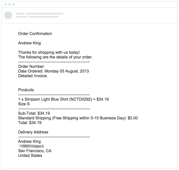
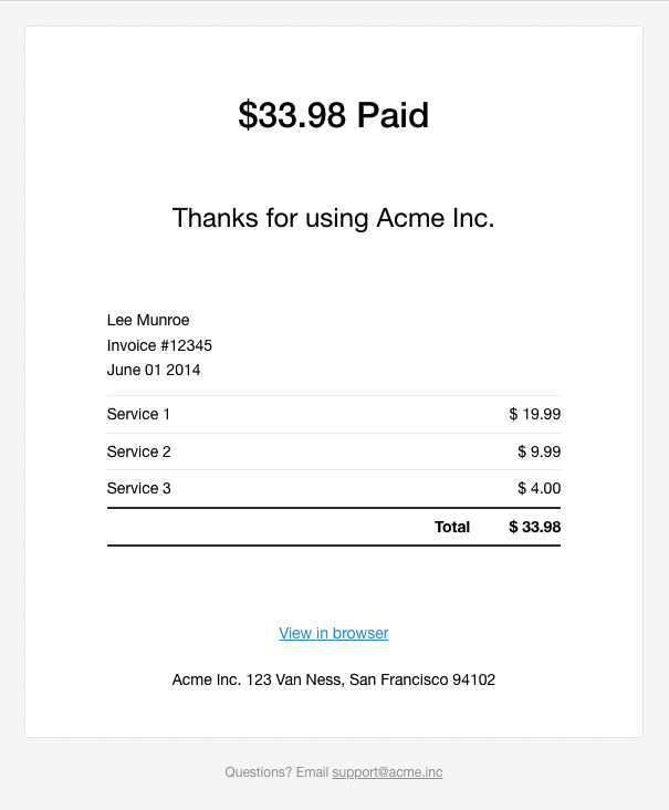
Then again, maybe that sort of simplicity is not your style. If you want to set your customer experience apart in the inbox, adding some flair to transactional email designs could make those everyday touchpoints more memorable.
Tips for creating simple HTML emails
- Limit the use of images and media: Don’t overdo it with your images. This will ensure quick loading times and reduce the risk of accessibility issues.
- Use web-safe fonts: Stick to standard fonts that are widely supported across email clients. Be aware that even Gmail doesn’t support all Google fonts. Learn more in our article on email safe fonts.
- Focus on clear, concise content: Keep your message straightforward and easy to read.
- Include a plain text alternative: There’s a very good chance your email service provider (ESP) already does this for you automatically. If not, consider providing a plain text version of your HTML email.
Some recipients may prefer plain text when they’ve got a slow internet connection or when email clients can’t render HTML properly. Allowing subscribers to view an email in their browser may also help with that problem.
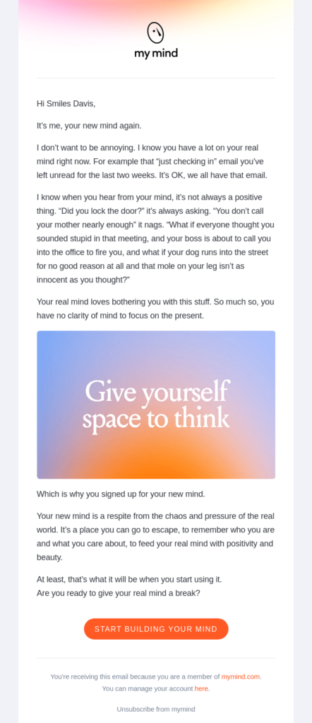
Here’s an email marketing example that showcases a simple HTML email design. There are a few design elements, including an image, button, and background. But its also formatted like a letter, which feels simple and personal.
What performs better?
Will an impressive interactive email get more people to click and convert? Not always. Even email geeks may prefer campaigns that keep it simple. That’s what Naomi West of the email coding platform, Parcel, found out when she tested different versions of her emails.
Check out the session below from our Sinch Email Camp: Mission Control archives to hear more from Naomi and Emily Ryan on the power of simplicity in email marketing. Find out why simplifying your emails can often improve performance.
Keep in mind… the fact that Naomi tested it first is key. The only way to really know how your list will respond and how different versions will perform is to A/B test and find out for yourself.
Even simple emails need to be tested
Even if you’ve kept your HTML email design simple, rendering issues can still occur. Different email clients can display HTML in varied ways, leading to potential problems with layout, fonts, or images. That’s why it’s crucial to test and preview your email campaigns before sending the to your subscribers. It’s the best way to see how your emails display in on hundreds of different clients and devices.
Sinch Email on Acid offers a comprehensive pre-send testing solution that allows marketers to preview their work in various inbox environments. This ensures that your message looks great and functions correctly, no matter where it’s viewed. With features like email previews, spam testing, and analytics, Sinch Email on Acid helps you deliver flawless emails that engage and convert.
By understanding the strengths and limitations of both HTML and plain text emails, you can make informed decisions that align with your marketing goals. Whether you’re aiming for high engagement, brand consistency, or simple, authentic communication, there’s a right choice for every campaign. And remember, always test your emails before hitting send to ensure the best possible experience for your everyone on your list.
