Email Marketing
Plain Text vs HTML Emails: What Works Best?
Is minimalism still in? Is it better to keep it simple, stupid? Or should you try to stun your subscribers with animated images and colors galore? Plain text versus HTML emails: which one should you use for your next email campaign?
When email marketers and developers look at an interactive email campaign with an eye-popping design, they may see a masterpiece. But the truth is, there are some people who look at emails like that and see nothing but slick marketing. And they don’t really trust it either.
So, what’s the right choice for your marketing strategy? Should you be sending plain text emails or are attractive HTML emails better at getting people to engage and convert?
First, let’s make sure we understand the technical differences between these two types of emails. Then, let’s discuss an approach that may give you and your list the best of both worlds.
What’s a plain text email?
Okay, this sounds a little self-explanatory, but bear with us. A plain text email is an email message that only includes text. There aren’t any images, graphics, columns, layouts, or formatting. Your reader’s email client renders the font as their default email font. Not to mention, hyperlinks aren’t hidden. Instead, they’re fully written out.
Here’s an example of a plain text version from one of our newsletters:

Looks pretty boring, right? But sometimes, boring isn’t a bad thing. Let’s take a detour to look at HTML emails before we unpack their differences and go through some pros and cons of both. Hang tight. We’ll show you where plain text emails shine!
What’s an HTML email?
While a plain text email keeps things minimal and, well, plain… HTML emails are the exact opposite… at least they certainly have the potential to be much more.
While there are limits to what you can do with HTML and CSS in email development, the big difference between the two is the use of any code at all. HTML emails will include elements like headings, different fonts, images, hyperlinks, buttons, animations, carousels, and even interactivity.
Take a look at this HTML version of an Email on Acid newsletter:
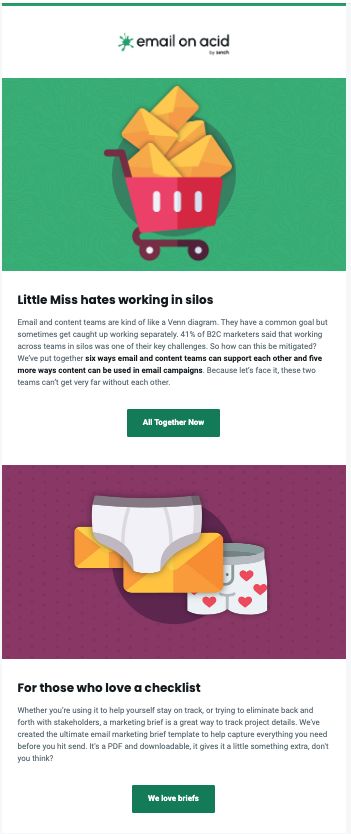
Less boring than the plain text version, right? But with great power comes great responsibility. When using HTML, you’ll have to focus on a new batch of issues, like making your emails accessible to all your readers and creating responsive designs to accommodate subscribers who open your emails on mobile devices.
Plus, the biggest challenge with creating HTML emails is inconsistent rendering among email clients. The HTML and CSS code that works in Apple Mail, may look different in Gmail, and horrible in Outlook inboxes. Truth be told that’s why an email testing and optimization platform like ours exists.
Plain text vs HTML emails: What are the differences?
Visual differences aside, what makes an HTML email better (or worse) than sending plain text messages to your subscribers?
Alright, brace yourself. This isn’t a plain text email:
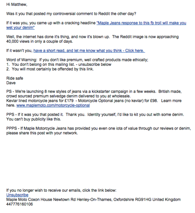
What? It’s nothing but text and links, right? Aha! But there are hyperlinks with anchor text in this message. That means there has to be some HTML code making it happen. In our original example of a plain text newsletter, the live links were all full URLs.
HTML emails aren’t just for marketing. If you composed an email in Gmail and you added an emoji, bolded some text, or included a hyperlink – it wasn’t plain text at all. Here are three key differences between plain text and HTML emails:
| HTML emails | Plain text emails | |
|---|---|---|
| Links | You can set the anchor text for hyperlinks. | The anchor text is the URL itself. |
| Columns and sections | You can design as many or as few columns and sections as you desire. HTML creates a great way to visually break up the text. | You can’t create columns or sections. But you can create spaces between lines of text – besides that, there’s no other way to create layouts. |
| Fonts and styling | Using HTML and CSS, you can specify font type, color, and size. Use font stacks for unsupported fonts. | Your text always renders with the email client’s default font. |
Let’s break things down a little further. What are some of the specific advantages or disadvantages of sending your list plain text emails as opposed to those with lots of design and functionality?
HTML email pros and cons
| HTML email advantages | HTML email challenges |
|---|---|
| Design flexibility: Code emails to be colorful, engaging, multimedia experiences. | Inconsistent email client support: Your email designs may not render as desired in some mailboxes. That means it won’t look or function as expected. |
| Exciting inbox experiences: Add personalization with dynamic content, graphics, variable mapping, and more. | Accessibility: Extra steps must be taken to make sure subscribers of all abilities can view and engage with HTML emails. |
| Performance tracking: HTML emails provide a lot of metrics to help marketers measure success | Mail Privacy Protection: New security features prevent tracking pixels from accurately reporting metrics such as email opens. |
Plain text email pros and cons
| Plain text email advantages | Plain text email challenges |
|---|---|
| Consistent display: You won’t need to test how plain text emails render. The only difference will be the email client’s default font. | Low engagement: It’s tough to convince people to read and click with nothing but boring text. |
| Look personal: These messages often look like simple emails from instead of fancy marketing. They are also accessible for people using screen reading software. | Lack of branding: Your emails won’t be able to include your brand’s logo or follow any of your preferred style guidelines. |
| Deliverability: Plain text emails are slightly less likely to be filtered into spam folders. | Lack of tracking: Without the ability to add tracking pixels or UTMs, you won’t get any info on open rates or other email metrics. |
Plain text vs HTML emails: Do I have to choose one?
Here’s the thing – you don’t really have to choose. HTML and plain text emails shine in different places, and they complement each other very well. So why not send both at the same time?
This is known as Multipurpose Internet Mail Extensions (MIME). Most email service providers (ESPs) can convert HTML to plain text so you can send both at the same time. Then, your reader’s email client can choose what version to place in your readers’ inboxes based on their specifications.
Minimalist email design: A happy medium
Guess what? There’s a way to get some of the best of both worlds. By that, we obviously mean you can send HTML emails that have the look and feel of a plain text email.
The beauty of HTML email design is you get to decide how much branding, imagery, color, and interactivity goes into it. As it turns out, anti-branding and minimalism are two very popular email design trends.
Minimalist graphic design techniques make use of clean lines, plenty of white space, and limited or monochromatic color palettes. Think of a minimalist email as being a plain text email with just a few essential flourishes. Anti-branding is a movement in which consumers try to avoid big, corporate brands. It’s a form of brand aversion, which is basically the opposite of brand loyalty. Here’s how Envato describes the anti-branding design trend:
The anti-branding trend often features monochromatic packaging, barely-there branding, and minimalist messaging…
With a minimalist email design, you can make the campaign feel more like a personal message. Here’s an example from Email on Acid. We asked our customers to take part in a survey.
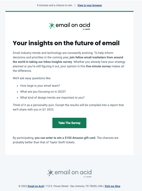
The email above definitely isn’t plain text only. It includes a logo, headings, a button, text formatting, and hyperlinks. So we obviously used HTML and CSS to build it. But when combined with the message, it feels less like pushy marketing. Instead, it has the more personal look and feel of a plain text email.
When to use minimalist email designs
There are some situations in which mimicking a plain text email could be a better approach than designing something flashy and complex. Let’s take a look at the types of emails in which minimalism could help maximize your results.
Sales outreach emails
We’ve all probably received a few emails from sales reps looking to set up a demo. They look personal, and they usually look fairly plain. But there’s a high likelihood they’re actually automated HTML emails.
Sales outreach emails, especially cold sales emails, need that personal angle. It’s more important to start an engaging, personal conversation than to wow them with your email design capabilities. For this reason, it’s probably better to use a minimalist design approach.
Important announcements
Sometimes, email is used for crisis management. If you have critical information to pass along to your list, you may not have time to develop an HTML email. And honestly, it may not be appropriate given the circumstances. When the COVID-19 pandemic began, the priority wasn’t having flashy emails, the goal was getting messages about safety and availability out to the public.
Still, a little bit of branding makes these kinds of emails look professional and makes it clear who they came from.
Transactional emails
Transactional emails, like order confirmations or password reset emails, can be plain text emails. You don’t really need to track these emails. Plus, it lowers the technical overhead of coding HTML email templates. Your readers are skimming these transactional emails for information, so it’s best to keep them short and to the point.
However, a little bit of design can boost brand recall and create a more memorable and even enjoyable email experience. Look at the way Nike designed this order confirmation email. Get more ideas for transactional email design.

You certainly can use minimalist email design for newsletters and promotions. However, if you’ve got a colorful brand, eye-catching products, or engaging imagery in your content, you might want to do something more than minimal. Plus, if you’ve got a talented email team, you’ll want them to get creative, build beautiful HTML emails, and push the envelope of what’s possible inside the inbox.
Ultimately, what works best comes down to what your target audience (or in this case your list) responds to. For example, the Sinch Email brands have different personas that respond better to certain things.
- Sinch Mailgun is for a technical audience including software engineers and IT professionals. We’ve found they respond better to messages and designs that are less pushy and flashy – more like plain text emails.
- Sinch Email on Acid tends to attract those who are serious about email development and want to try new things. So, we try to reflect some of that in our campaigns and newsletters.
- Sinch Mailjet has an audience that includes people from all sorts of marketing roles, including designers. So, they’re more likely to respond to an email in which it’s clear someone spent time considering design and strategy.
There may even be certain segments of your list that prefer one type of email design to another. But how do you know what works?
Take the time to test your emails
There are two types of testing that can help you understand your audience/subscribers and take your email program to the next level:
- A/B testing (aka split testing): Take two different elements or designs and test the performance of one option against the other. You could start by testing how an HTML email with a busier design performs compared to a plain version with a minimalist approach. Once you’ve got your answer, home in on specific design elements, like imagery and CTAs. Find out more about email A/B testing and get some rules for doing it right.
- Email pre-send testing: This kind of email testing is part of quality assurance. It ensures you send campaigns that render consistently across different clients and devices. It’s extremely important for all types of HTML emails and it supports A/B testing too. That’s because you’ll want to deliver a consistent design to get accurate results from a split test.
Email on Acid offers unlimited pre-send testing with all our plans. That means you can perfect your HTML email designs and put your best email forward without worrying about running out of previews.
