Email Marketing
Inbox Display: What it is and How it Increases ROI

Email Marketing

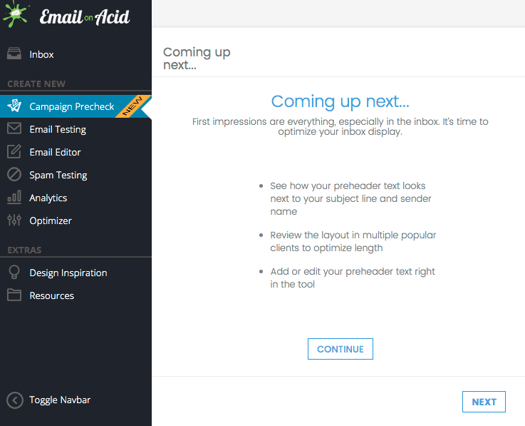
Allow us to introduce you to Email on Acid’s Inbox Display. You might know this step of the Campaign Precheck workflow as Preheader Text. We made this change because Inbox Display is a more inclusive and accurate description of this step.
First things first, let’s cover some particulars:
It is not.
An email envelope contains two addresses: the From: address (person) and the envelope sender (computers).
Think of it like a post office. When a piece of mail is delivered, it has the sender’s return address in the corner and postal markings from its transit. When a piece of mail is en route to an inaccurate address, the mail is then returned to the sender, or in email terms, bounced back. In this instance, the post office is the computer and the sender is, well, the sender.
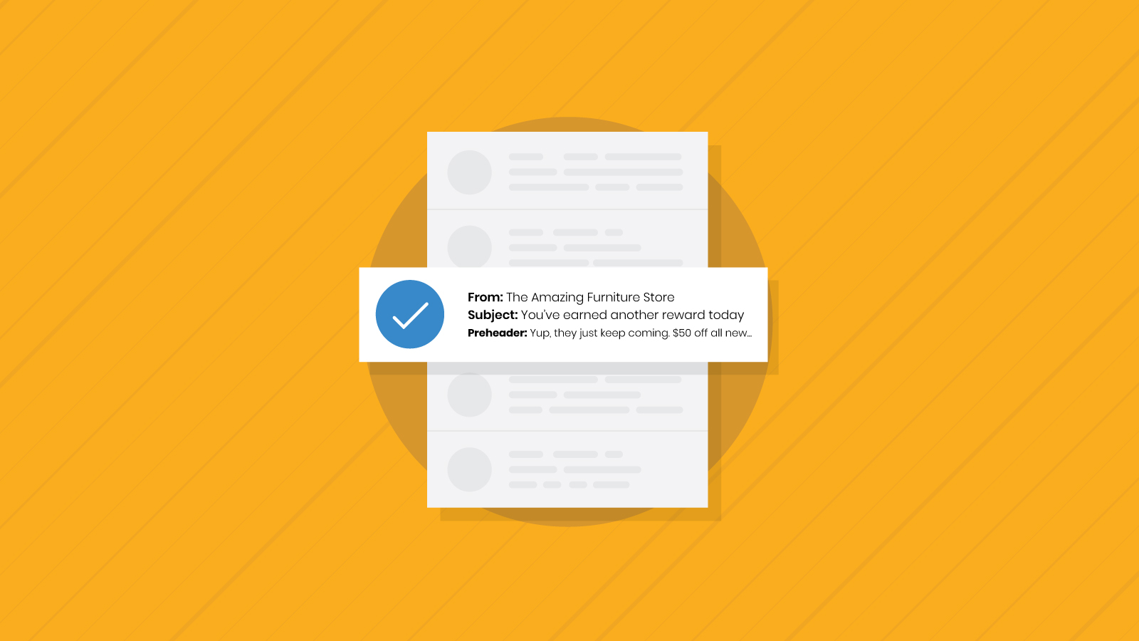
An inbox display is what your email looks like in a subscriber’s inbox before they even open it. It includes the sender name, subject line and preview text, and is your first and biggest opportunity to motivate the reader to open.

It is where you create your inbox display copy, but you also get to watch it come to life in the previews right next to it.
The previews include the same 90+ email clients and devices you’ve come to love and rely on. They allow you to see exactly where characters get cut off between devices and clients so you can optimize your message compelling the reader to open.

The details vary by niche and industry, but there are some high-level guidelines to keep in mind:
If there’s one thing email users look out for, it’s spammers and frauds. A little creativity is fine but be direct in letting your audience know who the message is coming from. Otherwise, they might mark it as spam.
If your message is good enough to email people about, then it’s certainly good enough to brag about in the inbox display. Use the subject line and preheader text to your full advantage and create a cohesive message that inspires, intrigues or entertains to the point where they just have to click (or tap).
Again, use the previews on the right—mobile, desktop and webmail—to polish it up so your message is effectively communicated no matter where someone might encounter it.
We see personalization a fair amount in email bodies, but less often in preheader text, which makes it one more way to stand out in the Unread folder.
It’s also impressive if you’re able to jump on a trending topic in a way that’s relevant for your brand in order to connect with subscribers and get them to open as well. Take this example from Uncubed, who joined in on the Chase tweet trend almost immediately:

The only drawback is that the inbox display wasn’t optimized for all devices. On desktop it pulls in social platforms from the footer:

Emails face obstacles left and right to get to their destination: spam filters, security, accessibility, etc. Once a message finally hits the inbox, the only part left is getting the reader to actually open it. This is the one element of the whole delivery process you can actually control.
Having an impactful inbox display can increase email open rates and therefore engagement and ROI.
This is the first step of Campaign Precheck and the entire Email on Acid workflow because it’s one of the most overlooked parts of an email but also arguably the most important.
Follow these guidelines and you’re already ahead of the game of motivating additional opens.
While you can use our email readiness platform in a variety of ways, we’ve designed the optimal predeployment checklist with Campaign Precheck. It streamlines and simplifies the entire pre-send process for efficiency and accuracy. Log in now to start using Campaign Precheck. Or, sign up for your free trial today!
Author: Melissa Berdine
When you visit any website, it may store or retrieve information on your browser, mostly in the form of cookies. This information might be about you, your preferences or your device and is mostly used to make the site work as you expect it to. The information does not usually directly identify you, but it can give you a more personalized web experience. Because we respect your right to privacy, you can choose not to allow some types of cookies. Click on the different category headings to find out more and change our default settings. However, blocking some types of cookies may impact your experience of the site and the services we are able to offer.
Cookie Statement
These cookies are necessary for the website to function and cannot be switched off in our systems. They are usually only set in response to actions made by you which amount to a request for services, such as setting your privacy preferences, logging in or filling in forms. You can set your browser to block or alert you about these cookies, but some parts of the site will not then work.
These cookies do not store any personally identifiable information.
Cookie details
| Cookie Subgroup | Cookies | Cookies used |
|---|---|---|
| eu5.mm.sdi.sinch.com | ASP.NET_SessionId | First Party |
| community.sinch.com | AWSALB , LiSESSIONID | First Party |
| appengage.sinch.com | dd_cookie_test_ | First Party |
| tickets.sinch.com | atlassian.xsrf.token , JSESSIONID | First Party |
| cockpit2.sinch.com | SESSION | First Party |
| engage.sinch.com | instapage-variant-xxxxxxxx | First Party |
| dashboard.sinch.com | cookietest | First Party |
| brand.sinch.com | PHPSESSID , AWSALBCORS | First Party |
| sinch.com | __cf_bm , OptanonConsent , TEST_AMCV_COOKIE_WRITE , OptanonAlertBoxClosed , onesaasCookieSettings, QueryString, functional-cookies, performance-cookies, targeting-cookies, social-cookies lastExternalReferrer, lastExternalReferrertime, cookies, receive-cookie-deprecation _gdvisitor, _gd_session, _gcl_au, _fbp, _an_uid, _utm_zzses, lpv | First Party |
| mediabrief.com | __cf_bm | Third Party |
| recaptcha.net | _GRECAPTCHA | Third Party |
| cision.com | __cf_bm | Third Party |
| techtarget.com | __cf_bm | Third Party |
These cookies allow us to count visits and traffic sources so we can measure and improve the performance of our site. They help us to know which pages are the most and least popular and see how visitors move around the site. All information these cookies collect is aggregated and therefore anonymous.
If you do not allow these cookies we will not know when you have visited our site, and will not be able to monitor its performance.
Cookie details
| Cookie Subgroup | Cookies | Cookies used |
|---|---|---|
| community.sinch.com | ValueSurveyVisitorCount | First Party |
| buzz.sinch.com | instap-spid.8069 , instap-spses.8069 | First Party |
| appengage.sinch.com | _dd_s | First Party |
| sinch.com | AMP_TLDTEST , rl_page_init_referrer , rl_trait , _vis_opt_s , __q_state_dp56h9oqwhna9CoL , cb_user_id , __hstc , rl_anonymous_id , rl_user_id , initialTrafficSource , _vwo_uuid , _vwo_uuid_v2 , rl_page_init_referring_domain , _hjIncludedInSessionSample_xxx , apt.uid , __hssrc , test_rudder_cookie , cb%3Atest , __hssc , rl_group_trait , _hjAbsoluteSessionInProgress , _vwo_referrer , _vwo_sn , _vis_opt_test_cookie , _hjFirstSeen , _hjTLDTest , _hjSession_xxxxxx , s_sq , _vwo_ds , rl_group_id , _vis_opt_exp_n_combi , s_cc , _gclxxxx , cb_anonymous_id , cb_group_id , apt.sid , rl_session , _uetvid , AMP_899c7e29a9 , _hjSessionUser_xxxxxx | First Party |
| brand.sinch.com | AMP_TEST | First Party |
| engage.sinch.com | no-cache , instap-spses.85bb , instap-spid.85bb | First Party |
| www.sinch.com | d-a8e6 , s-9da4 | First Party |
| nr-data.net | JSESSIONID | Third Party |
| sinch-en.newsroom.cision.com | _ga, _gid | Third Party |
| sinch.in | _ga_xxxxxxxxxx, _gat_UA-XXXXXX-X, _gid, _ga | Third Party |
| g.fastcdn.co | instap-spses.85bb | Third Party |
| hello.learn.mailjet.com | pardot, visitor_id, visitor_id##### | Third Party |
| www.googletagmanager.com | userId | Third Party |
| hello.learn.mailgun.com | visitor_id#####, visitor_id | Third Party |
| dev.visualwebsiteoptimizer.com | _vwo_ssm | Third Party |
| box.com | box_visitor_id | Third Party |
| app.box.com | z, cn | Third Party |
| sinch-tfn.paperform.co | laravel_session | Third Party |
| go.sinch.in | visitor_id#####, visitor_id | Third Party |
| Qualified | __q_local_form_debug | Third party |
| Rudderstack | rudder.inProgress, rudder.3156dd1f-7029-4600-ae54-baf147d9af20.queue, rudder.3156dd1f-7029-4600-ae54-baf147d9af20.ack, rudder.3156dd1f-7029-4600-ae54-baf147d9af20.reclaimStart, rudder.3156dd1f-7029-4600-ae54-baf147d9af20.reclaimEnd, | Third party |
| 6sense | _6senseCompanyDetauls, _6signalTTL | Third party |
| Appcues | apc_local_id, apc_user | Third party |
These cookies may be set through our site by our advertising partners. They may be used by those companies to build a profile of your interests and show you relevant adverts on other sites. They do not store directly personal information, but are based on uniquely identifying your browser and internet device.
If you do not allow these cookies, you will experience less targeted advertising.
Cookie details
| Cookie Subgroup | Cookies | Cookies used |
|---|---|---|
| investors.sinch.com | visitor_id | First Party |
| community.sinch.com | VISITOR_BEACON , LithiumVisitor | First Party |
| sinch.com | _uetsid , ajs_user_id , _gcl_aw , ajs_group_id , AMCV_ , __utmzzses , _fbp , _gcl_au , AMCVS_ | First Party |
| go.latam.sinch.com | visitor_id##### , pardot | First Party |
| linkedin.com | li_gc, bcookie, lidc, AnalyticsSyncHistory, UserMatchHistory, li_sugr | Third Party |
| pi.pardot.com | lpv151751, pardot | Third Party |
| hsforms.com | _cfuvid | Third Party |
| google.com | CONSENT | Third Party |
| sinch.in | _gclxxxx, _gcl_au | Third Party |
| www.linkedin.com | bscookie | Third Party |
| bing.com | MUID, MSPTC | Third Party |
| www.facebook.com | Third Party | |
| hello.learn.mailgun.com | pardot | Third Party |
| www.youtube.com | TESTCOOKIESENABLED | Third Party |
| dev.visualwebsiteoptimizer.com | uuid | Third Party |
| g2crowd.com | __cf_bm | Third Party |
| pardot.com | visitor_id#####, visitor_id | Third Party |
| tracking.g2crowd.com | _session_id | Third Party |
| hubspot.com | __cf_bm, _cfuvid | Third Party |
| doubleclick.net | test_cookie, IDE | Third Party |
| youtube.com | CONSENT, VISITOR_PRIVACY_METADATA, VISITOR_INFO1_LIVE | Third Party |
| go.sinch.in | pardot | Third Party |
| liadm.com | lidid | Third Party |
| www.google.com | _GRECAPTCHA | Third Party |
These cookies enable the website to provide enhanced functionality and personalisation. They may be set by us or by third party providers whose services we have added to our pages. If you do not allow these cookies, then some or all of these services may not function properly.
Cookie details
| Cookie Subgroup | Cookies | Cookies used |
|---|---|---|
| portal.sinch.com | pnctest | First Party |
| partner.appengage.sinch.com | _dd_s | First Party |
| investors.sinch.com | First Party | |
| community.sinch.com | LithiumUserInfo , LithiumUserSecure | First Party |
| tickets.sinch.com | selectedidp | First Party |
| engage.sinch.com | ln_or | First Party |
| cockpit2.sinch.com | CSRF-TOKEN , NG_TRANSLATE_LANG_KEY | First Party |
| sinch.com | apt.temp-xxxxxxxxxxxxxxxxxx , hubspotutk , ajs%3Acookies , cf_clearance , ajs%3Atest , __tld__ , __q_domainTest , pfjs%3Acookies , ajs_anonymous_id | First Party |
| auth.appengage.sinch.com | AUTH_SESSION_ID , KEYCLOAK_3P_COOKIE , KEYCLOAK_3P_COOKIE_SAMESITE , KC_RESTART , AUTH_SESSION_ID_LEGACY | First Party |
| www.recaptcha.net | _GRECAPTCHA | Third Party |
| boxcdn.net | __cf_bm | Third Party |
| d2oeshgsx64tgz.cloudfront.net | cookietest | Third Party |
| sinch-np.paperform.co | XSRF-TOKEN, laravel_session | Third Party |
| vimeo.com | __cf_bm, vuid | Third Party |
| sinch-ca-sc.paperform.co | XSRF-TOKEN, laravel_session | Third Party |
| box.com | site_preference | Third Party |
| app.box.com | bv | Third Party |
| sinch-tfn.paperform.co | XSRF-TOKEN | Third Party |
| cision.com | cf_clearance | Third Party |
These cookies are set by a range of social media services that we have added to the site to enable you to share our content with your friends and networks. They are capable of tracking your browser across other sites and building up a profile of your interests. This may impact the content and messages you see on other websites you visit. If you do not allow these cookies you may not be able to use or see these sharing tools.
Cookie details
| Cookie Subgroup | Cookies | Cookies used |
|---|---|---|
| community.sinch.com | ln_or | First Party |
| sinch.in | _fbp | Third Party |
| youtube-nocookie.com | CONSENT | Third Party |
| youtube.com | YSC | Third Party |