Email Marketing
Abandoned Cart Email Strategies and Examples
Email Marketing

When an online shopper gets so close to the finish line, only to leave their merchandise behind? That’s just the worst. But it’s also where automated emails can save the day.
Abandoning items in an online shopping cart is very common ecommerce behavior. The average cart abandonment rate is more than 70% across all devices and even higher on mobile. That means for every 10 shoppers who click “purchase,” only three actually complete the transaction.
Enter: The abandoned cart email.
This email workhorse reminds shoppers they have unfinished business and hopefully encourages them to return and complete the transaction. Done right, abandoned cart emails can help save some of the billions of dollars in lost revenue left behind every year. Here are our top abandoned cart email strategies you can implement for your business:
First, a quick explanation: Abandoned cart emails work by automatically sending a reminder to site visitors who’ve added items to a shopping cart but leave your website without making a purchase.
It’s not just for online retailers and B2C brands either. Abandoned cart emails can work for Software as a Service (SaaS) companies too. For example, the same idea can be applied to online account creation. When a new user fails to complete the process of filling out a profile or signing up for a trial, automated reminders bring them back.
Of course, you will need the shopper’s email address for this to work. That means they’d need to be logged in or they’ve entered contact information somewhere during the process of visiting your website.
According to statistics from the ecommerce personalization platform, Bariliance, abandoned cart emails see open rates as high as 49%. So, nearly half of those messages get opened. The average click rate is close to 9% and the typical conversion rate (meaning a recovered transaction) is around 8%.
Abandoned cart emails are usually triggered through an integration with an ecommerce platform. As such, they can be considered transactional emails. This distinction is important, because privacy laws such as the GPDR prohibit companies from sending unsolicited marketing emails to people who haven’t opted-in to receive them.
Because adding items to a cart implies legitimate interest, an abandoned cart message may be viewed as a helpful, transactional reminder. However, you should make sure that abandoned cart emails…
Keep in mind, if you’re adding a bunch of upsells and promotions in abandoned cart emails, it’s possible they could be considered marketing emails that are not primarily transactional. So, stick to the purpose of reminding – not selling.
How you put together an abandoned cart email, including timing and dynamic content, depends on your ecommerce platform. But your overall message should tug on the why behind a shopper abandoning their cart in the first place.
Can you imagine what it would look like at a grocery store if people abandoned their carts at the same rate as they do online? Absolute anarchy. Shoppers leave ecommerce merchandise behind for a variety of reasons.
The top reason according to research from Baymard Institute? Unexpected costs, such as shipping, taxes, or other hidden fees. In fact, most of the reasons people abandon their carts come from speedbumps in the check-out flow, like creating an account, adding credit card information, or a process that feels too complex.

Reading between the lines, it’s all about reducing friction and establishing trust. That means putting your pricing and promos up front, giving them a way to calculate shipping without having to add everything to their cart, and offering guest checkout options (and assuring them that you won’t store their credit card info, as an example). Then, when the abandoned cart email arrives in their inboxes, they’ll be that much more likely to convert.
As an email marketer, it may not be your responsibility to determine how the registration or checkout process works. And it’s probably not up to you what’s be charged for shipping.
However, when it’s time to convince reluctant shoppers to return to their cart and hit the “Order Now” button, it’s your time to shine. Here are a few tried-and-true ideas for an abandoned cart email strategy:
Most people abandon their cart because it costs more than they expected. You can remedy this issue by chipping away a bit at the price tag. Offering a small discount can address that price sensitivity, or you can offer more value-add promotions, such as free or discounted shipping or a free gift with purchase.
But remember, you may be dancing on a precarious line between transactional communication and marketing. So, watch your step and don’t go overboard.
When you send your abandoned cart email matters. You don’t want to send so quickly that you’re bombarding their inbox because they’ve stepped away for a normal, everyday reason, like making dinner, meeting a friend, or picking up kids from school.
Instead, find the right sweet spot with multiple emails over the course of the next week. Research from Klaviyo found that an abandoned cart series with three emails generated more than 6x the revenue compared to companies that sent only one email.
Separate research from SalesCycle suggests some online shopper may simply be waiting for their next paycheck to compete a purchase. That’s another reason why waiting a week or so to send one final reminder could be what’s needed.
Social proof, also known as informational social influence, is a psychological phenomenon that occurs when an individual looks to other people’s actions to determine what decision they should make. If a shopper isn’t sure about their purchase, showing how great it is for others can be the psychological nudge they need.
Sure, you could have an incredible offer (product, service, etc.), but you need people singing your praises to convince others. Think about including:
As an increasingly social culture, people want to feel validated by knowing that others find value in the product or service they are considering. Ease their minds and build trust in your brand with social proof.
“First name” is just the beginning for abandoned cart campaigns. 66% of customers expect companies to understand their needs and expectations. Most of the time when you send out email campaigns promoting certain items, you’re just making a guess at what a shopper will like (or real talk, what you need to move.)
But this is such a gift – they’ve literally just told you exactly what they want! Don’t waste it. Include that information directly in your email imagery and copy.
What differentiates an abandoned cart campaign from a regular promotion is that your shoppers already found something that catches their eye. You just have to be that friend that says, “No, you have to get it!”
Think back to the reasons shoppers abandon in the first place. It often comes from a lack of trust. While you can (and should) encourage a sense of FOMO, scarcity, or sense of urgency in your copy, make sure to reiterate why someone should purchase your product in the first place. What’s so great about it? Use your campaign to remind your shopper why they put it in their cart—and why they should finish what they started.
As evidenced from those impressive email open rates we mentioned earlier, shoppers really respond to abandoned cart campaigns. Part of what makes abandoned cart emails so enticing in the inbox is an effective subject line.
Clarity is important here. With only a few words, you want to convey to a shopper not just that they left an item behind but that they should actually purchase it. No pressure, right? But a great abandoned cart email subject line doesn’t have to be serious.
A few ideas from our inboxes…
These playful subject lines use emojis to stand out in the inbox.
Other subject lines can stroke the ego of the shopper.
While these subject lines emphasize urgency and the fact that items usually sell out.
You can offer an incentive up front, like these subject lines.
Or, you can take a friendlier approach to build trust.
If you’re selling technical products or anything that requires careful consideration before making a purchase, reach out with an offer to help.
Subject lines can make or break your open rates, so it’s a good idea to test them before committing to one approach. Do a few rounds of A/B testing to determine which subject line is the winner – or alternate approaches if you choose to run a longer email flow.
Yet another important element of cart abandonment emails is the call to action (CTA). While those open rates are impressive, the only thing that really matters is if your message helps you close the deal.
What you choose to use on the button copy that brings customers back to their cart could make or break your efforts. Your button copy isn’t asking the recipient to pay up just yet. It’s simply asking them to reconsider. As you could see with the subject line copy for abandoned cart emails, the tone you strike with subscribers matters.
You’re not being pushy. You’re offering a friendly reminder. That’s why CTAs like this work well in cart abandonment emails.
When adding words like “you” and “your” in the CTA button copy, it creates a sense that the recipient already owns the stuff they left in their cart. They picked it. It belongs to them. It’s just waiting for the last step.
Abandoned cart emails are a great place to get creative with CTA button copy. If there’s any element worth split testing – this is it.
Need a little more inspiration? Wondering how to design your abandoned cart email series? Check out these email campaigns from brand that get it:
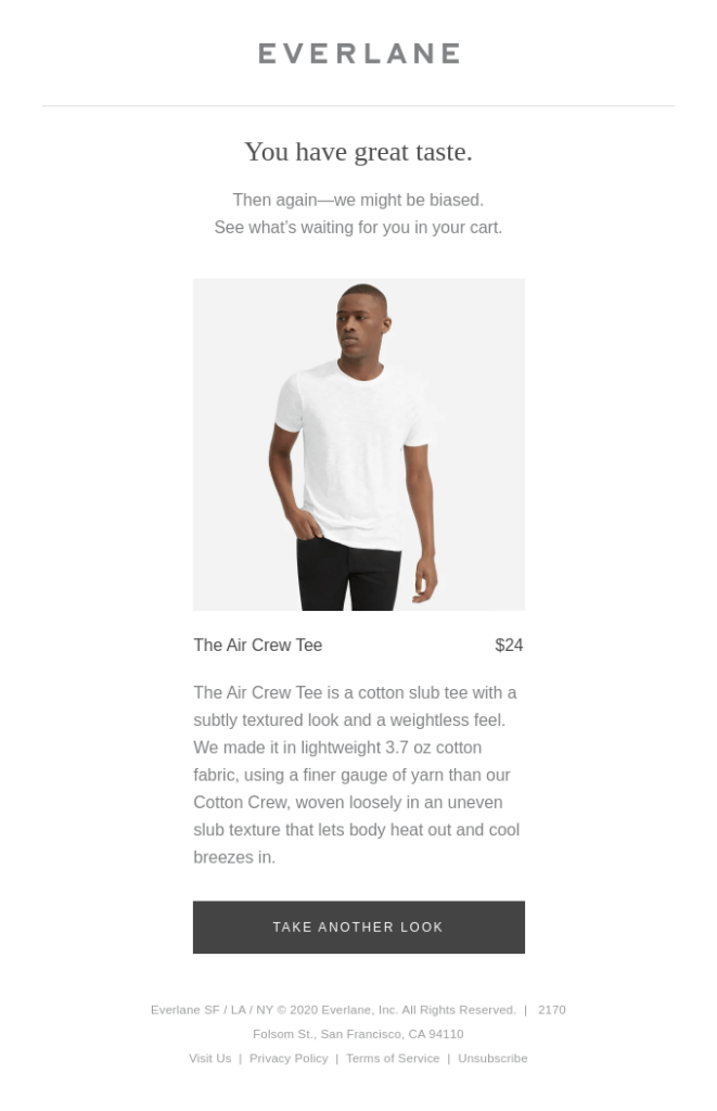
This campaign from Everlane is simple, using dynamic content to pull in a specific cart item and including a sense of urgency to purchase now.
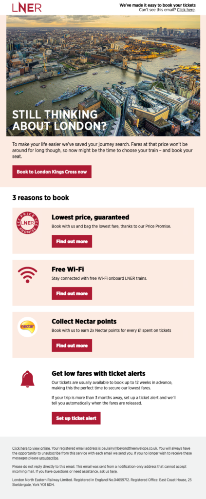
This campaign hits all the right notes by addressing the key value points for booking a trip. By reminding customers exactly why making a purchase (in this case, of train tickets) makes their lives easier and better, you’re much more likely to see them return to your site. Even better, this email keeps it short and snappy, outlining just three key reasons, with an easy CTA to book.
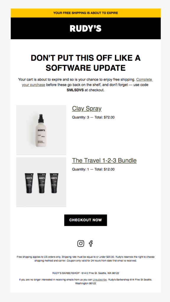
This email leans on a sense of urgency by reminding shoppers that their free shipping will expire if they don’t purchase within a set period of time. Bonus points for the chuckle-inducing line about software updates.
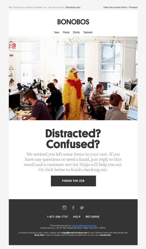
Sometimes there’s no real reason shoppers abandon their cart. They might just get distracted—this email does a great job playing on that idea with copy and imagery that draw some laughs.

If there’s ever a time to include an incentive in your email campaign, it’s with an abandoned cart. Huckberry does this with free shipping—incidentally, one of the top extra costs that shoppers cite as the reason they abandon items in the first place.
Sending abandoned cart emails is part of the overall customer experience. Your message has the potential to make a personal connection with online shoppers, turning browsers into loyal customers. This communication can be a crucial step in the customer journey. So you’ve got to make sure you deliver your best.
When unsightly or broken abandoned cart emails show up thanks to challenges like client rendering inconsistencies, it reflects poorly on your brand and the online shopping experience you offer. Thankfully, Sinch Email on Acid lets you test and preview these messages so you can be sure they look and function as expected.
From checking accessibility and deliverability to validating URLs and more, our pre-send testing platform streamlines the email quality assurance process with an automated workflow. That includes email previews from 100+ clients and devices. With unlimited email testing on all paid plans, you can perfect your abandoned cart emails so they’ll do the job no matter what kind of email inbox they land in.