Email Marketing
Funny Email Examples that Prove Humor is a Winning Marketing Tactic

Email Marketing

Here’s a silly marketing joke for you:
Q: What is a pirate’s favorite marketing tactic?
A: A webinAAARRRR!
(Go ahead, Slack it to your events manager. We’ll wait.)
Funny emails can be risky because humor doesn’t always translate the way the writer intends. If you send that joke out to your email list, and you sell clothing, fitness coaching, pet products, or any number of products and services that aren’t marketing, you’ll get a lot of confused reactions. But to a bunch of marketers? Guffaws.
So, can we use humor strategically in email marketing? Or is it just a waste of time?
National Speakers Association Hall of Fame member Karyn Buxman doesn’t think so. She has charted a career as a self-proclaimed “neurohumorist.”
Do you want your customers to trust you? Humor may help. Buxman studies humor intensively. She’s found that humor builds trust, in part because it increases positive brain activity. As Buxman put it in one of her live presentations, there are two kinds of people in the world:
“Those who bring joy to the room, and those who bring joy when they leave.”
Humor helps your marketing stand out. It gets more attention. It helps create a deeper and more loyal connection with your audience. And also, work is hard enough — why not make it fun? Here’s how you can use humor in your emails the right way with some knee-slapping funny email examples:
When you’re aiming for the funny bone, timing matters, audience matters, and of course, having a sense of humor matters, too. Let’s look at some specific ways you can inject humor into your email marketing.
The subject line is where you capture attention, so it’s arguably the best place to use humor. Really Good Emails definitely did that with a subject line that pushed the envelope and made us all do a double-take.
Subject line: I shipped my pants
It’s hard not to chuckle at a well-placed pun like this one. Now, the content of the email covered shipping and order confirmation messages. So, it wasn’t just for the shock factor. But it certainly does stand out from others in the inbox.
Massachusetts-based oyster farm and restaurant Island Creek Oysters often cracks jokes and puns in their weekly newsletter. This subject line, timed with an upcoming Nor’easter, plays on the storm essentials that sell out whenever a storm is in the forecast:

Humor in subject lines could also be a tool to boost your email open rates. Save the punchline for the inside of your message to entice your subscribers to open.
Subject line: Why do melons always have weddings?
Open to reveal: Because they cantaloupe!
Even if it’s a groaner of a dad joke like that, you spark a sense of curiosity in the subscriber. They have to see the punchline for themself. Just make sure you win them over after you get the open.
Get rid of “Submit.” Abandon “Learn more.” Ditch “Buy now.”
Creative email call-to-action (CTA) buttons are a great place to put some personality into your marketing. Plus, it’s more fun to click on a button that has a funny message — as long as the subscriber still understands where the button will take them. CTA buttons don’t need to be “ha ha” funny for them to stand out.
Phrasee gets a little edgy with language and uses a pop culture reference in its CTA button, which encourages subscribers to book a demo: “Book me, Danno.”

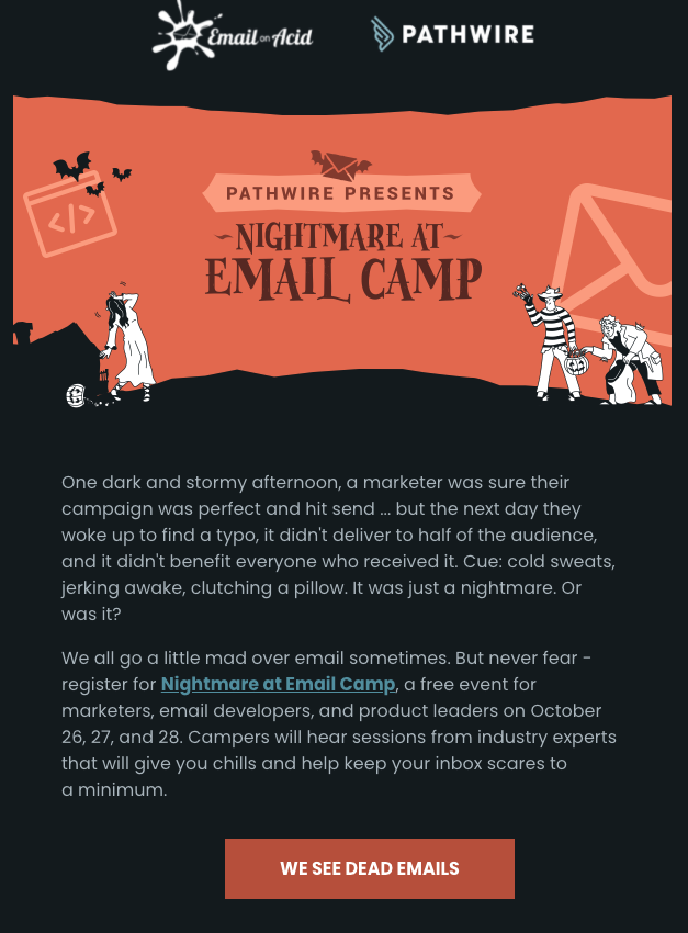
When Email on Acid promoted Pathwire’s Nightmare at Email Camp event, we used a little humorous storytelling in the copy and closed it out with a funny CTA that harkens back to a popular movie line — “we see dead emails.”
And sassy sauce brand Fly by Jing always uses creative CTAs for their promotional emails. This one has two to promote their newest dumpling line. Instead of a classic “shop now,” they keep the in-your-face design and branding with loud CTAs that say, “Feed me dumps” and “Dumpling lover for life.”

You can try to talk yourself out of it all you want, but in the end, it’s inescapable: A good pun is funny. We all groan at them, but deep down, we secretly like them.
This email from Paperless Post invites subscribers to “stop and smell the rosé” instead of “roses” for this seasonal email:

JetBlue recently added a new route to Amsterdam. Rather than a regular announcement email, they used the subject line, “Look where we’re Gogh-ing next,” filling the email with Amsterdam-related wordplay like “Hot ‘dam,” and “overseas the day.”

Creating puns that fit with your products and services, that your subscribers will instantly understand, is a surefire way to lighten someone’s day and deepen your audience connection. It can be as simple or as silly as you’d like.
Like good product-related puns, you can also use inside jokes that only your audience will get to further strengthen the trust within your community. For B2B email marketing, industry humor fits into this category. So would exercise jokes for a fitness email list, or video game jokes on a gamer list.
Turning viral memes into an industry- or company-specific joke is a great way to insert a little relatable, industry humor into email marketing. For example, you could throw a meme like this into an email targeting dental practices:

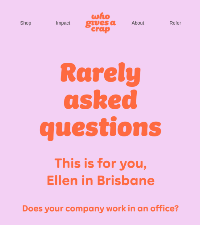
It doesn’t need to revolve around your industry to be funny. This email takes the standard “Frequently asked questions” email and flips it on its head, saying, “This is for you, Ellen from Brisbane.”
Sometimes, the right design can take traditional copy and make it more playful. Like many welcome emails, this one from British Tennis starts with, “You’re in!” What makes it funny is that it’s accompanied by an image of a tennis shot that’s landed just inside the lines — something that will make tennis lovers (their target audience) smile.

Sometimes, all you need to make someone laugh is a great photo, graphic, or meme. Here’s a funny email example from Olive Garden. The ridiculous amount of scrolling required to get to the email’s offer is clever and probably gave a few hungry subscribers a laugh.

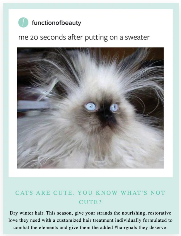
Here’s another one from Function of Beauty that uses a funny cat picture. As long as it relates in any way to your email’s content, you can’t really go wrong with a silly animal-related image.
Again, in comedy, timing is everything. The same goes with email marketing. Depending on your brand’s personality, you can add humor into plenty of types of emails. Here are eight situations where humor can make a great impression:
If you have a quirky or silly brand, a little humor in your welcome email can help set the tone for your subscriber relationship. This is a great spot to be more casual and inviting in your copywriting and design. After all, this is the very first email a subscriber will receive from you, so it’s a blank slate.
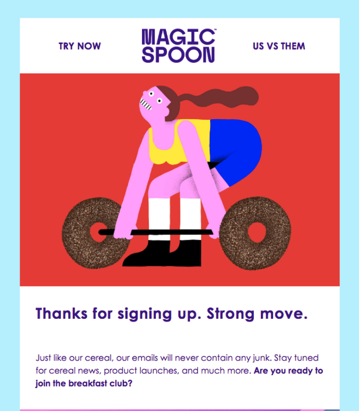
Here’s an example of a funny welcome email from Magic Spoon. People buying cereal online aren’t expecting 400 words from a welcome email. Magic Spoon keeps it brief, throws in a good pun that also reminds them of a core product benefit, and uses other fun and upbeat language.
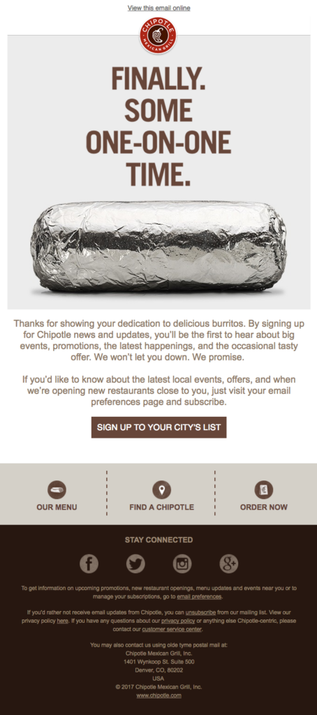
This email from Chipotle, that came with the subject line “The best tasting email you’ll receive,” is another example of a lighthearted but clear welcome email. Like most welcome emails, they include a thank you and a promise of what kinds of emails the subscriber is likely to receive. This one was for a Chipotle rewards program.
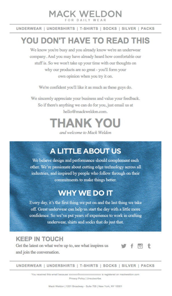
Underwear brand Mack Weldon uses a great mix of humor and sincerity. They start with a sarcastic, “You don’t have to read this,” which naturally makes you want to keep reading, and finishes with a sincere thank you for subscribing and supporting their business.
Take a look at our free email templates if you’re looking for more welcome email inspiration.
If you’ve sent out an email with a typo, incorrect link, or other oops, it’s an ideal time to poke fun at your brand and make it the butt of the joke. (Of course, these rarely happen to Email on Acid users 😉)
This is where you can pull out self-deprecating humor that makes you seem more relatable and trustworthy because it shows you’re willing to laugh at yourself. Rather than pretend a mistake didn’t happen, generally, it’s best to send a correction — especially if you’re fixing an incorrect link or another minor issue. Just be sure you don’t downplay mistakes that frustrate customers.
When MeUndies’ website went down after a line of Star Wars briefs went viral, they took the opportunity to make fun of themselves and crack a few Star Wars jokes.
Subject line: The Death Star crashed our site … but we fixed it
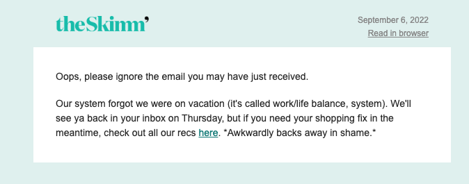
This apology email from theSkimm is super quick and to the point, and has a self-deprecating tone that matches their “hey, bestie” branding.
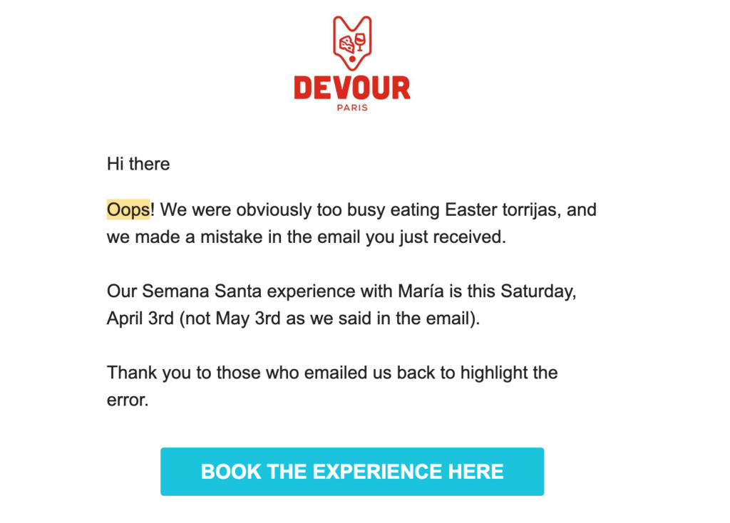
When you make a mistake in an email, it’s not the end of the world, even if it feels like it. In fact, apology emails tend to get more engagement than regular emails (chalk that one up to schadenfreude.) This apology email from tour company Devour Paris makes a lighthearted joke about their mistake and reiterates the correct dates quickly and clearly.
Remember, email marketing needs to stand out. Abandoned cart emails need to do this more than almost anything because a completed sale is still within your grasp. This is your last chance to convince a customer to make a purchase. Humor can be the element that tips someone from saying, “Nah, I don’t need it,” to “You know what, I do want this.”
So, find a way to make this email a little more creative. Here’s one from Food52 that makes use of a popular joke format on social media and humanizes the online cart.
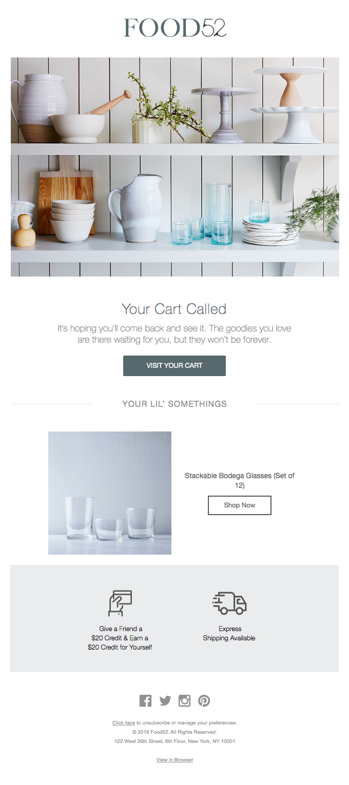
And another one that makes light of the subscriber procrastinating on making a purchase.
Casper, the mattress company, brings in a relevant joke for this abandoned cart email.
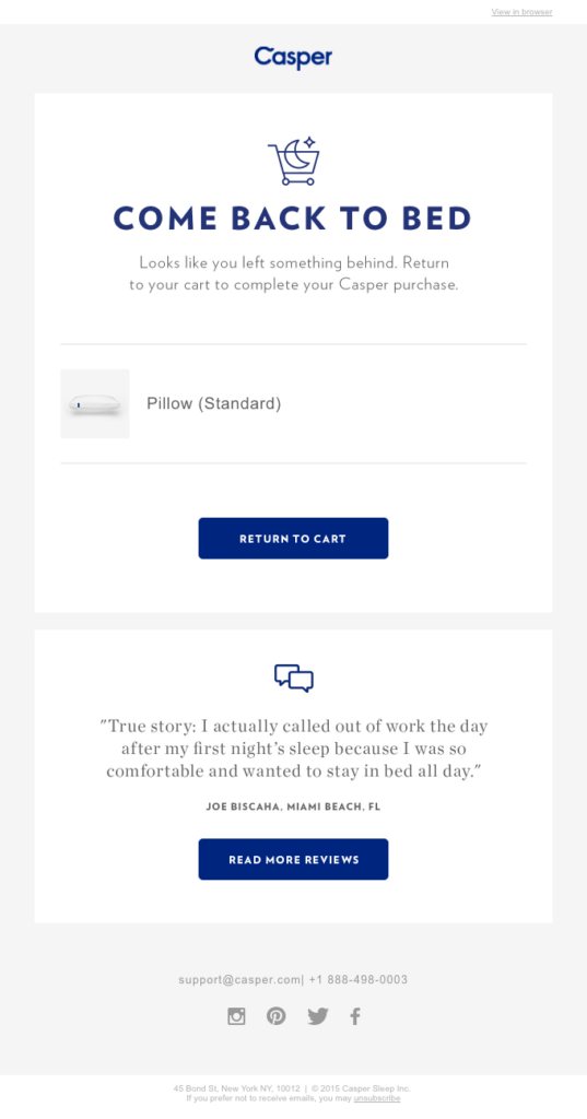
Recognizing someone’s birthday, for certain types of businesses, shows you pay attention to your subscribers and want them to keep coming back. Customer anniversary emails do the same and are a great chance to show your appreciation and maybe even give out loyalty rewards. These emails can always be enhanced with a dash of humor.
Wemo’s simple but lighthearted play on words keeps the good vibes flowing. It’s not over-the-top hilarious, but the combination of thoughtfulness and positivity serves as a way to strengthen customer relationships without feeling salesy.
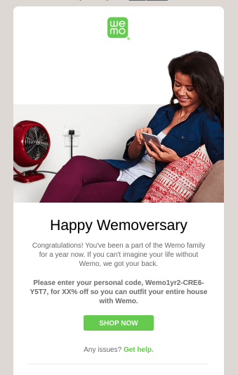
Outdoor Voices offers a gift not just for birthdays but for half-birthdays with a discount delivered in a silly and sweet way. No one expects a half-birthday gift, which makes this a great opportunity for that coveted “surprise and delight” moment.

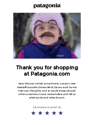
You want customers to be in a really good mood before you ask them to leave a review on a recent purchase, right? What better way than making them laugh?
Patagonia does it quite well with nothing but a little girl and a funny-looking mustache! Sometimes, you don’t need to overthink adding humor. If an image like this makes you laugh, it might make your subscribers laugh, too.
Cards Against Humanity is a gold standard for hilarious product updates in ecommerce. Often timed around Black Friday, they frequently release products that don’t exist, or ones designed to elicit a laugh. This one satirizes Scandinavian minimalism:

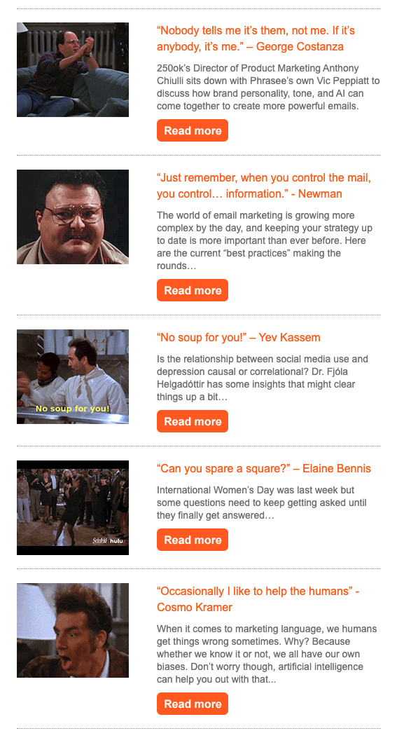
When humor is at the core of a brand’s voice, funny email newsletters are the perfect time to put it on display. The award-winning and often hilarious newsletter from Phrasee consistently delivers (they’ve got jokes). Here’s a sample from a 2019 email that’s chock full of Seinfeld references and GIFs.
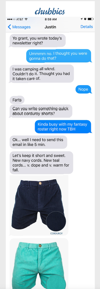
This email from Chubbies is all one text thread between two hypothetical office workers about sending this week’s newsletter. It’s a very relatable and funny read for anyone in email marketing, but still gets the point across about their new corduroy shorts.
Remember that with humor, you don’t want the jokes to be so funny that subscribers remember the jokes but forget the company or the deal that was offered. This is a major failure of many Super Bowl commercials. Don’t sacrifice clarity for comedy, especially in a newsletter promoting upcoming discounts, new products, or otherwise serves the bottom of the funnel.
Here again, getting attention is key. This is your attempt to re-engage subscribers who haven’t opened any emails for an extended period of time. Be funny, and you’re more likely to catch them.
Here’s a great reactivation email sent out around Halloween, from Blue Apron. The image is funny, and the copy adheres to the same theme and offers a discount for coming back.
Subject line: Forget the candy, this deal is the sweetest one yet!

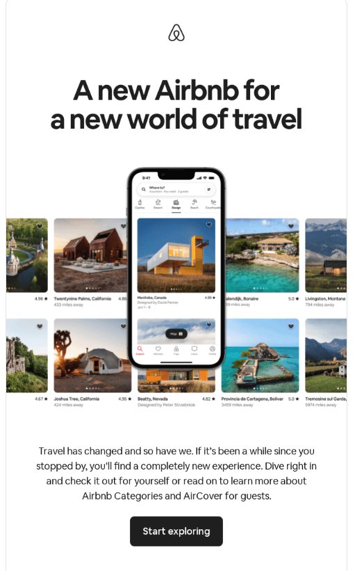
This re-engagement email from Airbnb, reintroduces the brand and pulls you right in from the subject line:
Subject line: What’s new? Oh, only everything.
For discounts and promotional emails, it’s always good to have a “reason” for it. If you can use some humor to explain that reason, all the better. Sales emails don’t have to be boring!
Here’s an example of this from Everlane. There’s a little bit of sarcasm in this email promoting a sale on summer denim shorts.
Subject line: Your butt has summer plans

Sarcasm can be misread if you don’t do it well, especially in writing. So use it sparingly and test the email on a few coworkers to make sure it’s coming across clearly. Or better yet, use the sarcasm emoji: 🙃
When you use something like sarcasm, don’t be afraid to call it out or make it more clear with a rolled eyes emoji, a line about reverse psychology, or even a parenthetical clarifying that you’re being sarcastic.
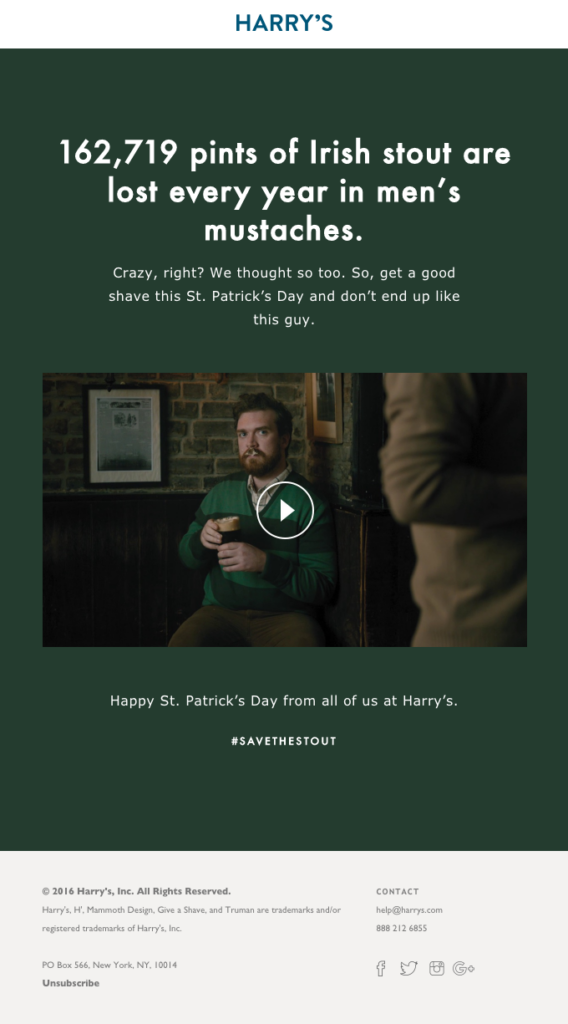
This St. Patrick’s Day themed email from Harry’s embeds a funny video as the anchor for their campaign advertising shaving ahead of St. Patrick’s Day festivities. The email leads with what sounds like something serious about food waste…until it devolves into a joke about mustaches:
While humor can be a great way to build a relationship with your subscriber, stand out in the inbox, and bring a little joy to people’s days, there are a few instances for your email campaigns when adding humor doesn’t make sense. Generally, you should avoid using humor in these and similar situations:
In these situations, subscribers just want emails to be sincere, honest, and to the point. And if a customer is frustrated, the last thing they want is for you to make light of it, which humor tends to do. They don’t want to laugh. They want solutions.
Similarly, it shouldn’t need to be said, but it’s never okay to make a joke at the expense of a particular group of people. There’s absolutely no use case where a joke about race, gender, sexuality, or disability will be funny — and if anything, it will cause you to lose subscribers and damage your brand’s reputation. If you’re not sure if a particular joke might be offensive, it’s probably best to leave it out.
That said, humor can be a great tool for your brand. Done right, humor is usually worth the risk, because it gets attention, builds trust, and deepens connection. Start small. Try out a few jokes and puns and A/B test funny emails against humorless versions to find out how they perform with your list. If you get a lift in engagement, you can start sprinkling more funny emails into your strategy.
Funny emails are all well and good, but if your email doesn’t get delivered, or has other errors in it that prevent engagement or cause confusion, that’s kind of like taking too long to deliver the punchline. It will reduce engagement with your emails.
Sinch Email on Acid exists to help you put your best email forward — so all your emails get delivered, and they all look and work correctly, on every device, for every subscriber.
We can’t pre-test your jokes, but we can ensure that many other aspects of your email marketing are working as you intended.