Email Marketing
Emails That Make Our Inbox Smile

Email Marketing

It goes without saying, 2019 was a great year for email. We saw a few bad emails sure, but we also read some amazing ones. There were lots of “favorite” emails floating around our inboxes at Email on Acid.
To kickoff the new year we decided to spotlight some of our top picks. So buckle up and get ready, these may be just the inspiration you need for your 2020 campaigns.
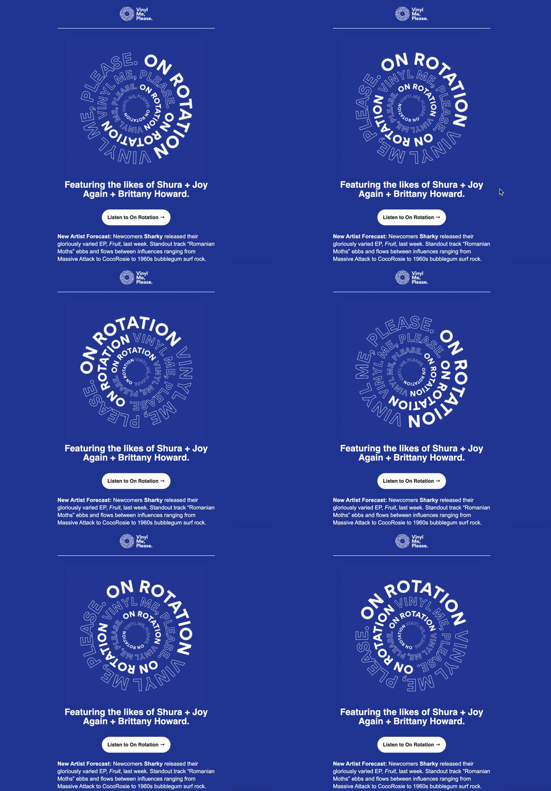
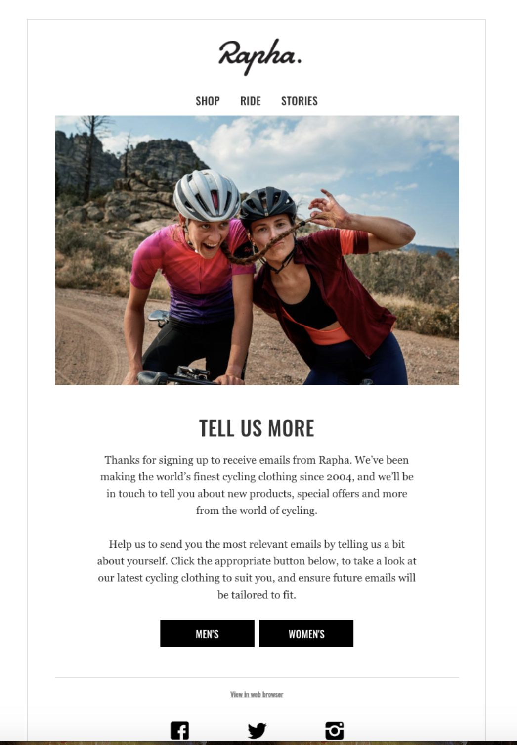
If you don’t have a welcome email or series, make it happen in 2020. With 4x the open rate and 5x the click-through rate compared to other marketing emails, welcome emails can boost your deliverability while setting the tone for your relationship with new subscribers. These email examples truly made us feel welcome.

Lots of email geeks experimented with interactive elements this year! Steven Sayo figured out how to code a pulsing CTA, and Jay Oram taught us how to create a search bar in our emails.
Even our very own developer, Ed Ball, wrote an amazing post on creating scratch-off effects for emails. Check out these other amazing interactive emails—just try to not let them have an effect on you.
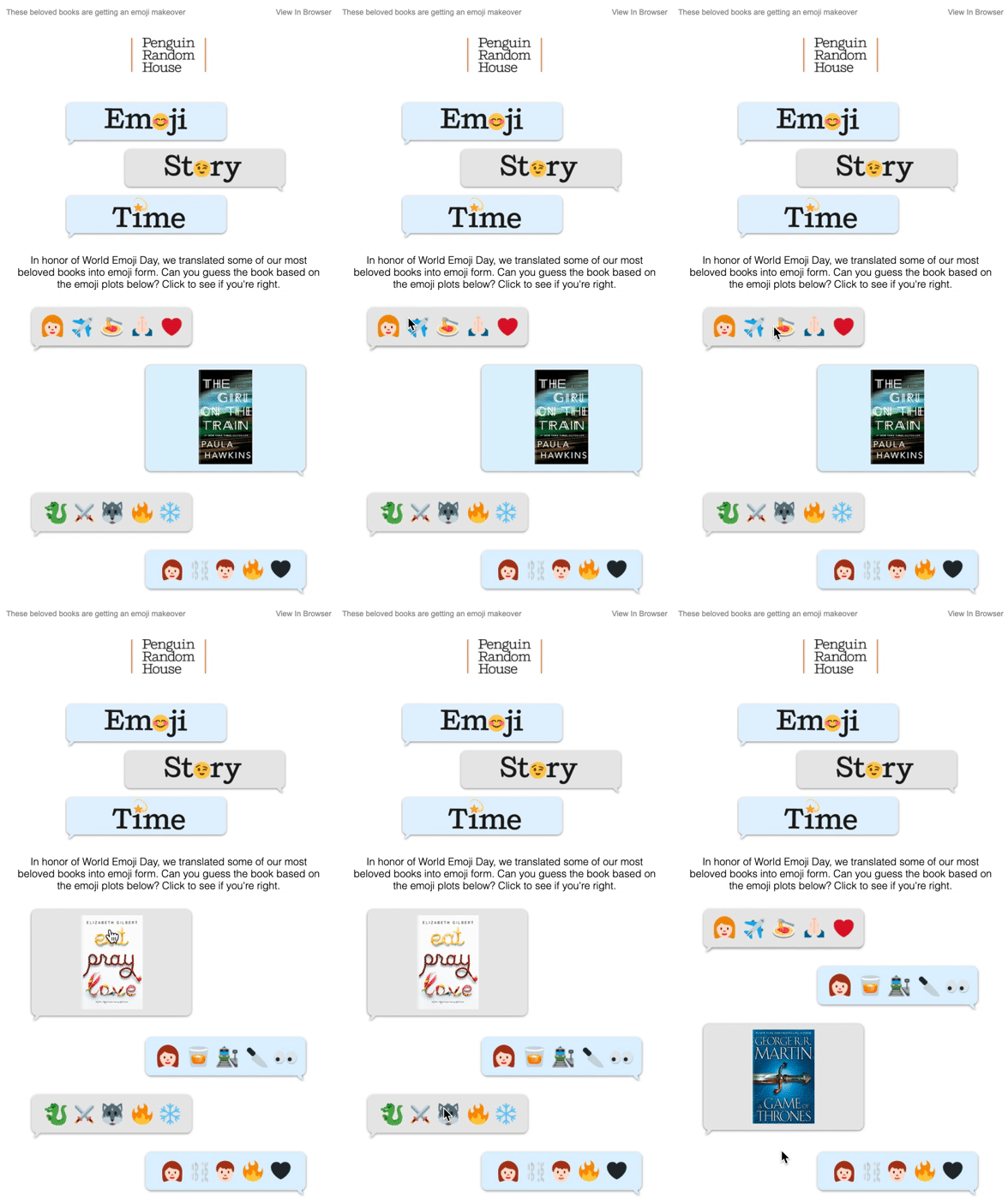
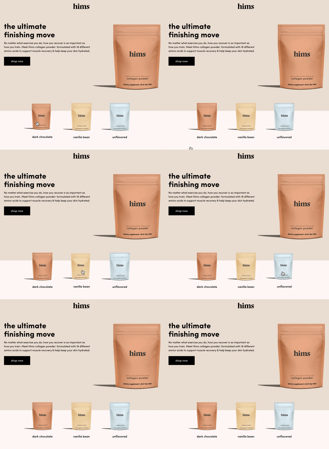

While the pronunciation debate rages on, email marketers on both sides decided to add a little motion to their emails using GIFs. These GIF email examples moved us to take action.


We would be remiss to not mention this tricky new email design. Dark mode has a lot of email developers and designers discussing how best to handle it, especially since Gmail doesn’t support dark mode yet. We lowered the lights for these dark mode email examples.


From the stellar design, to the clever copy, these emails stood out. We loved seeing them in our inboxes. We hope to see more like them. We look forward to see what you accomplish in 2020, pushing your designs to the next level, optimizing your subject lines and inbox display, and figuring out what the heck is going on with Outlook.
And remember, we’re here for you, every single day.
What’s the best way to run through your pre-send checklist? With Sinch Email on Acid’s Campaign Precheck, we’ve simplified the process and set everything up for you. Use it to double-check your content, optimize for deliverability, ensure accessibility, and preview how campaigns look on more than 100 of the most popular clients and devices. All before you hit send!
Author: Kirsten Queen
When you visit any website, it may store or retrieve information on your browser, mostly in the form of cookies. This information might be about you, your preferences or your device and is mostly used to make the site work as you expect it to. The information does not usually directly identify you, but it can give you a more personalized web experience. Because we respect your right to privacy, you can choose not to allow some types of cookies. Click on the different category headings to find out more and change our default settings. However, blocking some types of cookies may impact your experience of the site and the services we are able to offer.
Cookie Statement
These cookies are necessary for the website to function and cannot be switched off in our systems. They are usually only set in response to actions made by you which amount to a request for services, such as setting your privacy preferences, logging in or filling in forms. You can set your browser to block or alert you about these cookies, but some parts of the site will not then work.
These cookies do not store any personally identifiable information.
Cookie details
| Cookie Subgroup | Cookies | Cookies used |
|---|---|---|
| eu5.mm.sdi.sinch.com | ASP.NET_SessionId | First Party |
| community.sinch.com | AWSALB , LiSESSIONID | First Party |
| appengage.sinch.com | dd_cookie_test_ | First Party |
| tickets.sinch.com | atlassian.xsrf.token , JSESSIONID | First Party |
| cockpit2.sinch.com | SESSION | First Party |
| engage.sinch.com | instapage-variant-xxxxxxxx | First Party |
| dashboard.sinch.com | cookietest | First Party |
| brand.sinch.com | PHPSESSID , AWSALBCORS | First Party |
| sinch.com | __cf_bm , OptanonConsent , TEST_AMCV_COOKIE_WRITE , OptanonAlertBoxClosed , onesaasCookieSettings, QueryString, functional-cookies, performance-cookies, targeting-cookies, social-cookies lastExternalReferrer, lastExternalReferrertime, cookies, receive-cookie-deprecation _gdvisitor, _gd_session, _gcl_au, _fbp, _an_uid, _utm_zzses, lpv | First Party |
| mediabrief.com | __cf_bm | Third Party |
| recaptcha.net | _GRECAPTCHA | Third Party |
| cision.com | __cf_bm | Third Party |
| techtarget.com | __cf_bm | Third Party |
These cookies allow us to count visits and traffic sources so we can measure and improve the performance of our site. They help us to know which pages are the most and least popular and see how visitors move around the site. All information these cookies collect is aggregated and therefore anonymous.
If you do not allow these cookies we will not know when you have visited our site, and will not be able to monitor its performance.
Cookie details
| Cookie Subgroup | Cookies | Cookies used |
|---|---|---|
| community.sinch.com | ValueSurveyVisitorCount | First Party |
| buzz.sinch.com | instap-spid.8069 , instap-spses.8069 | First Party |
| appengage.sinch.com | _dd_s | First Party |
| sinch.com | AMP_TLDTEST , rl_page_init_referrer , rl_trait , _vis_opt_s , __q_state_dp56h9oqwhna9CoL , cb_user_id , __hstc , rl_anonymous_id , rl_user_id , initialTrafficSource , _vwo_uuid , _vwo_uuid_v2 , rl_page_init_referring_domain , _hjIncludedInSessionSample_xxx , apt.uid , __hssrc , test_rudder_cookie , cb%3Atest , __hssc , rl_group_trait , _hjAbsoluteSessionInProgress , _vwo_referrer , _vwo_sn , _vis_opt_test_cookie , _hjFirstSeen , _hjTLDTest , _hjSession_xxxxxx , s_sq , _vwo_ds , rl_group_id , _vis_opt_exp_n_combi , s_cc , _gclxxxx , cb_anonymous_id , cb_group_id , apt.sid , rl_session , _uetvid , AMP_899c7e29a9 , _hjSessionUser_xxxxxx | First Party |
| brand.sinch.com | AMP_TEST | First Party |
| engage.sinch.com | no-cache , instap-spses.85bb , instap-spid.85bb | First Party |
| www.sinch.com | d-a8e6 , s-9da4 | First Party |
| nr-data.net | JSESSIONID | Third Party |
| sinch-en.newsroom.cision.com | _ga, _gid | Third Party |
| sinch.in | _ga_xxxxxxxxxx, _gat_UA-XXXXXX-X, _gid, _ga | Third Party |
| g.fastcdn.co | instap-spses.85bb | Third Party |
| hello.learn.mailjet.com | pardot, visitor_id, visitor_id##### | Third Party |
| www.googletagmanager.com | userId | Third Party |
| hello.learn.mailgun.com | visitor_id#####, visitor_id | Third Party |
| dev.visualwebsiteoptimizer.com | _vwo_ssm | Third Party |
| box.com | box_visitor_id | Third Party |
| app.box.com | z, cn | Third Party |
| sinch-tfn.paperform.co | laravel_session | Third Party |
| go.sinch.in | visitor_id#####, visitor_id | Third Party |
| Qualified | __q_local_form_debug | Third party |
| Rudderstack | rudder.inProgress, rudder.3156dd1f-7029-4600-ae54-baf147d9af20.queue, rudder.3156dd1f-7029-4600-ae54-baf147d9af20.ack, rudder.3156dd1f-7029-4600-ae54-baf147d9af20.reclaimStart, rudder.3156dd1f-7029-4600-ae54-baf147d9af20.reclaimEnd, | Third party |
| 6sense | _6senseCompanyDetauls, _6signalTTL | Third party |
| Appcues | apc_local_id, apc_user | Third party |
These cookies may be set through our site by our advertising partners. They may be used by those companies to build a profile of your interests and show you relevant adverts on other sites. They do not store directly personal information, but are based on uniquely identifying your browser and internet device.
If you do not allow these cookies, you will experience less targeted advertising.
Cookie details
| Cookie Subgroup | Cookies | Cookies used |
|---|---|---|
| investors.sinch.com | visitor_id | First Party |
| community.sinch.com | VISITOR_BEACON , LithiumVisitor | First Party |
| sinch.com | _uetsid , ajs_user_id , _gcl_aw , ajs_group_id , AMCV_ , __utmzzses , _fbp , _gcl_au , AMCVS_ | First Party |
| go.latam.sinch.com | visitor_id##### , pardot | First Party |
| linkedin.com | li_gc, bcookie, lidc, AnalyticsSyncHistory, UserMatchHistory, li_sugr | Third Party |
| pi.pardot.com | lpv151751, pardot | Third Party |
| hsforms.com | _cfuvid | Third Party |
| google.com | CONSENT | Third Party |
| sinch.in | _gclxxxx, _gcl_au | Third Party |
| www.linkedin.com | bscookie | Third Party |
| bing.com | MUID, MSPTC | Third Party |
| www.facebook.com | Third Party | |
| hello.learn.mailgun.com | pardot | Third Party |
| www.youtube.com | TESTCOOKIESENABLED | Third Party |
| dev.visualwebsiteoptimizer.com | uuid | Third Party |
| g2crowd.com | __cf_bm | Third Party |
| pardot.com | visitor_id#####, visitor_id | Third Party |
| tracking.g2crowd.com | _session_id | Third Party |
| hubspot.com | __cf_bm, _cfuvid | Third Party |
| doubleclick.net | test_cookie, IDE | Third Party |
| youtube.com | CONSENT, VISITOR_PRIVACY_METADATA, VISITOR_INFO1_LIVE | Third Party |
| go.sinch.in | pardot | Third Party |
| liadm.com | lidid | Third Party |
| www.google.com | _GRECAPTCHA | Third Party |
These cookies enable the website to provide enhanced functionality and personalisation. They may be set by us or by third party providers whose services we have added to our pages. If you do not allow these cookies, then some or all of these services may not function properly.
Cookie details
| Cookie Subgroup | Cookies | Cookies used |
|---|---|---|
| portal.sinch.com | pnctest | First Party |
| partner.appengage.sinch.com | _dd_s | First Party |
| investors.sinch.com | First Party | |
| community.sinch.com | LithiumUserInfo , LithiumUserSecure | First Party |
| tickets.sinch.com | selectedidp | First Party |
| engage.sinch.com | ln_or | First Party |
| cockpit2.sinch.com | CSRF-TOKEN , NG_TRANSLATE_LANG_KEY | First Party |
| sinch.com | apt.temp-xxxxxxxxxxxxxxxxxx , hubspotutk , ajs%3Acookies , cf_clearance , ajs%3Atest , __tld__ , __q_domainTest , pfjs%3Acookies , ajs_anonymous_id | First Party |
| auth.appengage.sinch.com | AUTH_SESSION_ID , KEYCLOAK_3P_COOKIE , KEYCLOAK_3P_COOKIE_SAMESITE , KC_RESTART , AUTH_SESSION_ID_LEGACY | First Party |
| www.recaptcha.net | _GRECAPTCHA | Third Party |
| boxcdn.net | __cf_bm | Third Party |
| d2oeshgsx64tgz.cloudfront.net | cookietest | Third Party |
| sinch-np.paperform.co | XSRF-TOKEN, laravel_session | Third Party |
| vimeo.com | __cf_bm, vuid | Third Party |
| sinch-ca-sc.paperform.co | XSRF-TOKEN, laravel_session | Third Party |
| box.com | site_preference | Third Party |
| app.box.com | bv | Third Party |
| sinch-tfn.paperform.co | XSRF-TOKEN | Third Party |
| cision.com | cf_clearance | Third Party |
These cookies are set by a range of social media services that we have added to the site to enable you to share our content with your friends and networks. They are capable of tracking your browser across other sites and building up a profile of your interests. This may impact the content and messages you see on other websites you visit. If you do not allow these cookies you may not be able to use or see these sharing tools.
Cookie details
| Cookie Subgroup | Cookies | Cookies used |
|---|---|---|
| community.sinch.com | ln_or | First Party |
| sinch.in | _fbp | Third Party |
| youtube-nocookie.com | CONSENT | Third Party |
| youtube.com | YSC | Third Party |