Email Marketing
Email Marketing Psychology: 7 Ways to Get the Best Results

Email Marketing

Psychologists don’t have to be marketers. But marketers definitely need to know a thing or two about psychology, including for email campaigns.
We’re not saying your subscribers should lie down on a couch and tell you all about their fear of spam. However, any marketing effort you pursue will be much more effective if you’re able to get inside the heads of your contacts.
So, when it comes to the inbox experience, what makes your customers and prospects tick? Let’s dig into the topic of email marketing psychology – which is more than just good design templates and marketing strategies.
Understanding the importance of customer behavior is key. A vast amount of research and resources go into finding out how consumers make decisions. As you can imagine, psychology and marketing know-how is required to make sense of customer behavior. Many key factors involved in decision-making are rooted in psychology. That’s why it’s crucial to have an understanding of basic principles and how they apply to email marketing psychology.
Behavioral psychology lays the foundation for modern email marketing practices. The process of persuading your subscribers to open an email and click your call-to-action (CTA) is clear when you understand the psychological principles at play. The dependence of marketing on color psychology, buying behavior, and cognitive science shows psychological theories are needed to decode some of the trickiest marketing conundrums. Basically, psychologists don’t have to be marketers, but marketers have to be psychologists.
When you get into the nitty-gritty of email marketing, you’ll get a grasp of human psychology to understand what subscribers look for in an email, how they interact with email content, and what they engage with. Here’s a quick rundown of seven psychological effects to boost your email game:
Let’s dig into each of these:
The anchoring effect is the cognitive bias in which decision-making heavily favors the first piece of information received. It involves setting initial information as the anchor and making judgments based on this anchoring information. In other words, your first move should be your best move.
For example, if you’re haggling over a product, the initial price sets the bar for subsequent negotiations. The same is true for your email campaigns; ensure your first email captivates subscribers and presents a strong brand image.
Check out the welcome email below. In this email, dev.to engages their subscribers, starts a conversation, and piques their interest. If they like the first campaign, your readers will judge you positively and look forward to future correspondence.

Keep your efforts consistent by taking advantage of the more-exposure effect. This theory suggests people develop preferences for things the more they’re exposed to them. Think about making friends with your coworkers – you gradually develop relationships when you become familiar and comfortable with them.
This more-exposure concept is useful for keeping your audience’s attention. By sending relevant email campaigns consistently, you’ll familiarize subscribers with your business so they develop an affinity for your brand. For example, create and send a nurture email series to your subscribers, stay in touch, and expose them to everything you offer.
However, don’t send too many emails. Instead of simply upping the number of emails sent, maintain consistent quality. For instance, rather than sending out new product announcements and reminders, try to include social proof of your brand. Testimonials also expose your readers to your brand and start conversations. More importantly, social proof creates a sense of exclusivity – letting your readers feel like they’re part of the “in” crowd.
Alternatively, check out how Mention congratulates their reader on his first Mention. Instead of using social proof, they use another method to make their reader feel like he’s a team player and part of the “in” crowd. Mention took this achievement as an opportunity to email their user again, adding to the subscriber’s brand exposure.

The number three has always been significant in storytelling, advertisements, and philosophy. There’s something we’ll never forget: The three bears Goldilocks visits, the three traffic light colors to direct traffic, the ever-popular “live, love, laugh” quote, and even the pre-race instructions, “on your mark, get set, go.” The rule of three in content represents concision, rhythm, and a sense of tradition.
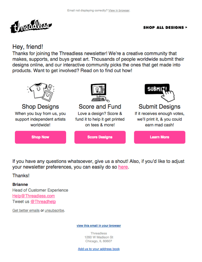
If you’re designing email content, organize it into three sections. When highlighting points, call out the three main ideas. And when crafting subject lines, try to make them punchy with three striking words. Check out how Threadless uses the rule of three in their email:

Give more to get more – in other words, the reciprocity effect.
How do you feel when someone offers to pay for your meal? You probably feel thankful, and deep down, you want to do something nice for them in return. That’s the rule of reciprocity – people repay what they receive.
Reward your readers with every email. Resources like e-books, guides, infographics, and articles will encourage your subscribers to take a keen interest in connecting with you. Your CTAs will be a lot more compelling when you give your readers a reason to take notice. Check out how Yieldify does this with their guide below.

Source: Really Good Emails
The clustering effect is the tendency to organize information into different memory-related groups. When you have a list of groceries to buy, you automatically group similar products together, so it’s easier to find them in the store.
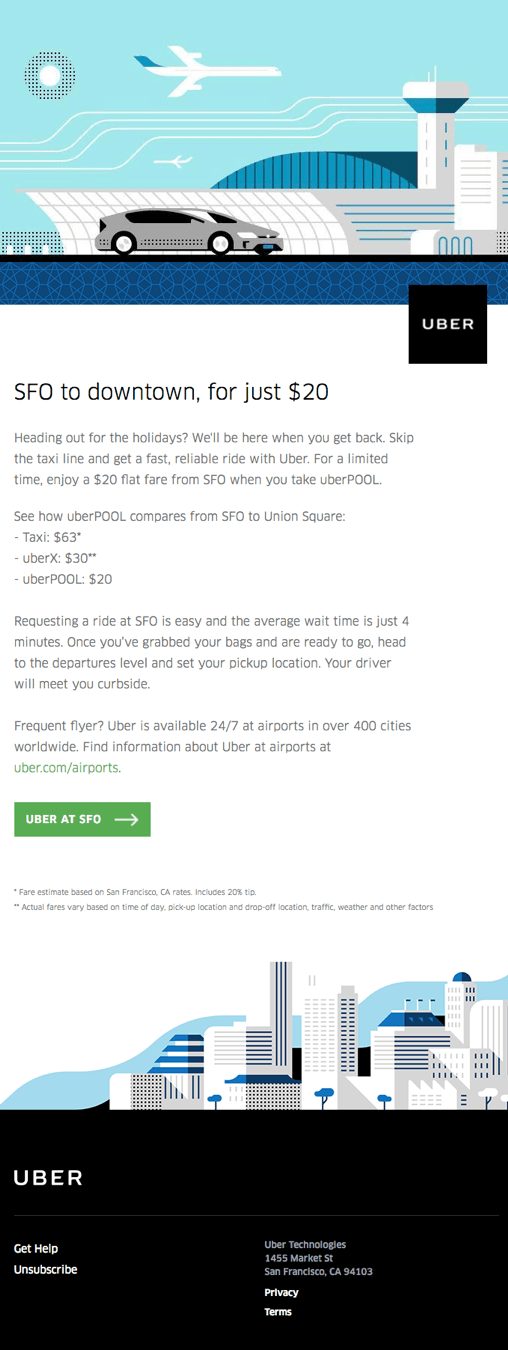
When your mailing list contains subscribers from different countries, it’s good to organize them into location-based segments. If some of your subscribers share common interests, create unique tags to group them together. Segmentation can have groups with several attributes; there’s no real limit. Segmenting lists and tailoring content to each niche make your digital marketing campaigns more effective. Use clusters to A/B test your emails and see what type of email content works best with each segment. Check out how Uber uses location to deliver SFO-specific content to their SF-based cluster.

A picture’s worth a thousand words, but we don’t recommend sending an image-only email. The mind is much better at recalling visuals than text – just look how social media content performs! In fact, humans retain 65% of visual information, even after three days.
Keep this in mind and strike a healthy text-to-image balance. But remember, not all of your subscribers will be able to see your images. Create fall-back options so your email is accessible for subscribers who use screen readers or email clients, like Microsoft Outlook, that block images. A “view in browser” option is a safe way to ensure subscribers can see your emails properly no matter what email client they use.
When designing your campaign, keep it exciting and visually attractive. Let your images be clear, colorful, and easy to understand. Ensure they’re relevant to the content’s purpose and don’t forget to put your brand’s logo in each campaign and email footer to make them authentic.
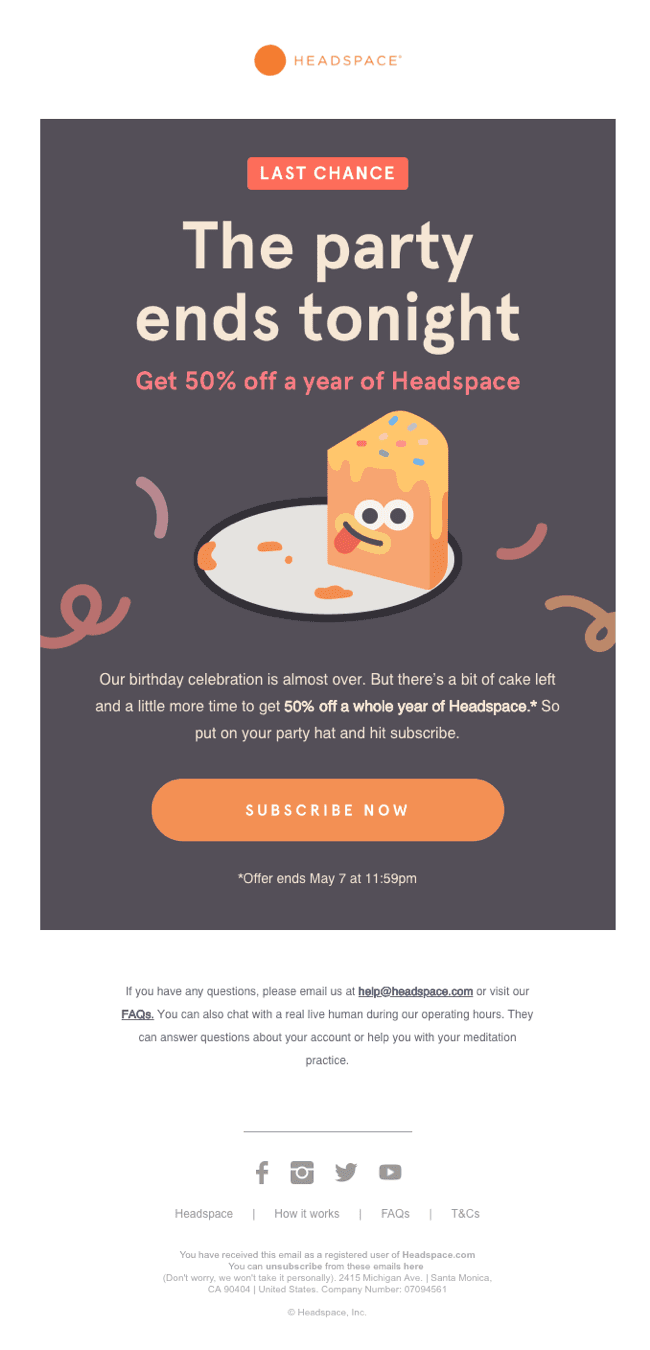
Check out how Headspace uses the image of a slice of cake to indicate that the party is over – in a cheeky way. It also adds a sense of urgency.

Help your readers make decisions faster, so they don’t fall victim to the analysis paralysis effect. This common effect strikes when you overthink to the point where a decision is never made.
Have you ever found yourself spending more time trying to figure out where to order take-out from than the time it actually takes to go to a restaurant? You don’t want to make the wrong choice and miss out on a better option.
The solution: avoid ambiguity and having too many choices. Help your readers reach decisions by keeping your intentions simple and direct. Your campaigns should stick to one concept and not divert your readers. Don’t put too many CTAs or deliverables in your email. Otherwise, your recipients won’t know which action to perform.
The CTA should be short and easy. For instance, instead of “Click here to download the guide that makes you a great marketer,” try “Become a Great Marketer” or “Download Now.” Not sure how long to make your copy? Check out our article on the ideal email length for some advice.
Check out how the minimal design, clear CTA, and uncluttered copy below help readers make quick decisions.

We’ve all been there – feeling like we’re missing out when all our friends are having way more fun. In terms of email marketing, your readers might feel this way if there’s a limited-time deal or if your product seems exclusive.
Check out how Nike promotes its membership perks to add a feeling of exclusivity. Imagine how their reader will react to this email. Most likely, they’ll feel like they don’t want to miss out on all the discounts and perks.

But what about you? Is email marketing taking a psychological toll on your mental health? Ever heard of a little thing called “send button anxiety”? Our survey on email marketing and stress found that more than half of you think your jobs are stressful.
One way to relieve that stress and gain “send button confidence” is by conducting email testing and quality assurance before launching a new campaign.
Hopefully, the psychology hacks in this article will give you a headstart in your next project.
Ready to try these techniques in your email? Check out our Campaign Precheck tool to test and send your emails before you send them. Let us help you reduce some of that stress!
This article was updated on November 9, 2022. It was originally published in October 2019 as a guest post from Aishwarya Ashok of Zoho Campaigns.