Email Marketing
Email Branding: Create a More Consistent Inbox Experience
People don’t buy from you because they need what you’re selling. They buy from you because of who you are. Your brand encompasses everything about a customer’s experience – from the moment they hear about you to their first purchase to their decision to recommend you to friends.
Do it right and you’ll build not just a business made up of customers but of passionate fans who can’t wait for what’s next. That’s how classic mega-brands become so popular: Think Apple, Coca-Cola, McDonald’s, Harley-Davidson, or Target.
So what does email marketing have to do with branding? Email finds its way into many facets of a brand’s customer experience. “Email branding” refers to a set of design, copy, and important strategic decisions that create a recognizable inbox experience. In this article, we’ll explain what that looks like and how to create consistent branding for the inbox.
Why does email branding matter?
If a subscriber can’t remember who you are, then they’re not going to open your email. (Or worse, they’ll mark you as spam.) Turns out, while the subject line matters, 68% of consumers say brand recall is more important when it comes to choosing whether or not to read an email.
Creating brand recall requires consistency. Every time a customer or prospect interacts with your business, they should have a familiar experience. That includes design, brand voice, imagery, and more.
But that’s just the beginning of what email branding can be. If you’re consistent about what you offer, how often you email your lists, and the kinds of content you include, your subscribers will know what to expect from you – whether that’s snazzy animated emails or deep-dive newsletters.
A consistent email branding experience helps establish a reliable relationship with your subscribers. It will also keep your brand top of mind so that when it comes time to make a purchase, they’ll come directly to you.
6 ways to brand your email marketing campaigns
Let’s look at the elements of your email marketing campaigns that can create a an inbox experience where your brand identity shines through.
1. Use “friendly from names” wisely
Since we know the brand matters when a recipient decides whether to open an email, good email branding means being clear about who the email is from. However, you can also edit the sender name (or from name) for various reasons. In most cases, the sender name will be your brand name by default.
So-called “friendly froms” often use the name of a particular employee, thought leader, or even your brand’s mascot as the sender name. That may help add a human touch to the inbox, but be careful with this decision if you’re trying to build brand awareness. With new subscribers, you should be as straightforward as possible about where the email is coming from. Remember that if the sender name is long, part of it could be cut off on mobile devices.
A welcome series, for example, should probably avoid fancy from names and stick to the company name. But after new contacts start engaging with your emails, you could start using other options, such as a the name of a branded newsletter.
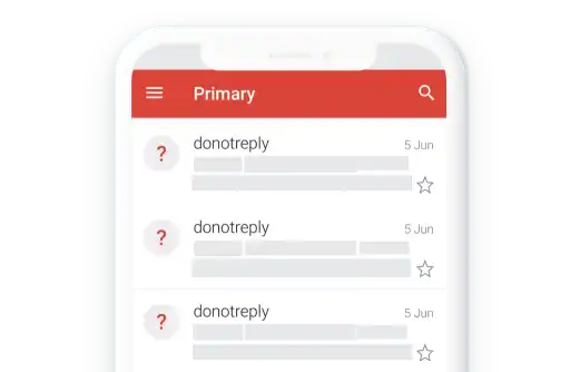
What you definitely do not want showing up in the inbox is a sender name and address that reads “no-reply@your-brand.com.” Nothing will kill the mood faster than that. And it’s a major missed opportunity for email branding. This advice includes avoiding donotreply addresses in transactional messages.
2. Display a BIMI logo
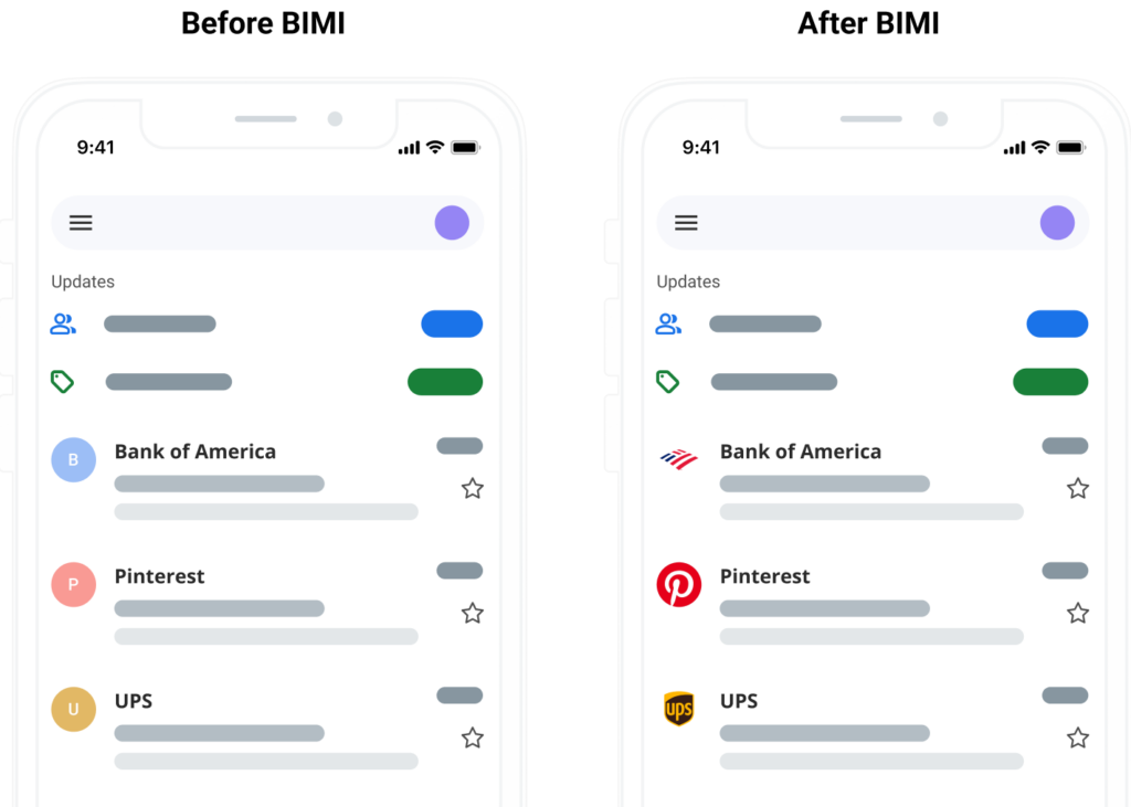
Your company logo is a great way to facilitate brand recall. You don’t have to wait for a subscriber to open your email to see it, either. With the BIMI (Brand Indicators for Message Identification) email specification, a verified logo can appear at the inbox level for subscribers who use certain email clients, like the Gmail app, Apple Mail, and Yahoo! Mail.
BIMI is directly related to email authentication protocols, which signal to inbox service providers that you are who you say you are. To get a BIMI logo, you must have a strong DMARC policy of either p=quarantine or p=reject. Setting up the BIMI specification for your email campaigns takes a some effort, but the payoff is worth it.
That’s because when brands use logos in the inbox, open rates go up by as much as 21%, and it increases the likelihood of a purchase by 34%. The reason? A BIMI logo adds a sense of legitimacy to your emails, building trust and brand recognition.
3. Maximize your email header space
Your email header is like the front page of a newspaper—it’s the first thing subscribers see when they open your emails. This is the place to prominently display your logo and tagline or other key messaging.
For email branding, you could include:
- Logo: Your company logo in the header makes it immediately clear who sent the email. Keep it simple. You don’t need your logo to take up too much space. If you’re well-known, you could use your brand mark instead. That’s basically your logo without the brand name – think the swoosh without Nike or the golden arches without McDonald’s.
- Slogan or tagline: If you want to make your company tagline or a slogan more recognizable, adding it to email header designs can help drive the idea home. Of course, this is totally optional.
- Menu: Menus are a great way to send traffic to your specific pages on your website. They work well for ecommerce brands with product categories. If an email header menu mirrors the menu on your website, it can also connect email campaigns to landing pages.
- Call-to-action (CTA): If your goal is to drive clicks to your website, why not include a CTA front and center in your email header? Make it the first thing your users see, and then use the rest of your copy to back it up.
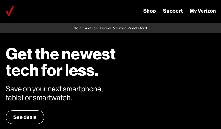
Your header sets the tone for your email, so don’t neglect it. The example below from Verizon includes a brand mark, menu, and an above the fold CTA.
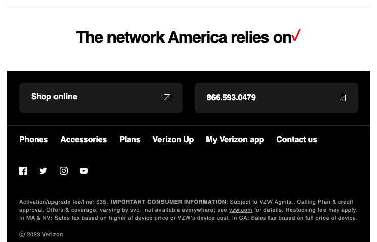
Your email footer is the last part of the email your subscribers sees as when scroll to the bottom of the message. While your footer may need to include some basic elements, such as disclaimers for legal purposes, it’s also a place to make a lasting impression with your brand. For branding purpose, you’ll can include:
- Contact information: Use your email footer as a place to answer a few FAQs, like how to contact your customer support team and where you’re located. (You also need to include this information to comply with regulations like CAN-SPAM.)
- Social media icons: Similar to your logo, adding social media buttons in your footer is another way for subscribers to engage with your brand. Keep them small and subtle—the focus should be on your CTA, after all.
- Unsubscribe link: Like your contact info, make sure you have an opt-out link clearly displayed in your footer. If you have an email preference center, subscribers can also manage the frequency and types of emails they want to receive.
- Certifications: If your organization has earned important certifications or awards, the email footer is a good place to add them. It can help build trust in your brand.
You can also include a logo or brand mark in the footer again along with additional CTAs, taglines, a link to your blog, help forum, or anything else that doesn’t quite fit into the rest of your email.
A branded email signature is a close cousin to the email footer, and they’re a nice way to add some branding in everyday messages that go out from individuals in your organization.
5. Pay attention to copywriting and imagery
Now, it’s time to think about the meat and potatoes of your email: The body copy. Good email content persuades the reader to act and evokes a specific feeling. Is your brand friendly and approachable? A little quirky? Or more serious and authoritative? Make sure that comes through in email copywriting.
Take time to consider brand voice, tone, and personality. These aspects of branding represent the words you use, how you use them, and the attitude your copywriting portrays. These things may change slightly depending on the goal of the email or the segment of subscribers you’re reaching out to.
Email marketers can also use images that are consistent with the brand. If you use stock photography, what should it look like? Do the stock photo models represent your target audience? The visuals you add to emails should complement the writing (and vice versa).
6. Show off your brand style in your email design
Finally, tie it all together with great email design. This means your color palette, fonts, headings, icons, and more. It even includes how much white space is used in your campaigns. Some of that design will be coded using CSS in your emails. So, if you’re an email developer, work with the branding and design experts in your company to be sure you’re on the same page.
Email design trends come and go. But there should be some things about your brand that are timeless. Setting a clear design direction for your emails that aligns with your overall brand guidelines is critical to building a cohesive email marketing campaign.
How a design system supports email branding
A component driven email design system is a powerful way to ensure brand consistency in every email campaign. Email marketers and developers can work directly with designers and brand experts to build a system that is repeatable yet more flexible than simply using templates. It improves efficiency while keeping every campaign on brand.
That’s because the pre-built components in an email design system already have your brand in mind. Design systems are also helpful when you’re managing email production for multiple brands that are related. You can have similar styles, which you can easily update to switch elements such as fonts, colors, and logos.
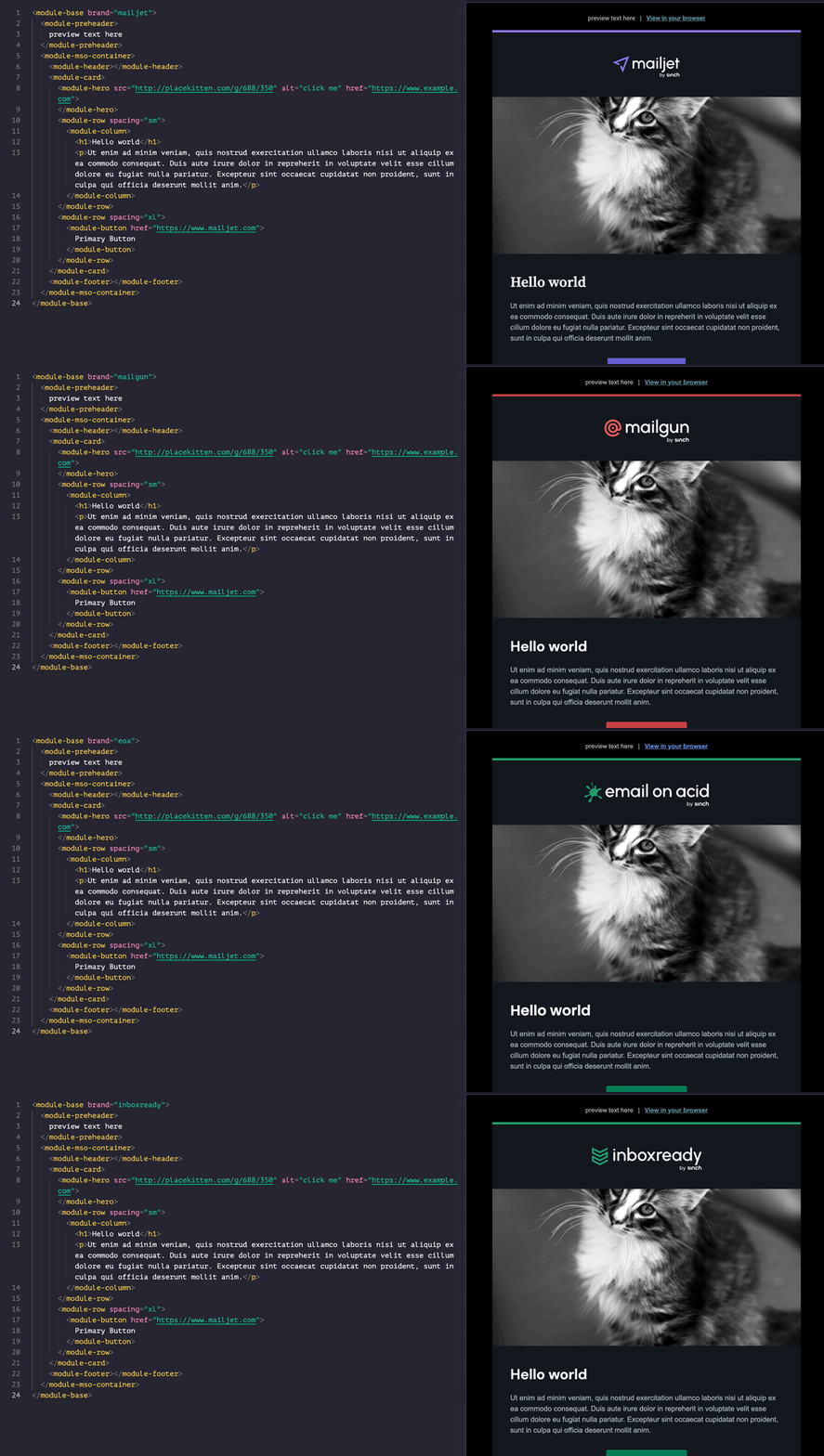
Find out how our own Megan Boshuyzen pulled this off in an eye-opening presentation from Email Camp.
4 potential email branding problems
It wouldn’t be email without a few speed bumps along the way, right? Email branding is no exception. As you think about your inbox experience, you’ll want to keep these potential problems in mind:
1. Blocked images
Some email clients, mainly Outlook, automatically block images, and some subscribers turn images off. Does your email still resonate without them? Is it still recognizable as a message from your brand? Do a double check. Otherwise, make sure you include alt-text so your message still gets across, no matter what happens with your images.
2. Inverted colors in dark mode
Dark mode email challenges create plenty of headaches, but darker user interfaces are becoming increasingly popular for users and for email marketers alike. Depending on the email client, dark mode may invert your colors or substitutes new ones. From a branding perspective, you have two choices: Code a completely separate dark mode email, or make sure your color choices invert in a way that’s still readable and on-brand.
3. Disappearing logos in dark mode
Dark mode emails can cause problems with your brand logo. When the theme switches form light to dark, and you’re not using a transparent png, your logo may suddenly appear on a white background. Or worse yet… If your logo is black, it could completely disappear. That’s an important piece of branding you don’t want lose. So, get some advice on logos and dark mode to learn more about quick fixes for these problems.
4. Unsupported custom fonts
If your brand uses a custom font…you may not be able to use it in your emails. That’s why it’s important to discuss ahead of time as a team which different fonts, colors, and design patterns are acceptable in emails and which aren’t, keeping in mind accessibility and fallbacks.
As you build your font stack choose options that still feel like your brand’s preferred typeface, or make your main font one of these web-safe options.
Stay on brand and test every email campaign
An email that fails to display as you intended can destroy all your hard work and email branding strategy. But that happens more than you might think. You see, email clients render the HTML and CSS code in your campaigns in different ways. Suddenly, all that consistency you strived for becomes … inconsistent.
The only way to be confident in what your sending is to test every email every time. Thankfully, Sinch Email on Acid offers unlimited testing with every plan. That means you can preview campaigns on more than 100 of the most popular email clients and live devices, and it includes dark mode email previews.
Deliver better branding to every inbox every time when you conduct email quality assurance with our cutting edge pre-send testing platform.
