Email Marketing
Do Your Subscribers View Email in Dark Mode?

Email Marketing

Dark mode is the new black. Of course, by that we mean it’s a growing digital design trend for user interfaces (obviously, there tends to be a lot of black).
But how do you know if your list is reading emails in dark mode? Should you be optimizing your campaigns for it? Is it necessary to design emails in both light and dark mode?
For now, there’s a lack of definitive data on dark mode email usage. What we do know is that many popular email applications, operating systems, and browsers are providing people with the option of turning down the lights. There are also some strong hints that adding dark mode testing to your email pre-deployment checklist is a smart idea.
Dark mode offers specific benefits that make certain audiences more likely to use it. If your customers and prospects include any of these marketing segments, dark mode emails should be on your radar.
Here’s an interesting fact about dark mode … it’s not actually new at all. If you’ve been around long enough, you probably remember booting up a computer using DOS or staring at a bulky beige monitor with bright green text on a black screen.

The familiar dark-on-light color scheme came on the scene with the advent of word processors, which aimed to imitate the look of black ink on white paper. Eventually, light mode became the norm. So dark mode isn’t exactly cutting edge – it’s retro!
A lot of software programmers, web developers, and those who work in IT have always used dark mode. These professionals prefer it because it allegedly helps reduce eye strain. That’s understandable. You try staring at a bright screen full of code all day long.
If you’re targeting the inboxes of these professions, there’s a good chance a substantial number of them are reading emails in dark mode.
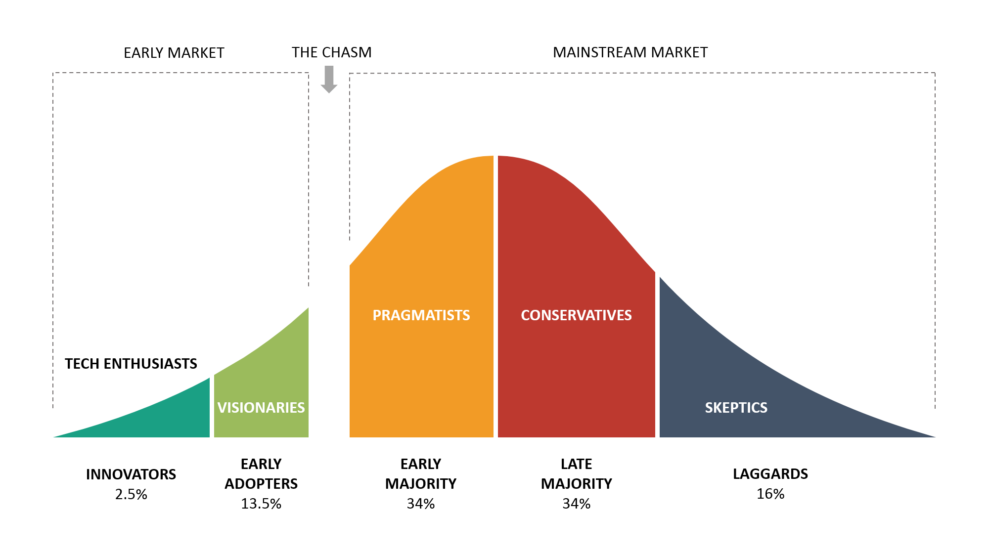
Most marketers are familiar with the technology adoption lifecycle curve. Close to the front, you’ll find the Early Adopters. These are the trendsetters who are willing to try out new products and features once they see Tech Enthusiasts playing around with them.
In his book, Crossing the Chasm, Geoffrey Moore explained that new ideas and innovations need to make a jump from those Early Adopters to the mainstream market.

Developers and programmers fall into the Tech Enthusiast camp. Many of them have always preferred dark mode. Early Adopters could be described as those who are avid readers of technology publications. They’re more likely to stand in line for the latest Apple product and want everyone to know they’re using cutting-edge tech.
2019 was packed with news about apps adding dark mode settings as well as plenty of opinion articles on the subject. When Android Authority surveyed their tech-savvy readers, they discovered nearly 82% are choosing dark mode whenever they can.
So, it’s reasonable to say that dark mode has already crossed the chasm and is making its way through the Early Majority. That group of consumers is influential in spreading the adoption of innovation through the rest of the curve.
If you’re mainly marketing to Laggards, you might be able to ignore dark mode emails for now. The Laggards are still wondering why no one is using Myspace anymore. For the rest of the market, however, dark mode could soon be part of the mix.
An audience of Early Adopters and the Early Majority is likely to include youth of the world.
For many young people, the appeal of dark mode is that it looks cool. And even the most skeptical Gen-Xers among us would have to admit that’s totally true. Here’s how Arielle Pardes described dark mode in Wired:
Turning the lights off oozes coolness. It brings your phone or laptop into its ever-alluring goth phase and signals a certain kind of devotion to your screen.
Beyond the appearance, dark mode also saves battery life on some devices. Less time hunting for cables and charging phones means more time texting friends and live-streaming.
A lot of popular social media apps have dark mode settings, including Instagram and TikTok, both of which tend to attract a younger demographic. We can safely assume that social media UX preference often translates to the inboxes of young people, too.
If you’re marketing to people in their teens and twenties, the broody moodiness of dark mode emails may be exactly what they want. Plus, if your brand strives to be seen as cool, designing emails for dark mode could help you maintain your reputation.

A key benefit of using dark mode is that it cuts down on exposure to blue light. Too much blue light can trick your brain into thinking it’s daytime, which makes it harder to fall asleep. That’s why health experts tell us to turn off and turn away from our screens two or three hours before bed.
Let’s be honest. No one is doing that. How are you supposed to binge Netflix if you turn off the TV at 8 pm? What if you log off Twitter too early and miss a late-night tweet? There’s a reason Apple named a feature that switches macOS to dark mode in the evening “NightOwl.”
Dark mode may be helpful to the more than 50-million Americans who suffer from sleep disorders as well as those who have no choice but to work in front of a screen in the nighttime. If you have email analytics showing that your campaigns are getting opened at night, designing and optimizing emails for dark mode makes sense.
Sleep deprivation can certainly cause health issues, but it’s not the only concern connected to exposure to bright screens.
Photophobia is a condition that causes migraines because of sensitivity to bright light. Sometimes screens are the culprit. Dark mode tones things down for these people so they reduce the risk of triggering a painful migraine.
When it comes to accessible emails, dark mode can be either a problem or a solution. It all depends on the reader’s situation. There may be times when dark mode email design makes things more readable. But, failing to have the right contrast can easily make your emails difficult to read. For advice on this topic, check out our article on dark mode and accessibility from email developer Ed Ball.
Sheri Byrne-Haber of UX Collective explains how dark mode sometimes causes accessibility issues:
One of my glaucoma-related issues is I see ‘halos’ (like rings around streetlights at night) when presented with light print on a dark background, which blurs everything into non-readability. This issue is exacerbated with thinner and smaller fonts. Also people with dyslexia (5–7 % of the population) have more trouble decoding light text on a dark background than they do the reverse.
In some cases, designing dark mode emails shows you have empathy for your audience. But it’s not a definitive solution for accessibility. Byrne-Haber adds that designing for both dark and light mode is the most accessible UX approach.
It could also be the right user experience for a lot of other reasons. Like many things in life, people are divided on dark mode. It truly is a personal preference — and one that will need to be addressed moving forward.
What does all this mean for email marketers? It means that dark mode is an option that’s here to stay. That does add some complexity to the process of testing and optimizing emails. However, if your goal is to reach as many people as possible with your email campaigns, designing for dark mode is a no-brainer.
To learn more about how dark mode is impacting the world of email marketing, check out Pathwire’s dark mode for email survey. Want some basic info? Check out our dark mode 101 infographic.