Email Marketing
Creative Email Inspiration Using HTML Tricks

Okay, by now we all know how important it is to test an email before you send it out. Not only does email testing help protect your brand’s reputation among subscribers (and spam filters), but it’s also a chance to push your creative boundaries. For this month’s dose of creative email inspiration, we wanted to find out how email marketers are leveling up their messages with handy email development tricks, including:
Synapse Sparks a Sense of Urgency
SL: Countdown to Synapse: last week to save on tickets
A common tactic of marketing is to create scarcity around something. When people see that there are only X number of seats left at an event, or there’s only Y hours left to sign up, their gut reaction is to get on that list. It creates both a feeling of urgency and exclusivity, and if they don’t get a spot on the list, someone else will take it.
Having a countdown timer in an email is one such tactic that can be effective in driving registrations, ticket sales, etc.
Synapse did this perfectly by methodically placing the timer at the top of their email so it’s one of the first things readers see. It sparks a sense of urgency, which can be huge in motivating conversion.
Countdowns aren’t only relevant to live events. There are plenty of things you can count down to, it will just depend on your brand and messaging. Other examples include:
- End of a sale or promotion (or the start of one, if you’re teasing it out early)
- Something becoming available to purchase
- The end of a pre-order opportunity before it’s available to the public and sells out
- A grand opening or start of a season, or how much time remains in a current season
- Or, if you work at Cape Canaveral, everyone loves a good “blastoff!” countdown
Also consider personalization. Countdown timers can really make an impact in a time-triggered email, such as a guest’s upcoming reservation or check-in date.

Lyft Steers Towards Animated Product Announcements
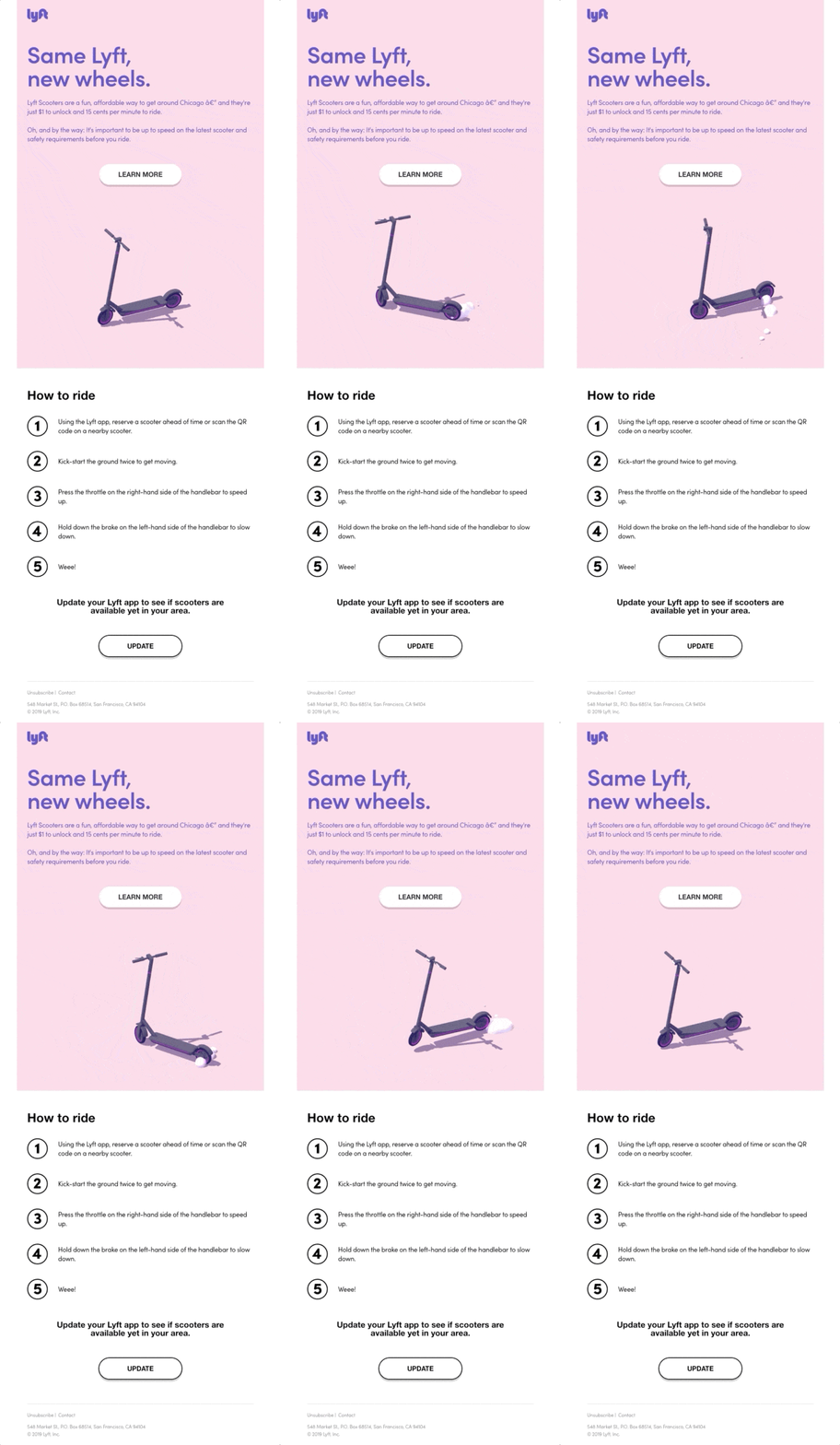
SL: Now arriving: Lyft Scooters
A product announcement email is one of the highest stakes messages an email marketer can create. You only get one first chance to excite people about your new offering, so better make it count.
Lyft kept their scooter announcement simple and let their quirky, hard-to-miss GIF drive the main message. They were sure to include pertinent info, such as where the scooters are available, price, and how to use them.
More and more, GIFs are finding their way into emails in fun, adventurous ways. Now that newer versions of Outlook are starting to play nice with GIFs, try out using one in a future email!

Harry’s Interactive Approach to Personalization
SL: Quiz: Which shower scent fits you best?
There is no one right way to shower, and Harry’s knows it. By adding an interactive personality quiz into their email, Harry’s gave each reader a seemingly tailored result pointing to which body wash scent suits them best.
Plus, they get bonus points for achieving both personalization and interactivity in one fell swoop. That’s a gold-star move in our book.

Shopify’s Video Tutorial is the Shortcut We Never Knew We Wanted
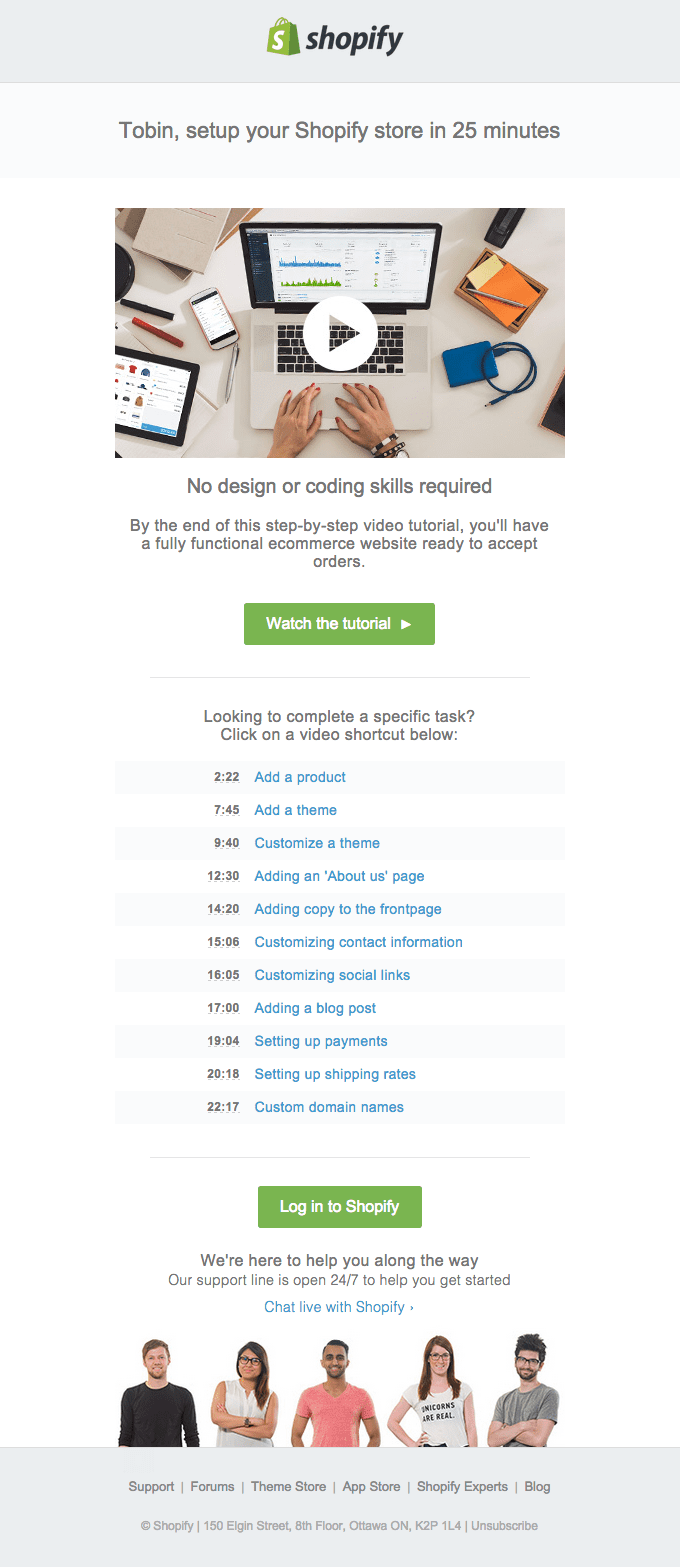
SL: Setup your Shopify store in 25 minutes
When it’s appropriate, videos are a great addition to an email. In fact, emails with a video have a 96% higher click-through-rate (CTR) than those without. This makes them the perfect place to share some of yours. Videos in email can cover a wide range of topics, including tutorials, demonstrations, commercials, testimonials, press coverage, etc.
Shopify went the tutorial route and sent a dedicated email teaching new users how to get set up on their platform in under a half hour. Here’s where the real stroke of genius comes in: since this video is roughly 25 minutes long (woof!) they created what’s basically a table of contents with jump links to those time stamps.
The time stamp links give readers an idea of what the video will walk through, and allows them to jump around in the video if they’d like. This makes a 25-minute video much more digestible and far less overwhelming.

A New Font from Hoefler & Co.
SL: Meet Peristyle, a new sans serif
It’s no secret that all-image emails can really affect your deliverability. That’s why we’re so proud of Hoefler & Co.’s email announcing a brand new style of typography. Are we 100% sure they didn’t use an all-image email? No, but we’re giving them the benefit of the doubt since using custom fonts in email is entirely possible, even if the code is a mammoth to tackle.

Color Us Impressed
Clearly, email developers and marketers are nothing short of artists. They’re always brewing something new and unique. But trying out-of-the-box tricks and techniques comes with its own set of risks. Email clients are changing everyday, and what rendered yesterday may not display properly tomorrow. That’s why it’s important to test every email.
The easiest way to do that is with unlimited email testing on live clients. Email on Acid offers unlimited email tests with every subscription plan. Content check every email with Campaign Precheck to ensure your fancy HTML is all put in place, then run it through a live email test (not emulated) on 90+ clients and devices to ensure it renders the way you intend.
Having unlimited email tests available gives you peace of mind when you’re pushing the creative email envelope. Run as many email tests as you’d like with reckless abandon without worry of hitting a cap or having to pay extra.


