Email Marketing
How to Build a Better Email Footer for a Lasting Impression

Email Marketing

So you’ve made a great first impression with a perfectly primed subject line, email header, and email body. You’ve boosted your open rate and click-through rate. What’s left?
Now that you’ve opened the door for your customer, don’t forget to make a lasting impression. Even though the footer sits discreetly at the bottom of your email, it plays a vital role in customer conversion, retention rates, and ultimately, the success of your ecommerce shop. We’ll explain what an email footer is, some of its elements, and how to build better email footers.
To a developer, a footer is a specific section of an HTML document located after the <header> and <body>. In the world of email marketing, design elements like the email footer, header, and body are visible parts of an email. In this case, a footer is at the very bottom of the email and includes key information like resources, an unsubscribe link, and ways to get in touch with the company.
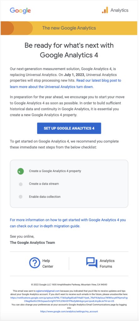
Let’s take a look at an example email:

This email from Google Analytics starts with a header containing the Google logo and Google Analytics logo. Then, it transitions into the body of the email.
And at the very bottom, you can see the footer:

This email footer example houses additional resources to improve customer experience and keep customers within the brand’s ecosystem. Here, Google provides links to its Help Center and Analytics Forums to guide its customers find solutions and receive expert advice. Next, Google provides an unsubscribe link followed by a link to access personal accounts.
Whether you’re working on a new email newsletter design or a transactional email template, email footer design isn’t just for email marketers or designers but also for email developers. All parts of the email team need to work together to deliver an effective email footer.
Now that we’ve established the basics, here are four elements you must include in your email footer:
Let’s dig into each of these components:
As we mentioned, email footers are a great place to include extra information for your users, so they don’t have to leave your email to obtain the answers. Doing so reduces user friction and creates a better customer experience. Add your contact information to your footer to make it easy for your subscriber to get in touch. You can include preferred email addresses, phone numbers, and physical addresses. Even if your users don’t reach out, providing your contact information clearly communicates that you welcome user engagement and conversations.
Many email clients, like Gmail and Microsoft Outlook, determine whether or not they’ll place your email in your subscriber’s inbox based on how subscribers interact with your emails. For example, many users often label emails as spam if they can’t easily find an unsubscribe option. Ensure your email doesn’t negatively affect your deliverability by providing an easy-to-find unsubscribe link in your email footer design.
Email footers are a convenient place to put legal information, including details on your business’s compliance with data protection laws, like GDPR. Keep your users informed about your legal obligations and how you’re responsibly (and legally) handling their personal data.
If your industry requires you to disclose legal disclaimers you can put them in the email footer. This way, you fulfill your legal obligations without distracting your subscribers from your main content.
Apart from the necessary elements we discussed, here are some nice-to-have elements you can include in your email footer:
Let’s unpack each of these extra elements:
As we saw in Google’s email example, one nice-to-have element in your footer is a link to your business’s knowledge base or help forum. Your subscribers are bound to have questions. Keep them within your brand ecosystem to ease their path to purchase. While you’re at it, show that you’re open to creating conversations and engaging with your customers.
Why limit yourself to email messages? These days, brands need to cross-pollinate over various platforms to keep their customers engaged. Make it easy for your customers to find you on different platforms with social media buttons or social media links conveniently placed at the end of the email.

You made a good impression in the main body of your email, but maybe it didn’t stick. The email footer gives you one more chance to drive your message home and score click-throughs. Include a CTA to encourage your customers to click through to your landing page on their path to purchase.
Any marketer will say that marketing is about creating conversations and spaces. Have your brand’s mission statement and values front and center to engage your users. Make it obvious what your brand brings to the table and why people should care.
In this section, we’ve compiled a list of best practices for building email footers. These include:
And that’s it! Remember, a thoughtfully crafted email footer can go a long way.
Ready to send your email? Don’t forget to test your footer first to see how it’ll display to your subscribers. Check out our email testing tools for free for seven days.
Social media icons