Email Marketing
Preheader Text: How to Use the Email Subject Line’s Secret Weapon

Email subject lines are one of the most important elements of your email campaign.
Without a good subject line, why would someone open your email? No open, no click…and another round of ideation, design, copywriting, proofing, coding, and testing thrown out the window.
But a good subject line is not the only part of the inbox envelope that can help get that open. Most companies miss out on a secret weapon—and some sweet real estate right next door: The email preheader text. Instead, they’re following their subject lines with the uninspiring “view in web browser” or other technical phrases.
The problem with ignoring email preheader text is that you’re probably missing out on higher open and click rates. The best email marketers maximize every inch of their email marketing campaigns. Here’s why it’s worth showing your email preheader text some love for your next email campaign:
What is email preheader text?
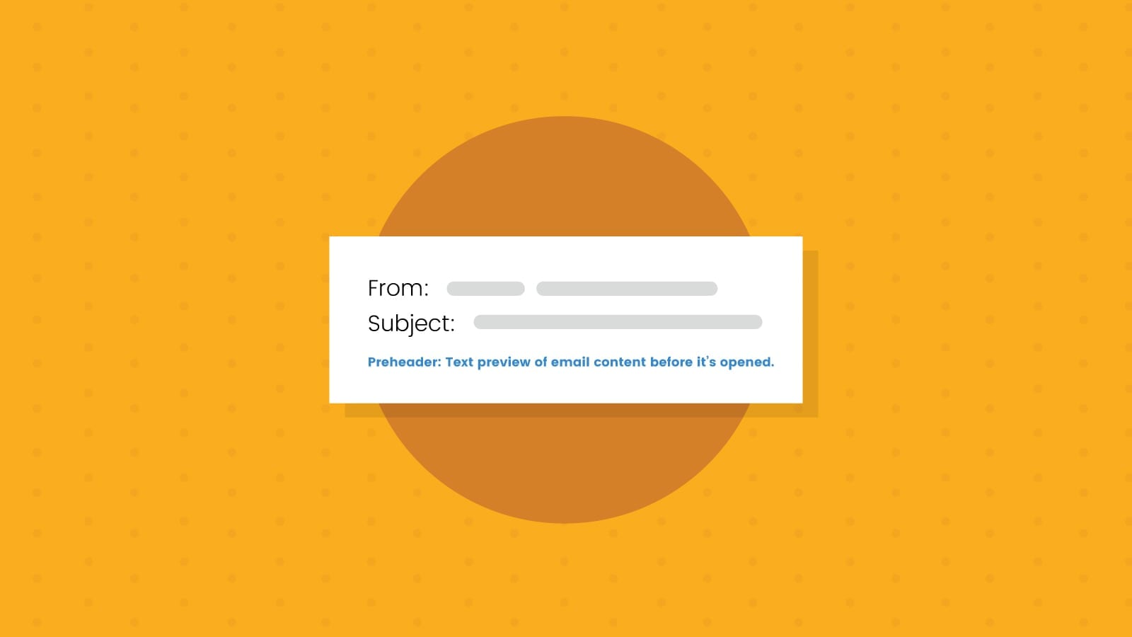
Email preheader text (abbreviated as PHT) is the line of copy that appears in your inbox right after the subject line. Where it appears varies based on the inbox provider—for example, in Gmail, it appears as a lighter, gray line of text either below (in the app) or to the right (on desktop).
Here are a view examples from Gmail showing brands that know exactly how to take advantage of email preheader text:

This convention is left over from one of the staples of direct mail: The Johnson box. This is a line of text at the top of most direct mail that can be seen through the clear pane of an envelope. Looks like some aspects of marketing never change, huh?
Email preheader text vs. email preview text
You may have heard email preheader text referred to as “email preview text.” And while they are often used interchangeably, there’s a subtle difference: Email preview text is what appears in the inbox, while preheader text is what appears at the top of your email in the code (before the header…hence, preheader).
While there are some instances where you would keep your preheader and preview text different (more on this below), for most email marketing campaigns, they’re the same. That’s why you’ll see folks use the terms interchangeably.
Why you shouldn’t skip writing email preview text
If you don’t write an email preview text, the mailbox provider will pull the first line of text from your email body. This is where the distinction between preview text and preheader text comes in—you can set your preheader text to be hidden, but your preview text will always appear. Below your carefully optimized subject line chosen through rounds of A/B testing, a subscriber might see “Can’t read this email? View in the browser,” an unsubscribe line, random code, or sometimes even a URL.
In other words, it can be a major missed opportunity if you don’t write email preview text:

The subject line and preheader text shown above don’t give the subscriber a compelling reason to open this email. The user can’t even tell where he or she might be able to win a trip. Timbuktu? Tahiti? Tasmania? Turkmenistan? It’s a waste of prime real estate.
Repeating your subject line text (as shown below) won’t win you any points, either. It’s a waste of space and a waste of words.

Adding email preview text in your email service provider (ESP) is usually very easy. It’s often just another field right next to the subject line. Here’s a quick animation showing how easy it is to do using Sinch Mailjet as your ESP. If including preview text in your campaigns, is this simple, why skip it?

If your emails use custom-coded templates, you can still add email preview text. Here’s how to write HTML or CSS code for email preheader text to ensure your best marketing messages show up in your subscribers’ inboxes.
How long should your email preheader text be?
Your favorite email marketing answer: It depends.
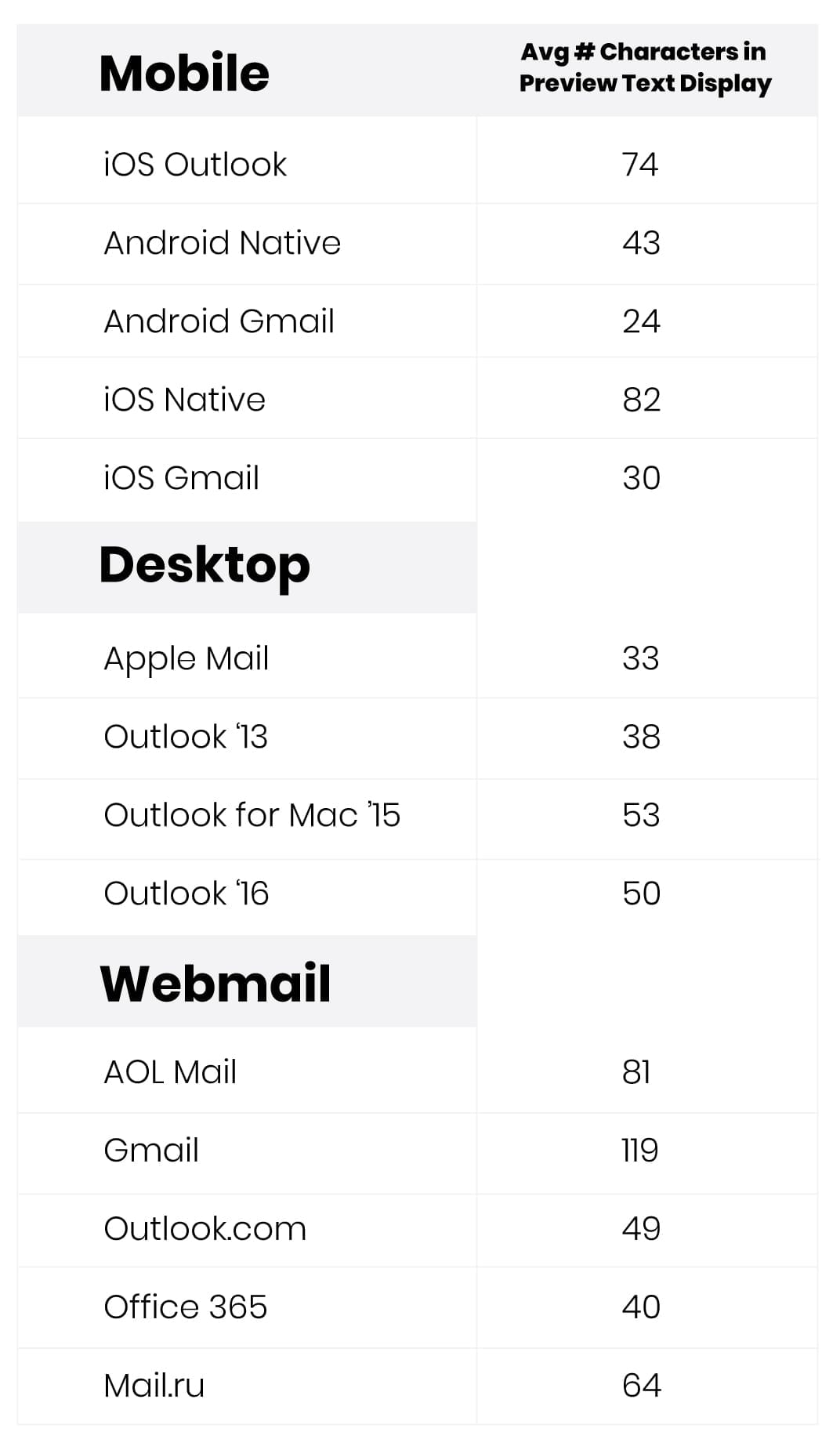
Character limits vary by email client, device, and version (naturally), so you’ll want to find a middle ground with your preheader text or optimize based on which email clients your subscribers use the most. For example, if you have mostly Outlook users, you’ll want to keep your PHT to no more than 50 characters, but the iOS Mail App allows for 84. Use this chart as a handy reference for the number of characters you have available:

In the same way that subject lines should be short and to the point, keep your preheader text as tight as possible. Here’s what a highly optimized preheader text can do for your email campaign:
10 examples of effective email preheader text to increase open rates
So, what should you write in your email preheader? Here are ten things you can do to enhance the message of your lonely subject line and produce more opens and engagement so your email content can shine:
1. Provide key details
Subject lines can only be so long. Preheader text gives you extra room for at least one juicy detail—like exactly what is on sale or some fine print on your offer. It’s a chance to give a complementary message that drives home exactly what your email is about and why someone should open it in the first place.
For example:
- Subject line: Valentine’s Day footwear sale
- Preheader text: Save an extra 10% in-store
The preheader adds an incentivizing detail, beyond just the sale announcement.
2. Elaborate or expand on the subject line
Some emails, especially newsletters, tend to be longer and touch on multiple topics. For a subject line, there’s no good way to address everything. That’s disappointing because, for different subscribers, any one of the topics could be what compels them to open the email.
Email preview text gives you the extra room you need to fit that information in.
- Subject line: Meet the new CEO at an upcoming event
- Preheader text: Plus, how to use the new HR software
This example would be for an internal staff newsletter. But the idea is, in the subject, you find out that the new CEO is at an upcoming event, and the preheader gives useful information about a different topic.
3. Tease an incentive in the preheader text
One of the great ways to use preheaders is to play it against the subject line. Both of them tease the curiosity of the subscriber, but the preheader just increases the urge to open. Instead of adding more details, tickle their curiosity or their sense of FOMO so they just have to open.
In marketing terminology, the subject states the problem, and the preheader agitates it.
- Subject line: Our biggest complaint from homeowners
- Preheader text: Do this one thing to avoid the problem
In this example, recipients are made to wonder what homeowners complain about the most to this business. But then, if you don’t take some specific action, you’ll be complaining about it too! What is it?? The preheader increases that need to know.
4. Personalize the preview text
Personalization should be an ongoing part of your email marketing strategy. And in certain situations, you can use it in the subject line or preheader text.
The idea is to help the subscriber feel like this email is just for them—because you know them and their personal needs.
- Subject line: Need some sunscreen for your boating trip?
- Preheader text: We’ve got you covered, Dave
This personalization is based on past purchase behavior and incorporates the subscriber’s first name. This customer, “Dave,” bought something related to boating in the recent past, so the company can assume that Dave likes to go out boating in the warm weather. That means Dave will need some sunscreen.
If your company is collecting past purchase information and knows some interests and preferences for your customers, you can use personalization like this to speak more directly to their needs.
5. Show your sense of humor
Humor can be tough in marketing, but when it works, it works well. The preheader can act as sort of a punchline to whatever appears in the subject line.
You might use this when you don’t want to spell out exactly what’s in the email, but want to use curiosity in a more creative and fun way. Instead of stating a problem and using the preheader to agitate it, you’re lowering barriers and resistance. This is what email marketing humor does best.
Another way to look at humor is to let it flow from your personality. If you’re a trusted source for your subscribers (which you should be), humor can flow out of that quite naturally.
- Subject line: Y’all, we are breaking the internet
- Preheader text:: But who needed it anyway?
Again, this is basically a version of curiosity. Why are they breaking the internet? And the preheader punchline just adds to the intrigue. Credit for this subject goes to Kim Phillips.
6. Ask a question
There are at least five ways to use curiosity in any type of sales copy.
- Imply you have information the reader doesn’t have
- Imply they used to know something they’ve since forgotten
- Violate expectations
- Start a sequence or story, but don’t finish it
- Ask a question that includes curiosity
The example above about breaking the internet uses number three. “Breaking the internet” violates expectations for what should happen in normal life. So, it makes us curious.
But any good question does the same thing—it must be a question that the subscriber just cannot leave unanswered. Something that goes beyond a yes-no dichotomy. Don’t ask a question subscribers can easily skip, such as, “Want to hear about our sale?” They could easily say, “Nope.”
Instead, try something that invites curiosity, like:
- Subject line: Jen boosted her conversions by 84%
- Preheader text: How do you think she did it?
You can put the question in the subject, and then add intrigue in the email preview text. Or vice versa.
7. Add a sense of urgency
This tried-and-true marketing strategy is easier to use with an email preheader, because now you don’t have to cram the whole message in one subject line.
- Subject line: 50% off this weekend
- Preheader text: But only for the first 100 customers
Urgency can come from time deadlines, limited supplies, limited openings, peer pressure, fear of missing out, and several other sources.
8. Include a call-to-action
Sometimes, the offer is the reason to open the email. So rather than beat around the bush with curiosity and intrigue, just give it to them straight and make them open it by putting the CTA right in the email preview text.
- Subject line: 3 new flavors now in stock
- Preheader text: Buy all 3, and get 3 more free
The subject line announces the news—and it’s good news—but the email preheader gives the reason to open the email, a spectacular offer presented as a call-to-action.
9. Use preheader text for branding
Here, you’re attempting to stay on the minds of your subscribers whether they open the email or not. The problem with curiosity subjects and preheaders is that for the people who don’t open them, unless your sender name is your company name, they may not even know who the email was from.
For example:
- Subject line: Are you ready for Christmas?
- Preheader text: Come to BigStore before it’s too late
Even for subscribers who don’t open that particular email, BigStore has reminded everyone on their email list that BigStore exists, and that they’re a great choice for Christmas shopping. It plants a seed. Much like a display ad, billboard, or certain TV commercials can do.
10. Use emojis in preview text
Lastly, you can use emojis in your preheader text simply to draw attention to your email among the thousands of others crowding the inbox. You shouldn’t do this every time, but it can be an effective tool when used well.
For example:
- Subject line: Last chance to shop 60% off
- Preheader text: 🚨Our sale ends tonight! 🚨
For your preheader, include an emoji’s HTML entity in the email’s code, for example, 🍔 for the cheeseburger( ) emoji in your HTML tag.
Here’s more on using emojis in emails, including in email preheader text.
5 email preheader best practices that get higher open rates
A few do’s and don’ts as you craft good email preheader text for your next email campaign—ones that increase open rates and help your click-through rates:
1. Don’t just repeat the subject line
Preheaders and subject lines are complementary. You wouldn’t repeat your subject line, email header, body copy, and CTA, so don’t repeat with your preheader text, either. Make it go together:
- Subject line: Early access to party-ready favorites starts now.
- Preheader text: Sign up for texts to shop before anyone else.
One way or another, they need to play off each other. Instead of repeating your subject line (or remixing it), use this space to your advantage.
2. Don’t use the same preheader text in every email
As tempting as it may be to “set it and forget it,” treat your preheader text like a second subject line. If you keep repeating, subscribers will quickly catch on and begin to ignore it. This is just a different version of “view in web browser.” In some cases, it will work. But most of the time, it won’t even make sense.
3. Do use the appropriate preheader length
As we mentioned above, you want to make sure you’re optimizing for the right number of characters in your preheaders. Otherwise, you’ll be back at “view in browser.”
If your subject and preheader combine to have fewer characters than the email inbox will show, then at the end of preheader text, your subscribers will once again be greeted with whatever the first line of text is in your email. Similarly, too long and you’ll cut off your message with an ellipsis. All that effort will be for nothing!
4. Do put important info first
Because of length limitations on different devices—particularly mobile devices such as the iPhone where a significant portion of your emails will be opened—you want to put the most important preheader information first, knowing that the end of it might get cut off.
5. Do hide longer preheader text in the actual email
Make sure you hide the preview text if you’re coding your emails, because you don’t want to use up valuable space on mobile devices by having the preheader text show up twice—in the preheader and the email.
Before you shy away from hidden code for deliverability reasons, know that it’s much more common now, and as long as you’re not hiding spammy words or other shady elements in your code, you should be okay to hide your preheader text.
How to add preheader text to your next email campaign
There are two ways to add preheader text to an email campaign:
- Code visible or hidden preheader text to your email code.
- Add your email preview text directly with your ESP. While every ESP is different, but many offer a spot in the campaign setup flow to add your preview text (usually after you write the copy for the email’s subject line.)
Optimize inbox display with Email on Acid
If you forget about it when you’re coding or building in your ESP, you can also add preheader text during the Inbox Display step of Campaign Precheck from Sinch Email on Acid.
Don’t neglect your subject line’s secret weapon again. The Inbox Display step of our automated pre-send email checklist shows how you can expect your subject line, preview text, and sender name will appear on the most popular email clients and devices. You don’t need to know HTML to use the tool, and the Email on Acid platform makes it easy to fix any mistakes.
And that’s just one of the many ways we can help with email quality assurance. Use the Email on Acid platform to preview how your code renders on more than 100 clients and live devices. With unlimited email testing, you’ll always be able to put your best email forward.


