Email Marketing
5 Emails We’ve Loved in April – The Coronavirus Pivot

Email Marketing

I could start this blog by saying, “We’re living in unprecedented times……” but that’s not how we roll here! Instead, let’s take a look at how brands and marketers are creating some great email messaging in the face of a global pandemic.
The best email marketing I’ve seen in my inbox comes from to brands that are pivoting messaging during the COVID-19 pandemic. According to Klaviyo, by April 23, as part of their COVID-19 daily study, they found a 300% increase in YOY email revenue for its over 18,000 clients.
It’s clear that email isn’t going anywhere, and now is a great time to capitalize in the inbox.
So, the eternal question reigns supreme—how can you stand out in the inbox? Here are some of my favorite COVID-19 pivot emails that I’ve seen over the last month.
This email is a great example of adapting your content to the current world situation— to offer a product that is helpful alongside relevant tips to help the subscriber. In this case, SelectSpecs helps protect their customers’ eyes while working from home.
I really like the strong red bulletproof CTA button. It stands out in the email, drawing the eye right there. Another great section is the ‘Why Choose SelectSpecs’ call-out at the bottom of the email. It’s an opportunity to explain SelectSpecs’ unique selling points and they pair it nicely with their reviews from Trustpilot to provide some social proof.
I would suggest making an email like this mobile responsive, which would make the content much easier to interact with and read on a mobile device. According to emailmonday, about half of all email opens come from mobile devices. It’s imperative to make emails mobile-friendly.

In this email, McDonald’s demonstrates another example of a great COVID-19 content pivot by divulging the recipe for their famous Sausage and Egg McMuffin. Though their restaurants may be closed, McDonald’s stays top of mind and provides a taste of their offering. Now that’s providing value in an email!
They cleverly play on the social media element to help gain traction by inviting subscribers to share the recipe, as well as offering a snippet of brand reassurance about the quality of their eggs.
The layout is in their signature, one-column mobile optimized design and features step by step instructions on how to make the McMuffin at home. They also feature a ‘Stay at Home’ GIF at the bottom of their content—both attention-grabbing and relevant to the current circumstances.
Who else wants to make a Sausage and Egg McMuffin now?

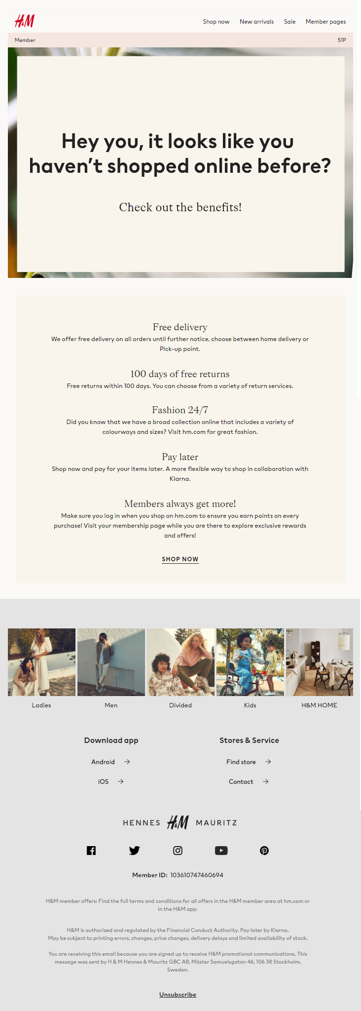
This is a great example from H&M of combining offline POS shopping data with online behavior; they know I’ve only shopped in store with them previously, and so they sent an email to showcase the benefits of shopping online. Incidentally, this email was received during the COVID-19 UK lockdown when physical stores were closed, but it remains a great example of pivoting to provide value in new circumstances.
The email also includes a subtle nod to the number of membership points the subscriber has (below the menu in the header of the email) and a recovery module menu at the bottom of the email leading to key product categories to explore.

This email from The Home Depot was received during the COVID-19 pandemic and is perfectly on message for the time it was sent— hitting on people being at home and the rise in DIY being done because of this lockdown situation.
The content starts with practical tips on how to complete specific tasks such as fixing a toilet (jobs you may usually outsource but are unable to due to social distancing) as well as leading to some key products you may need. It then goes on to detail three ways in which they can help to make shopping with them easy.
Unfortunately, the email doesn’t seem to be mobile responsive and simply shrinks, which makes the information in columns more difficult to engage with on a small screen. All the text in the email is also in as images which means that with images disabled, or slow to load, the main message and CTAs will be lost.

In this example of a more Instagram-grid-styled design, Target uses an unusual layout to stand out from the crowd—with a three-column layout consisting of 1/2 email size image and four 1/4 size email images in a block row. The theme of the email is COVID-19 stay-at-home related and on-message for the timing by offering business and pleasure electronic purchase options. They have cleverly matched the colors on images in each section to clearly define each offer, with a headline banner in between each to break them up and offer a subheading introduction and various offers.
Although there aren’t any obvious CTA buttons, each product name is linked and identified with a > symbol.
There is a short header navigation menu used at the start of the email and a longer footer menu to offer additional options.
Within the footer, there is also a ‘Subscribe’ option, to allow anyone who has been forwarded the message, an easy way to subsequently join the list themselves.

By now, we’ve all had to adapt our messaging, because life as we know it has changed completely. The most effective way to adapt messaging is by providing value, as demonstrated by these examples. Your subscribers and customers may not have the same needs as they did before, but that doesn’t mean you can’t meet their new concerns. Hopefully, these examples will inspire your next email marketing campaign and help you stand out in the inbox.
Want more great examples? Check out EmailDesignGuru.com from eFocus Marketing– a brand new site dedicated to inspiring great email marketing! Got a great example that you’re proud of? Submit it to us on the site!