Email Marketing
10 Email Newsletter Mistakes Marketers Should Avoid
Creating a successful email newsletter is quite an undertaking for a marketer. There’s content, design, send frequency, and subscriber lists to consider.
Then, once you’ve done all that work, you need to test the design and make sure your code doesn’t break somewhere in the process. And of course, after you send the newsletter, there are important metrics to track.
Phew, it’s exhausting just talking about it.
Here at Email on Acid, we’re big fans of testing different newsletter strategies and finding out what works best for our subscriber base. In fact, we recently revamped our monthly newsletters and we’ve been experimenting as we work on the new design. We also love subscribing to newsletters and finding inspiration in what other email experts are putting out there.
As we’ve tested (and observed) over the years, we’ve found there are many things that can go wrong in an email newsletter. So, we’d like to save you some time and list some of the biggest email newsletter mistakes you should avoid:
Before you spend hours designing a newsletter and writing content, stop and think: Do you need a newsletter? Do you have content worth sharing with your subscribers? If your newsletter doesn’t have anything valuable to share, users are less likely to engage, or they may click that dreaded “unsubscribe” link.
However, we don’t want to discourage you too much. When you consider your newsletter-worthy content, also consider your send frequency. Maybe you don’t have enough content for a weekly newsletter, but a monthly or quarterly send could be more robust.
2. Overloading your subscribers
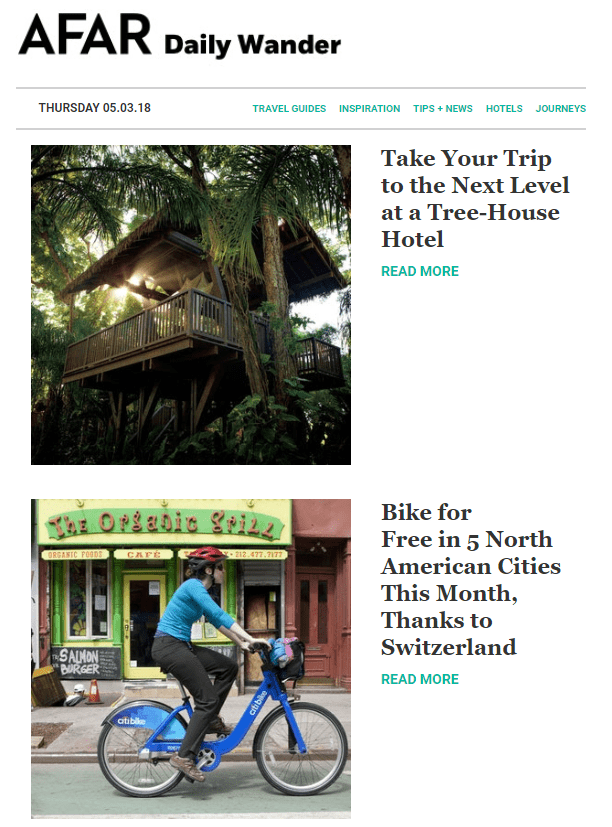
While you don’t want to include too much promotional content, the truth is you don’t want to include too much content, period. If you overload your subscribers with too many stories or long blocks of text, you risk losing their attention or burying an important CTA.
You should keep the same “less is more” mindset with your newsletter images. Clean, sleek newsletters with a few eye-catching graphics are easier to read and process.
3. Including too much promotional content
Newsletters are a balancing act; it’s important to find the right mix of useful content and calls to action (CTAs) that can convert subscribers. Don’t make the mistake of loading up your newsletters with offers and product highlights. Instead, make sure your newsletter provides content that is valuable and informative. Showing your expertise and thought leadership can help drive conversions, too.
4. Burying your most important content or CTA
Many of us have heard the phrase “burying the lede” in content writing and marketing. This phrase, which is one of the pillars of newspaper writing, means that you shouldn’t put the important content at the bottom of the story. In the case of a newsletter, don’t place your most compelling story or strongest CTA at the end of the email.
You can’t assume your subscribers will read “below the fold” (that’s another newspaper phrase) – in other words, there’s no guarantee a user will scroll through your entire email and reach the bottom. You’ll have a better chance of engaging them early in the email.

5. Having a one-size-fits-all approach
Avoid sending identical newsletters to every subscriber and instead, take advantage of dynamic content to personalize your email. Dynamic content leverages subscriber data and behavior to serve up content and CTAs that target individual subscribers. After all, a relevant email is an engaging email.
For example, you can include a module in your newsletter that offers a strong CTA or value call-out to subscribers who are not yet customers. When a current customer opens that same newsletter, you can swap out the CTA for a module that features resources to help them use your product, or include a note encouraging them to purchase a related product.
6. Not testing your email
Well, you’re probably not too surprised we included this one, right? Newsletters are often content- and design-heavy, which leaves more room for possible rendering problems. Boost your email engagement and save yourself time and embarrassment by making sure your newsletter looks right in the most popular email clients and devices. Email on Acid can help you do just that.
7. Not taking advantage of preheader text
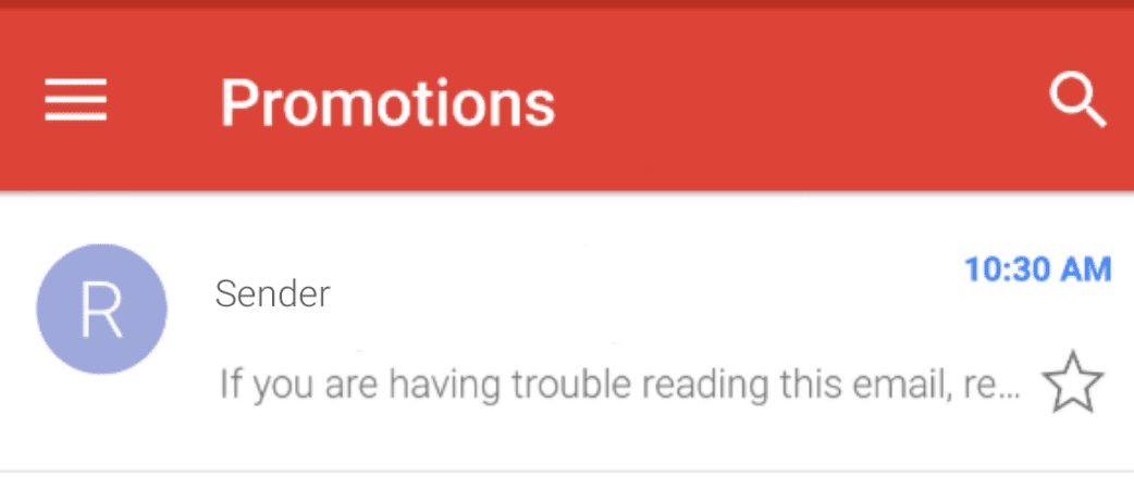
Missing or bad preheader text is one of our biggest email marketing pet peeves. Preheader text is the summary text that accompanies the subject line, and it’s another chance to encourage your subscriber to open your email. Whether it’s hidden or not – preheader text is important in all emails, newsletters included.
Social media and email marketing go together like subject lines and preheader text. In fact, there are many ways you can combine your social and email marketing to boost engagement, grow followers, and identify influencers. At the very least, make sure you include links to your social channels in your newsletter, so your followers can connect with you on more than one channel.
9. Taking a “me, me, me” approach
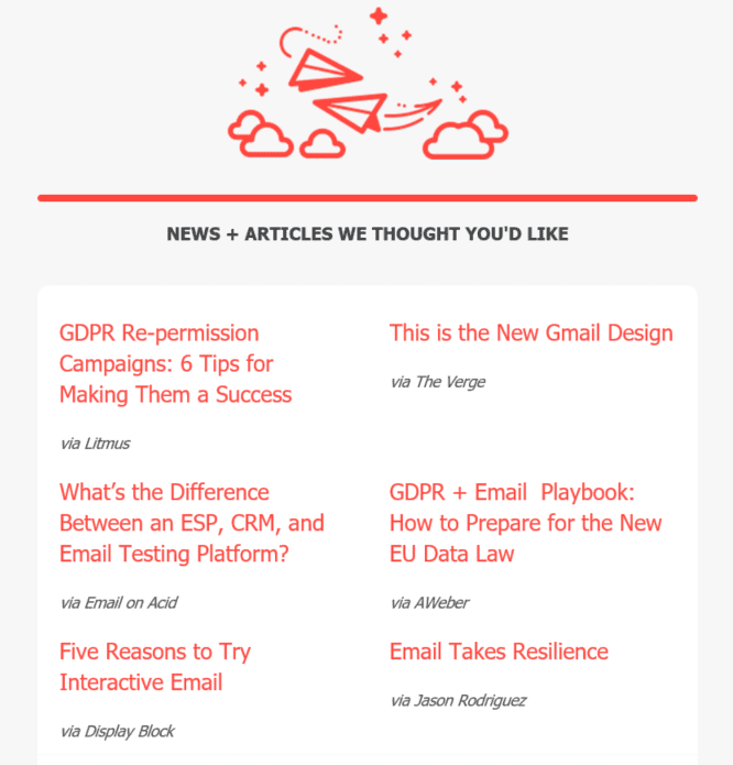
Your newsletter should, first and foremost, be a helpful resource for your subscribers. If this means sharing external content from one of your industry peers or partners – that’s fine! Sure, you may not get the traffic to your website, but it shows that you’re collaborative, friendly, and on a mission to share the best content in the industry. Plus, you may find that other brands will reward the favor and feature your content in their newsletters.
10. Not using responsive design
More than half of all email opens worldwide are now on mobile devices, and 40% of consumers say that their mobile phone is their primary device for checking email. With so many subscribers reading email on mobile devices, using responsive or hybrid design in your newsletter is crucial. Users who have trouble reading your message (or who must constantly pinch and zoom) will be less inclined to engage.
We understand that email marketers have a lot on their plate, and testing a newsletter is one more step in the process. Email on Acid can help you speed up and streamline your email editing and testing workflow, so you can get your newsletters out the door fast and flawlessly. Give our free trial a shot and see for yourself.
