What You Need to Know about CSS Fixed Positioning in Email
One of the key features of modern webkit based email clients is the support for more sophisticated capabilities in email design such as CSS animations and interactivity in email. Animations and interactivity commonly utilize CSS positioning to move elements within the email. This article will show you what can be achieved with fixed positioning. With fixed positioning, you can place an element at a specific position relative to the viewport or edges of an email. This allows an element to stay or "float" at a specific position in the window while the reader scrolls the email. On the web, fixed positioning is used as a common technique to place headers or menus that stick to the top of the page. However, as I'll show you, in email this technique has its share of quirks. Knowing the different quirks allows you to create designs using fixed positioning in email that stand out in inboxes where it works and fallback where it doesn't.
Support for Fixed Position
Fixed positioning is supported by the webkit-based email clients which includes the iOS Mail client. Other clients that also support fixed position include the AOL Webmail client, the Outlook iOS app, the earlier Android native mail clients (4.4 and older) and the Samsung Android email client. The other email clients including Gmail webmail and apps, Yahoo! Webmail and apps and Outlook.com do not support fixed positioning. Most importantly, though, it appears that Apple Mail treats fixed positioning like absolute positioning and elements are positioned relative to the email container and not the viewport of the email.Quirk: iOS Mail Toolbars obscures fixed elements
 In iOS, the viewport includes the entire screen of the device and that means that setting an element to the very top or bottom position results in the element being obscured by the top or bottom toolbars of the email client.
The top toolbar is 65px tall and the bottom toolbar is 45px tall so if you want an element to be visible while scrolling in the iOS mail client, you need to position your element either 65px from the top or 45px from the bottom.
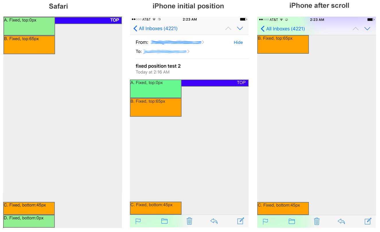
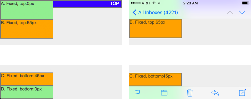
See graphic below. The green boxes have their fixed position set to the top and bottom with the height of the respective toolbars. You can see that the bottom box is always obscured by the toolbar and the top box becomes obscured once the user begins scrolling.
The orange boxes are positioned 65px from the top and 45px from the bottom and they are never obscured. The orange box appears with a 65px offset from the top initially but latches underneath the top toolbar once the user begins scrolling.

Quirk: iOS Mail does not respect z-index between fixed and absolute positioned elements
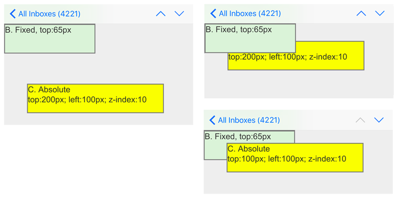
This is an interesting bug in the iOS Mail client. Basically the iOS Mail client will only respect the higher z-index of an absolute positioned element and place it over a fixed position element IF the initial position has them overlapped. Otherwise, during the scrolling of content, the absolute positioned element will always scroll under fixed positioned element regardless of their individual z-indexes. See graphic below. The yellow box is initially absolute positioned at 200px from the top with a z-index of 100. When the box is scrolled, the absolute positioned box scrolls under the fixed element even though it has a higher z-index than the fixed element. However, if the yellow box is set to be initially absolute positioned overlapping the fixed element (at 100px from the top), the yellow box appears above the fixed positioned element!
Android 4.4 Email Client
Thankfully, the Android 4.4 native email client does not exhibit the same quirks as iOS Mail when it comes to fixed positioning, and none of the fixed position elements are obscured when the recipient scrolls the email.Example: Taco Bell scrolling email
A while back I came across a Taco Bell email that was designed by the folks at eROI. The innovative email featured three characters that made three breakfast decisions (Taco Bell, Nada, Bland) and by scrolling down the user is able to follow what transpired next. The email was built with three layers with the three characters sandwiched between a top and bottom layer giving the email a 3D effect while scrolling. The layer with the characters was set to a fixed position so the characters appeared to float while the two layers scrolled above or under them. Although the characters only took up a small amount of vertical space, the layer with the characters took up the complete height of the email - most of it transparent empty space. I have a hunch this was done to address the iOS z-index quirk as mention above - where absolute positioned elements can only appear above fixed positioned elements if at least a portion of the fixed positioned element overlaps the absolute positioned element before scrolling commences. All in all, a pretty eye catching and fun email! Check out the email here if you didn't already. eROI also recently wrote about their design brainstorm that led to the design of this email.Fixed positioning ideas
Although the usage is mostly limited to iOS, there are many practical and cool uses for fixed position techniques if you have a large number of users reading your email on an iPhone. For example, you could place a fixed position menu or a call to action that stays at a specific position on the screen. This way the menu or call to action is always accessible to the user regardless of how far the user scrolls in the email. As the Taco Bell email above shows, you can create emails that engage and delight the recipient as well.Other clients and Fallback Content
A key consideration is that since fixed position is not supported by Apple Mail this technique can only be used on webkit based mobile clients which is a bit of a shame. You can initially hide your fixed elements using this technique and display them within a max-device-width media query.@media screen and (max-device-width : 1024px) {
.fixed-elements {
display:block !important;
max-height: none !important;
….
}
} An upcoming article will feature some other cool things you can do with fixed positioning in email, so stay tuned! What cool examples of fixed position in email have you seen or created? Let us know in the comments below!


