Email Development
How to Start Building an Effective Email Design System

Email Development

A lot of email marketers rely on templates to get the job done. There are also developers who build email campaigns from scratch. Some of us like to improvise, others prefer having a strict set of rules applied to a brand’s emails.
Whatever your approach might be, any email marketing team will benefit from having a defined email design system.
In a way, it’s the best of both worlds. An email design system leads to consistency, but it also gives you flexibility. It’s efficient, but it also leaves room for creativity.
Over the past several months, I had the opportunity to build an amazing email design system with some of my colleagues. We did it for three brands simultaneously. And while it took some work to set up, it’s already saving us a ton of time.
In this article, we’ll give you a peek behind the scenes. Let’s explore how marketers, designers, and email developers can work together to define a design system that makes everyone’s life a little easier.
A design system includes a set of standards used to create a collection of reusable components. These components (or email modules) share a consistent visual style, which typically follows brand guidelines.
It’s helpful to think of a design system like a set of building blocks or Lego bricks. Each component is a block, and you can use those content blocks to build a variety of things.
In addition to creating a library of pieces used to build digital assets (like landing pages, newsletters, or advertisements), the design system should also define how components are used and explain why they are effective.
In an email design system, you’ll have headers, footers, titles, CTA buttons, hero images, and logos, just to name a few potential components.

So why should your team take the time and effort to create a design system for email marketing? I recently talked to my colleagues, Sr. Graphic Designer Francois Sahli and Email Marketing Manager Julia Ritter, about how the system benefits all three of us.
Here are five of the key advantages:
An email design system helps you get the job done a lot faster. So, one of the biggest benefits is the amount of time you’ll save.
Depending on the complexity of the campaigns you design and develop, I feel confident saying that an email design system could shave hours off the production process. With our new design system, an email that requires an entire workday to code can be developed in just a couple of hours.
It takes the pressure off when we get last-minute requests, and it causes minimal disruptions to our schedule because we can turn things around fairly quickly using the email design system.
One of the biggest reasons a design system saves time is because so much is pre-built. As Email Marketing Manager Julia Ritter puts it, we don’t have to “bug each other” as often. The system gives us the flexibility to do more in less time.
For example, because Julia has some basic HTML editing experience, she can use components to assemble common emails, such as newsletters for our three brands. And she can do it with minimal design and development requests. The design system gives us flexibility with out-of-the-ordinary emails too.
If someone outside the email team needs us to create a campaign, they can use our email design system as a starting point. They could say, I want this style of headline and this CTA.
The prebuilt components and predefined styles give us the flexibility to be creative within a set of standards.While it’s not the same as drag and drop email building with a WYSIWYG editor, it’s almost like choosing toppings from a build-your-own pizza menu.
One thing that Senior Graphic Design Francois Sahli loves about our email design system is that he can be 100% certain we’re following brand guidelines. In this case, we were dealing with the brand identity of not one but three brands. The system ensures the right colors, typography, and logos are being used in every email.
However, consistent email code is also important. An email design system gives us a single base of trustworthy code to work with. And, because it’s already been tested, the QA process goes much faster.
What you get with an email design system is a shared workflow for email production, which helps keep things consistent because everyone is playing by the same rules.
Without an email design system, your production process for a new campaign might look a lot like this:
In between each of those steps, there’s a lot of back-and-forth between the team: requesting assets, getting clarifications, and making tweaks.
Not only does that take time, but when you start email production from scratch, you leave a lot of room for mistakes. That could be a typo, a bad link, or a campaign with code that doesn’t render correctly in certain email clients.
When Email on Acid partnered on a survey with Holistic back in 2020, we found that 60% of respondents admitted they’d sent an email with an error over the previous 12 months. Mistakes were somewhat more likely within larger email teams with more “cooks in the kitchen.”
The consistent design, trustworthy code, and repeatable process of an email design system help improve accuracy and help you avoid those costly email mistakes.
Once the design and development are done, you just have one last check at the end of the process to make sure everything is alright. But you don’t have to rework everything every time.
An effective email design system should also grow with your strategy, team members, and organization. The system makes it much easier to build new emails, add components and modules, or make universal changes across campaigns.
As Francois explains, rather than having to start from square one, you just make the necessary tweaks and keep moving forward.
Instead of reinventing your email designs every time, you can just make incremental changes to the design system, which is more manageable.
For example, if we want an interactive map for an email in the future, we’d build it based on our existing standards. Then it becomes part of the design system and is ready to go the next time it’s needed.
If we update the logos or colors for our brands, the design system makes it easy to implement universal changes. If we were to add a fourth brand, the email design system provides a guide that helps us scale up quickly and efficiently.

Now that you understand all the advantages of an email design system, let’s take a closer look at what goes into the process of putting it all together.
This will definitely be a collaborative project. Marketers, designers, and developers have got to work together to agree on the best solutions. So, don’t go rogue and try to do it alone.
The first step is reviewing all the types of emails in your existing program. Julia and I went through all of the email templates for each brand (Mailgun, Mailjet, and Email on Acid). That helped us understand what we needed from a big picture perspective.
Every organization will have different types of emails. There could be transactional emails for ecommerce, webinar emails, newsletters, promotions, reminders, and more.
If you’ve recently done an email marketing audit, that should help you take inventory of all the ongoing campaigns, email automations, and newsletters.
In fact, I wouldn’t start creating any assets for the email design system before auditing everything first. That’s the only way to see what you do and don’t need.
After getting our heads around the different emails each brand sends, we set to work identifying the individual components used to build those emails.
At this point, Julia and I were digging into the details. What did we like? What did we want to get rid of? What seemed to be working and what wasn’t? It’s a little bit like de-junking your home and deciding how you want to redecorate.
Don’t forget about the different types of layouts you’ll want for your emails:
Simplification was definitely part of the process. We knew our design team wanted to create clean emails without an overabundance of visuals, and we already had our existing brand style guides as a reference.
Once we had a list of the components (or building blocks) for our email design system, we took it all to Sr. Graphic Designer Francois and started discussing how we all wanted these email modules to look and function.
This step included some design research. We looked at email designs from other brands to get ideas for how we wanted to adapt and refresh our own campaigns.
One of Francois’ inspirations came from Invision. It’s a collaboration tool our team uses to pass design prototypes along to developers. In fact, Invision has some great advice on design systems. We could tell they were using one in their email marketing efforts.
Their emails are really clean, have good structure, and don’t include many unnecessary visual elements. You can see that they have a modularity in their library.
When our trio found design ideas we liked, we also looked at the code to find out more about how developers built them.
Systems have rules that need to be followed. And, while I’m all for bending the rules of a brand style guide when it makes sense, those guidelines totally helped define our email design system.
Because Francois had already established style guidelines for our brands’ web designs, he could jump right into designing our email components. However, there were some specific challenges to consider, such as the fonts used in emails.
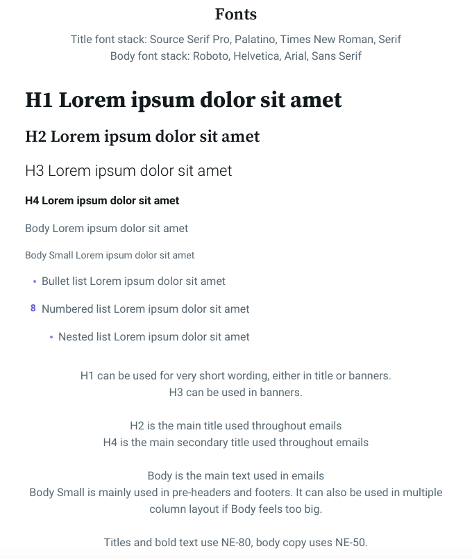
Since some email clients don’t render web fonts, email developers use font stacks. It’s a list of fonts in the font-family CSS declaration, which indicates which fonts you prefer. If your preferred font isn’t supported, it moves to the next best choice.
You have to be careful with font stacks. Your fallback fonts should not only have a similar look, but a similar height and width to all its characters as well. Otherwise, a font that’s too wide could break the layout.
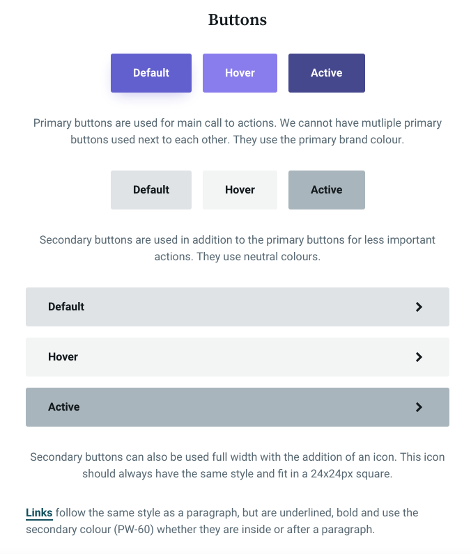
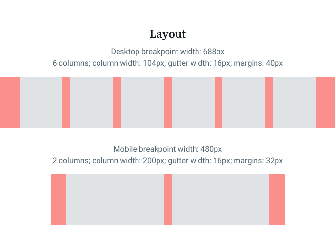
The preferred fonts went into a document Francois created as a guide for email development. It also provides a lot of other helpful information:
These are our “design system rules,” which includes an explanation of how various elements and components are meant to be used within our emails.


Now that we had our plan of attack, and a blueprint to go with it, Francois could start building our design library and passing it along to me to code things up.
Francois took components and made them work in email by starting with a grid layout. Before email development began, Francois sent his mockups to Julia, myself, and other stakeholders for review, and he made adjustments until everyone was happy.
After I got the approved designs, I thought through the best way to code individual components and the actual email templates. You’ll want to avoid having overly complex code so that it’s faster and easier to edit.
That being said, I also had to get even more granular than design when coding components for the design system. For example, I developed components that are the shells of one column, two-column, and three-column content blocks. Within each of those shells, I then build other components like images, text, and CTA buttons that work with the different types of layouts.
Doing this allows me to control each thing separately. But I also coded it up in a way that’s really easy to edit quickly. Essentially, it was almost like I created my own customized MJML system for our emails.
To get the most out of your email design system, you’ll need to build a collection of reusable pre-coded components that you can easily access when needed.
It’s best to use a code editor that gives you the ability to save snippets right within the software. You could save out your HTML and grab it when needed, but that’s not the most elegant or efficient method. Having a library of trustworthy code at your fingertips is the whole point.
If you use Adobe Dreamweaver to code emails, you can save your library there. Sublime Text, which is popular with some email geeks, lets you save code in folders too. However, free tools like Alter.email do not.
I used Parcel to code and archive our new email design system. Parcel is great because it’s built to be a platform dedicated to email development. As I went through this process, I worked closely with Parcel’s founder, Avi Goldman. He helped me make the most of the tool and find even more efficiencies to create components.
Once I’d coded up components, I could then assemble those blocks to create new email templates. Finally, I documented explanations of my code so that new developers, designers, and marketers who are unfamiliar with the system can get up to speed.
There’s one last step before you’re ready to start sending out campaigns with your new email design system – testing. We ran all of our email templates through Email on Acid’s Campaign Precheck.
The automated pre-send checklist evaluates the templates for potential issues surrounding email accessibility and deliverability while providing email previews on dozens of clients and devices. This helps ensure we’re delivering an ideal inbox experience to every subscriber.
We can also use Campaign Precheck to test the emails we send using those new templates. The platform helps catch typos and bad links while optimizing images and optimizing inbox display.
In addition to email pre-deployment testing, the email marketer on our team reminds us of the importance of A/B testing as another way to get the most from the email design system.
You can start with your best ideas of what will work in the design system, but what works for you may not work for your audience. Every list is different, and you won’t know what your subscribers respond to until you test it.
Thankfully, design systems are built to be flexible and scalable. So, when split testing reveals a more effective design choice, you can easily incorporate that into the system.
Earlier, I mentioned that when I was developing email components, I basically created my own coding system. I also talked about how Parcel was an integral tool when creating our email design system.
Parcel really helped us improve our design system game and I’m excited to show you all more about how it works. What we were able to do with it is going to save email developers tons of time, and Avi and I plan to tell you more in the near future.
Just to give you a hint, it involves the Components feature of Parcel, and it provided a ton of speed, efficiency, and flexibility as we worked to build a unified system for three brands.
Keep an eye on the Email on Acid blog and subscribe on YouTube so you don’t miss out on the sequel to our behind-the-scenes adventure into email design systems.