Email Development
How to Use Media Queries in HTML Emails

Email Development

Wouldn’t it be nice if every email looked the same in every email client, and on every device?
An email developer can dream. But since that’s not the case, we’ll cover one of the most useful tools in any developer’s toolbox to optimize designs for different devices and viewports: the media query.
If you’re familiar with media queries for web coding, they work pretty much the same way, except that you can’t nest them. Otherwise, there are a few other use cases for media queries in email that might prove helpful.
Media queries are part of CSS3 and allow developers to customize their content for different presentations or devices. These blocks of code are placed in the <style> block of your email that controls how your email appears at different sizes. They typically look like this:
                                 /* When the browser is at least 600px and below */
 @media screen and (max-width: 600px) {
   .element {
     /* Apply some styles */
   }
 }
A media query consists of an optional media type (all, handheld, print, TV, and so on) and any number of optional expressions that limit when the query will trigger, such as width, pixel-density, or orientation.
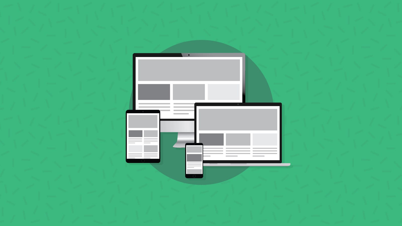
Chances are, you’ve seen media queries work in the real world. They’re one of the best ways developers and designers can create responsive emails optimized for mobile. Media queries do this by detecting device or display width and changing the design of the email accordingly.
Here’s how that works:
Responsive emails are the most common reason why you’d use a media query in an email, so let’s talk through what that looks like step-by-step.
Say you’re coding a newsletter using a two-column format, with an image on the left and text on the right. That won’t work on most mobile screens — or at least, isn’t the best experience — so you’re going to want to use a media query to adjust the design for mobile. In this case, most designers would stack the images on top of the text for mobile designs.
Media queries tell the code when and how this should happen, usually using two attributes: min-width and max-width. A simple media query sets both of these for a given device or viewport size.
Here is an example of a min-width query:
@media only screen and (min-width: 600px) {...}
What this query really means, is “If [device width] is greater than or equal to 600px, then do {…}” In this case, you would default to the two-column style.
So, if the email is opened on an iPhone 13 Pro, with a viewport width of 390px, the media query will not trigger and the styles contained in { … } will not take effect.
Then, you would set your max-width query:
@media only screen and (max-width: 600px) {...}
What this query really means, is “If [device width] is less than or equal to 600px, then do {…}” In this case, you would stack the images into one column.
So, if the email is opened on an iPhone 13 Pro, with a viewport width of 390px, the media query will trigger and all of the styles contained in { … } will take effect.
You don’t have to do them one at a time, though. Here’s what it looks like combined:
@media only screen and (min-width: 400px) and (max-width: 600px) {...}
You can use these queries together to target a specific range of screen sizes.
The query above will trigger only for screens that are between 400px and 600px wide. You can use this method if you want to target a design for a specific device with a known width.
But that can get repeatable and clumsy if you’re trying to hold every single recent iPhone, Android, iPad, and Google Pixel in the same query. Androids in particular vary widely in screen size, and most manufacturers release new phones every year. You may have plenty of subscribers still hanging on to their old iPhone 8s!
Most media queries are set to trigger at certain screen widths or breakpoints, to give a range rather than target a specific device. Here’s an example provided by W3schools:
| Breakpoint Setting | For Device |
| max-width 320 px | Smartwatches |
| max-width 420 px | Smaller devices |
| max-width 600px | Phones |
| min-width 600px | Tablets and Large Phones |
| min-width 768px | Tablets |
| min-width 992px | Laptops and Desktops |
| min-width 1200px | Monitors, Desktops |
But most developers don’t think about every single breakpoint in their queries. When coding a responsive email using media queries, a common technique is to create tables with align = “left” and a special class to target inside the media queries. For example, a two-column section might look like this:
                                <table role=”presentation” border="0" cellpadding="0" cellspacing="0" align="center" class="deviceWidth">
    <tr>
        <td style="padding:10px 0">
            <table align="left" width="49%" border="0" class="deviceWidth">
                <tr>
                    <td>
                        ...
                    </td>
                </tr>
            </table>
            <table align="left" width="49%" border="0" class="deviceWidth">
                <tr>
                    <td>
                        ...
                    </td>
                </tr>
            </table>
        </td>
    </tr>
</table>
Each of the tables with 49% width can fit side-by-side when on “desktop” view. We use 49% instead of 50% because Outlook can be very picky about what fits side-by-side and what doesn’t. You can use 50% width if you set all your styles right (no border, padding, etc).
If you want to create a three-column section using similar code, set each table to 32% width.
When the responsive code kicks in, we’ll want to make these content blocks 100% width for phones, so they fill the whole screen. A single media query will handle this for most phones:
                                @media only screen and (max-width: 414px) {
    .deviceWidth {
        width:280px!important;
        padding:0;
    }
    .center {
        text-align: center!important;
    }
}
You can continue to add media queries with special styles to cover as many different screen sizes as you’d like. You should also add code to your media queries to optimize font-size and line-height for each screen size. This will improve readability for your recipients and make sure your email looks like this:
But that’s not the only major use case for media queries — we’ll dive into how and why to use them below.
You can also use media queries to target device orientation, not just viewport size. Going back to that two-column layout example, it might work if a phone or tablet is in landscape mode, but not in portrait mode. Here’s an example of what that looks like:
@media screen and (orientation: landscape) { ... }
In most clients, the landscape media query will always trigger regardless of orientation. So, if the email is opened on a phone or tablet in portrait mode, the email will look just like the responsive email we coded above, stacking images above one another. But if it’s opened in landscape mode, the email will appear in a two-column format.
Unfortunately, this query doesn’t work well in iOS Mail.
Every client is slightly different, and media queries are one way to address those differences.
When it comes to Yahoo! Mail inboxes, there is a media query you can try using that specifically targets this email client. You could use this media query and add styles that only trigger in Yahoo!
                                <style type="text/css">
    @media screen yahoo{
        { /* Place your styles here */ }
    }
</style>
This can be used to address layout or rendering issues that you see only in Yahoo! Mail or to include messages intended only for Yahoo! Users.
Another application of media queries that can be quite useful is defensively coding for dark mode. Some email clients won’t change your email design at all, resulting in a really poor email experience — either by completely inverting the colors of your email, rendering it inaccessible and unreadable or by keeping it bright when they’ve initiated dark mode, hurting their eyes.
To prevent this, you can display different designs for dark mode using this media query:
@media (prefers-color-scheme: dark )
Unfortunately, not every email client supports media queries. What would the life of an email developer be without curveballs thrown by specific email clients? (Yeah, it’s Outlook and Gmail…it always is.)
Here’s a rundown of which email clients support media queries, and which do not:
| Client | Supported? |
| Apple Mail macOS | Yes |
| Apple Mail iOS | Yes |
| Gmail (web/desktop) | Partial |
| Gmail (Android) | Partial |
| Gmail (iOS) | Partial |
| Gmail (mobile app) | No |
| Outlook (macOS) | Yes |
| Outlook (iOS) | Partial |
| Outlook.com | Partial |
| Outlook (Android) | Partial |
| Outlook (Windows Mail) | No |
| Outlook (Desktop 2007 – 2019) | No |
| AOL | Partial |
| Yahoo! Mail | Partial |
| Samsung Email | Yes |
| Mozilla Thunderbird (60.3) | Yes |
(Thanks to our friends at Can I Email for the info. Check them out for the latest on media queries and more.)
You’ll find strong support from clients using WebKit, but you’ll need to use workarounds for inconsistent support in Gmail. For example, you can use min-width and max-width for responsiveness, but not (prefers-color-scheme) for dark mode emails.
With inconsistent support across email clients and different designs for mobile and web, testing becomes essential. Especially for finicky clients like Gmail, where anything wrong in the CSS renders the email unreadable. Email on Acid offers unlimited email testing in major mailbox providers and the most popular devices. That means you can make sure your email looks good before it hits the inbox. Want to see for yourself? Take advantage of our free, seven-day trial.
This article was last updated in November 2021. It was previously updated in February 2019 and first published in October 2016.