Email Development
Introducing the Filmstrip Interactive Email Technique

Email Development

Nov 29 2017 Update: This article has been updated to display a fallback on Gmail on Android as it no longer works on that client.
You’ve read all about interactive emails. You’re thinking this is really cool, that you should give it a try. Then you find out there’s all these weird CSS things you need to know (because Javascript isn’t supported in email – duh) – hidden radio buttons, the “checked” selector and “sibling” selectors. All this JUST to build a simple interactive carousel in email?
Then you realize they’ll only work in the iPhone email client. Wait a minute! What about the other half of my audience that reads their email on the Gmail app on an Android phone? This doesn’t sound so appealing anymore.
But what if I could teach you a method to create an interactive email using the HTML skills you’re already familiar with – basic CSS and links. That learning the concept is as simple as visualizing images captured on a strip of film by an analog camera.
What if I told you this method works on both the iPhone email client AND the Gmail app on Android as well. Interested?
Well let’s get started!
The simplicity of the filmstrip technique lies in the use of named anchors. Yes, those a tags containing a name attribute that allow you to jump from one part of an email to the next.
                                <a href="#foo">Click here</a>

<a name="foo"></a>
Content here...
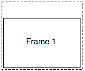
By stacking blocks or frames of content separated by named anchors and placing them within a container that is sized to show only a single frame, you can display any frame by referencing the anchor name in a link.
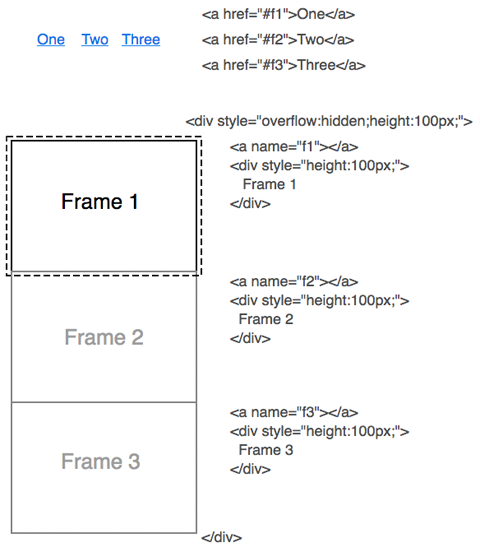
Think of it like a strip of film. Remember those rolls of celluloid you capture photos with before the advent of digital cameras? Well in our case we capture the state of each interaction as a frame in a vertical strip that we selectively display in the email client.

Normally, named anchors are used to segment content in an email and clicking on a link that refers to a named anchor will scroll the email to the location of the anchor. However since these anchors are hidden inside a container, clicking on a link referring to a hidden anchor has the effect of shifting the frame into view.
Strangely, although regular named anchors don’t work in the iOS email client, they work when placed within a “window”.
                                <a href="#f1">One</a>
<a href="#f2">Two</a>
<a href="#f3">Three</a>

<div style="overflow:hidden;width:200px;height:100px;">
  <a name="f1"></a>
  <div style="height:100px;">Frame 1</div>
  <a name="f2"></a>
  <div style="height:100px;">Frame 2</div>
  <a name="f3"></a>
  <div style="height:100px;">Frame 3</div>
</div>
Although the name attribute in anchors are technically deprecated in HTML5 in favor of simple ids, they still work in modern browsers. This technique will not work in the Gmail App if your link refers to an id instead of a name.
Update: Unfortunately due to a Gmail Android update, this technique no longer works on that client.
The following table lists the email clients that this technique will work in. For the clients that don’t support this technique, you’ll need to ensure you have an alternative or fallback design to display in the other clients.
Here’s where Email on Acid comes in handy. Email on Acid’s email testing lets you quickly see which of the dozens of email clients are rendering your fallback vs interactive design and if something is not looking right.
| Windowed Name Anchor Support | |
|---|---|
| Android 4.4 Native Client | |
| AOL Mail | |
| Apple Mail | |
| Gmail App (Android) | |
| Gmail POP/IMAP * (Android) | |
| Gmail Webmail | |
| iOS Mail | |
| Outlook (Mac/Windows/iOS/Android) | |
| Outlook.com Webmail ** | |
| Samsung Native Client | |
| Yahoo! Mail App (iOS/Android) | |
| Yahoo! Webmail** |
* Gmail POP/IMAP aka Gmail Android for Non Google Accounts (GANGA) ** This technique works works inconsistently in Outlook.com and Yahoo! Mail
Now you’ll be able to design interactivity that the majority of users of email clients on iOS and Android can see. This technique works in the Gmail app for Android, Android 4.4 and Samsung native clients. This technique won’t work in the Outlook, Yahoo! Mail and Gmail iOS apps as well as the Gmail Android app when set up with a non-Gmail account.
No more long chains of checked and sibling selectors to deal with, it’s just links and named anchors.
You still need CSS to style your email, but all the interactivity lies completely in HTML making the coding process straightforward. Although CSS is used to detect and control when to show the interactive and fallback versions, that code shouldn’t need to be changed between designs.
Some email service providers (ESP) *ahem MailChimp!* strip checkbox and radio elements in emails which limited their customers’ ability to send interactive email. Since this method only uses anchors, customers of these ESPs can finally send interactive email.
There’s often tradeoffs when it comes to email design and this is no exception.
Although regular named anchors work in Gmail webmail, this technique does not work in Gmail webmail. Apple Mail and Outlook for Mac supports the older checkbox technique but this technique won’t work in it. A follow up article will show ways to get support on the Mac using a combination technique.
The simplicity of the technique can also be a limitation. This filmstrip technique true to its namesake requires that all the interactive frames be of the same size. However, you can use media queries to create different fixed dimensions based on the size of the screen of the client (such as between tablet and mobile).
Another feature of the checkbox technique is that you can toggle the display and hiding of elements such as a hamburger menu using the state of the checkbox. (I am experimenting with some techniques to achieve the same effect with the filmstrip technique).
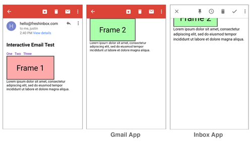
In Android clients (Gmail, Inbox, Samsung and Android 4.4) when the recipient triggers an anchor, the email client will scroll the email so the the new frame is displayed right below top of the message window. So if your trigger links are above the container, the recipient will need to scroll your container down each time the recipient wants to click on a different link.
In the Inbox App, the container will also be slightly obscured by the toolbar when the container is shifted. The detection and fallback code we will use will exclude the Inbox App.
The following is an implementation of interactive tabs using the filmstrip technique.
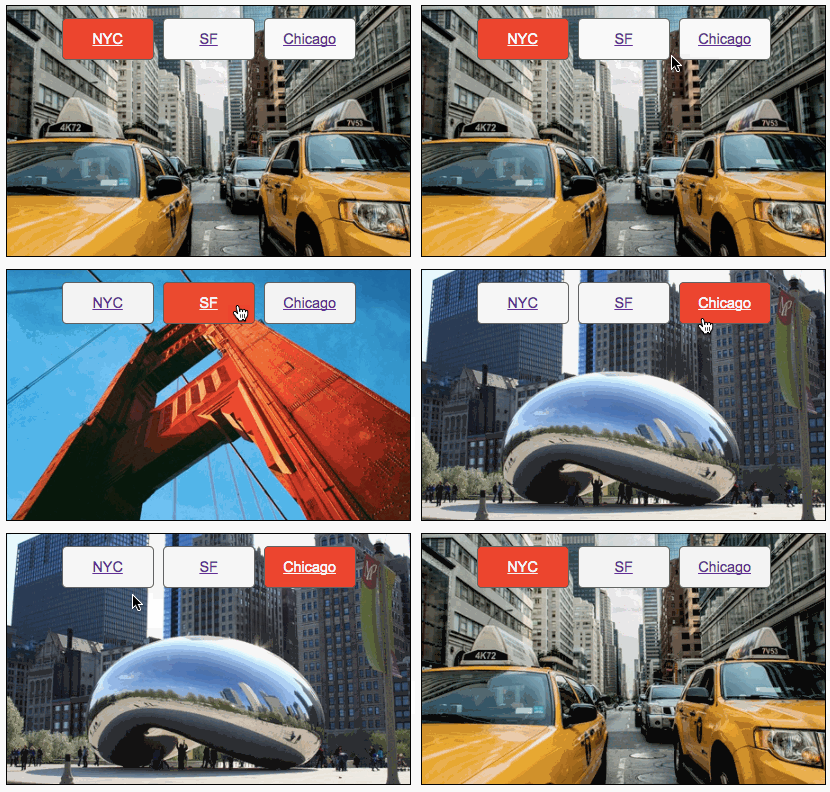
The tabs are styled links that link to named anchors above the individual frames. Instead of placing the tabs at the top of the container, the tabs are included inside every frame. This technique allows you to easily highlight the active tab and address the scroll issue that was mentioned earlier.
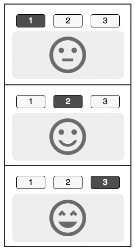
We want to show a different block of content for clients that don’t support windowed named anchors. We begin by showing the fallback by default and hiding the interactive content.
                                <!--[if !mso]><!-->
<div class="interactive" style="display:none;max-height:0;overflow:hidden;">
  INTERACTIVE CONTENT (PUT FILMSTRIP CODE HERE)
</div>
<!--<![endif]-->
<div class="fallback">
  FALLBACK CONTENT
</div>
Then with CSS and media queries we can selectively enable interactivity only for supported clients. First we enable interactivity in iOS 10+ Mail clients using a @supports technique discovered by Rémi Parmentier. Note because Gmail strips out style blocks containing @supports, it needs to be placed in its own <style> block.
                                @supports (-webkit-overflow-scrolling:touch) and (color:#ffff) {
  ...
}
Next we enable interactivity by targeting Gmail and Inbox apps in Android. We do this by using a Gmail targeting technique pioneered by Mark Robbins that only targets the Gmail Android client. (I’m using a shortcut that requires you to not use the <u> tag in your email content).
                                /* This technique no longer works in Gmail on Android as of Nov 2017 */
/*
div > u ~ div .interactive{
    display:block !important;
    max-height:none!important;
}
div > u ~ div .fallback{
  display:none!important;
}
*/
And finally we add the Samsung email client by targeting its unique container id of #MessageViewBody.
Verifying which version shows up on which email client can be a really tedious process. Email on Acid’s email testing can help save you hours when building interactive designs as you’ll be able to quickly see the impact of your code changes in over 60 different email clients in a single test.
The resulting interactive detection code below should be placed in the <head>:
                                <style>
/* Using @supports to ONLY target iOS Mail 10+ */
@supports (-webkit-overflow-scrolling:touch) and (color:#ffff) {
    div[class^=interactive]{
      display:block !important;
      max-height:none!important;
    }
    div[class^=fallback]{
      display:none!important;
    }
}
</style>
<style>
  /*
   Enable for Gmail on Android
   This no longer works as of Nov 2017
  */
/*  div > u ~ div .interactive{
    display:block !important;
    max-height:none!important;
  }
  div > u ~ div .fallback{
    display:none!important;
  }
*/
  /* Enable for Samsung App */
  #MessageViewBody .interactive{
    display:block !important;
    max-height:none!important;
  }
  #MessageViewBody .fallback{
    display:none!important;
  }
</style>
Having the interactive content hug the top of the window when the user interacts with it may not be visually pleasing. One solution is to specify a margin between the named anchor and the frame so that the frame appears below the toolbar. Alternatively you can include a static header at the top of each frame as a buffer.
Here are a few ideas to get you started: Image galleries, product walkthroughs, hotspots, and interactive storytelling modules.
View example using the Filmstrip technique.
If this has whet your appetite for interactive email, this next article covers a technique to add more clients to the list of support including Apple Mail and Outlook for the Mac.
Read about the Filmstrip+ technique.
At Email on Acid, testing is at the core of our mission. After you’ve finished setting up the perfect design for your campaign, ensure the email looks fantastic in EVERY inbox. Because every client renders your HTML differently, it’s critical to test your email across the most popular clients and devices.
Try us free for 7 days and get unlimited access to email, image and spam testing to ensure you get delivered and look good doing it!