Email Development
Our Experiment with an Interactive Email Design

Email Development

By Paul Kirby and Ed Ball
When you send an interactive email, it’s important to consider not just what code tricks you’re going to use, but also what you’re using interactivity for. Without a strategic goal, interactivity is just a way to get attention, and doesn’t offer much more than a traditional email would. With a clear purpose, you can use interactive techniques to provide additional value to readers. In the end, you’ll deliver an experience that a static email can’t match. Our interactive email example aimed to achieve just that.
With the interactive email we sent last month, our goal was to illustrate how quickly and easily our Campaign Precheck workflow finds and resolves content issues. The first step was creating both before and after versions of an email with a handful of problems. Our brilliant designer Rachel gave us that, with a short email sitting inside the image of a phone.
Here’s a slightly modified version of the original send:

Check out the interactive version
But we also needed a way for you to interact with the email and fix the issues. That’s where our developer Ed came in.
Creating a responsive rollover technique in an email is a fun way to take some simple functionality and make an interesting interactive email. Email on Acid’s email is interactive in some clients and requires a fallback in others so it renders well for every subscriber. Let’s see how it works.
Here is the CSS code for our interactive email. Hyperlinks can have four states: a:link, a:visited, a:hover, and a:active.
a:link is a selector that selects unvisited links.a:visited selects visited links.a:hover will select elements when someone hovers over them.a:active selects an active link.This example uses the a:hover selector to parse an event to switch out the top image with the bottom image.
                                <style type=”text/css”>
.rollover:hover .rollover-main {
max-height: 0px !important;
}
.rollover:hover div img {
max-height: none !important;
}
</style>
Because some email clients don’t respect the interactivity of this email, specifically Outlook, we have to wrap the interactive section in Microsoft Outlook (MSO) conditional statements.
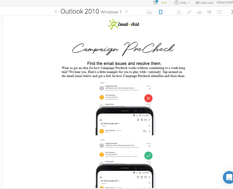
Here’s an example of how the email renders in Outlook 2010 without the MSO conditional statement hiding the interactivity. You can see how the client is rendering both images. Ultimately this is happening because the render engine doesn’t respect the <div> tag the second image is in, and therefore you see this.

These two images are basically stacked, wrapped in an anchor tag, with one image inside the <td> tag on top of the other inside a <div> tag having a class that parses an event when it gets hovered over. The classes attached to the image the <td> tag make the top image disappear on a hover event and display the other image in the <div> tag.
                                <!-- START INTERACTIVE SECTION -->

<!--[if !mso]><!-->
<span style="padding:0px 0px 0px 0px;"><a class="rollover" href="#"><img class="rollover-main" src="https://marketing.emailonacid.com/hubfs/2019EmailImages/InteractiveCPKmail/red_01.jpg" width="600" alt="" border="0" style="display:block;width:100%;max-width:600px;" /></a></span>
<table role="presentation" width="100%" border="0" cellspacing="0" cellpadding="0" class="em_full_wrap">
<tr>
<td align="center" valign="top" bgcolor="#FFFFFF"><table role="presentation"  align="center" width="600" border="0" cellspacing="0" cellpadding="0" class="em_main_table" style="width:600px; table-layout:fixed;" bgcolor="#FFFFFF">
<tr>
<td valign="top" align="center" bgcolor="#FFFFFF" style="padding:0px 0px 0px 0px;"><table role="presentation"  width="100%" border="0" cellspacing="0" cellpadding="0" align="center">
<tbody>
<tr>
<td valign="middle" align="center" bgcolor="#FFFFFF" style="padding:0px 0px 0px 0px;"><a class="rollover" href="#">
<div> <img src="https://marketing.emailonacid.com/hubfs/2019EmailImages/InteractiveCPKEmail/green_01.jpg"  width="600" alt="" border="0" style="max-height:0px;display:block;width:100%;max-width:600px;"></div>
</a></td>
</tr>
</tbody>
</table></td>
</tr>
</table></td>
</tr>
</table>
<!--<![endif]-->

<!-- END INTERACTIVE SECTION -->
The fallback is needed for email clients that don’t respect interactivity, like what happened with the email in Outlook 2010. An opening and closing MSO statement wraps the fallback and ensures it only renders on Outlook versions that require it.
                                <!-- START FALLBACK SECTION -->

<!--[if gte mso 9]>
<center>
<table class="fallback" border="0" width="600" align="center" valign="top" cellpadding="0" cellspacing="0" bgcolor="#FFFFFF">
<tr>
<td align="center" valign="top">
<table class="fallback" border="0" width="600" align="center" valign="top" cellpadding="0" cellspacing="0" bgcolor="#FFFFFF" style="padding:20px 0px 20px 0px; width:600px;">
<tr>
<td align="center" valign="top"><img src="https://marketing.emailonacid.com/hubfs/2019%20Email%20Images/Interactive%20CPK%20Email/Interactive_FALLBACK.jpg" width="600" style="width:600px;" /></td>
</tr>
</table>
</td>
</tr>
</table>
</center>
<![endif]-->

<!-- END FALLBACK SECTION -->
The trick with interactive emails is targeting specific clients the interactivity will work on. Plus, you want to make sure the email has no other rendering issues for the clients that don’t support interactivity.
Did we succeed in both delivering an engaging interactive experience and illustrating some of Campaign Precheck’s capabilities? Let us know in the comments. We hope this experiment motivates you to take a chance with an interactive email that provides value to readers too.