Email Development
How Do Screen Readers Work with Emails?

Email Development

Let’s pretend there’s an email subscriber, Kathy, who loves a specific brand of coffee. She’s part of their membership program and gets a pound of beans delivered to her doorstep every two weeks. When she finds out the brand has an email newsletter with tips for getting the most out of their coffee, she immediately subscribes.
But the welcome email she receives with a 10% off coupon is unreadable. She has a vision impairment and is using a screen reader to consume the content, but it’s a garbled mess. She has no idea what it says. Not only will she not use the coupon and purchase more coffee, she also begins to think less of the brand she previously loved because they didn’t meet her needs. If it keeps happening, she’ll unsubscribe and maybe find a new favorite coffee.
This could be your brand. But, if you understand how screen readers work with emails, you’ll have a better chance of delivering the right experience to people with vision-related disabilities.
Pathwire’s Accessibility in the Inbox survey revealed that about half of marketers say they consider screen readers during email development, but what they do shows another story. Only 14% said they address keyboard navigation and just 4% said they use semantic HTML mark-up.
One of your primary goals should be to make each email as relevant and applicable to as much of your audience as possible. Doing this leads more subscribers to engage and, ultimately, convert. And, more importantly, it gives everyone an equal opportunity to learn and benefit from great content.
Accessibility is key to achieving this goal. For an in-depth look, check out Email on Acid’s guide to email accessibility. But for now, let’s jump into the specifics of screen readers and how they work for emails.
A screen reader is a tool that helps people with vision impairments or cognitive disabilities consume content on their devices. It converts text, images, page structure, and additional elements to speech or braille. The goal is to make digital content accessible to everyone.
When operating a screen reader, people typically use their keyboard to jump from element to element on a page (more on that later). On mobile devices, people use their touchscreen for navigation. The page content is then read out loud using text-to-speech, or translated into Braille.
There are a variety of screen readers available for different operating systems, but the most common are:
In a study from WebAIM, 72.5% of respondents used more than one screen reader. The majority also used a Windows operating system.

Most people who use screen readers have a visual impairment. But it is important to note that not all users are completely blind — many are partially sighted or have conditions like glaucoma or cataracts.
By converting text and images into speech or braille, screen readers make it possible for them to understand and interact with web pages, emails, and other types of on-screen content.
Screen readers can also be helpful for those with dyslexia or cognitive disabilities that may affect their ability to consume or process words on a screen. It might be faster or easier for them to listen to content instead of reading it.
More than 2.2 billion people have some sort of vision impairment, with 217 million of them moderate or severe. If you’re not making your emails accessible to them, you’re not reaching a good chunk of your target audience.
Accessible emails are also important because you can:
Screen reader users typically navigate emails with their keyboard. Each tool has a different set of keyboard shortcuts and commands associated with an action.
For example, to go to the next heading using NVDA, you would hit the “H” key. To have NVDA read the next sentence aloud, you would hit “alt + ↓.”
Screen readers present information in the order they appear in an email. This means subscribers using these tools are unable to easily skim text to find what they want. Instead, they have to carefully listen to items one at a time until they find something they want to learn more about. They can also jump from section to section using headings, paragraphs, and “skip navigation” links.
Not only do people have to pay close attention when using a screen reader, they also have to remember a lot of information at once. Imagine going to an ice cream shop and listening to the owner list all 43 available flavors out loud for you to choose from. Sound overwhelming? That’s why it’s so important for your emails to have a logical structure and descriptive headings.
Here are a few other key ways that screen readers handle email:
Each mailbox provider has its own, slightly different way of handling screen readers. For example, when using Outlook, VoiceOver (the default Mac screen reader) will read the following information about each email in a user’s inbox: the sender’s name, the subject line, the sending date, and whether or not there are attachments.
Learn more about how Outlook and Gmail handle screen readers.
Want a real-life example of how a screen reader interacts with an email? Watch this video:
The way your email is coded can make a huge difference in making it usable for everyone, especially those utilizing screen readers. Why? Because HTML provides critical context. For example, a properly-coded button uses HTML to tell a screen reader that:
This helps subscribers navigate through your emails, find relevant information, and interact with content. Let’s take a look at a few ways you can make your HTML more accessible.
Semantic HTML markup in email is used to define the meaning of elements so that browsers and screen readers can clearly understand and interpret them. Non-semantic elements (like <div> and <span> tags) say nothing about the content. In contrast, semantic elements (like <form> and <nav>) provide more context.
Ultimately, semantic HTML helps each of your subscribers understand the meaning of your content by distinguishing between each element within the email body.
A simple first step is to define headings and paragraphs to establish structure. So, a basic email with semantic HTML might look like this:
                                 <h1> Tips for Making the Best Pizza </h1>

 <h2> Pizza Crust Styles: Which Is Best? </h2>

 <p> Traditional Italian crusts vary widely from American styles like deep dish. </p>

 <h2> Choosing the Right Ingredients <h2>

 <p> High-quality ingredients, like our zesty marinara sauce, help your pie stand out and taste its best. </p>
Without the header and paragraph tags, screen readers would consider all the content equal and simply read through the email without separation between titles and text. This would seriously impact the experience for those using screen readers and could lead to a lot of confusion.
Here are a few other semantic tags you might use throughout your emails:
View more semantic elements and examples of how to use them in this guide from W3Schools.
Semantic markup also impacts the way that you style the text within your emails. Let’s say that you want to highlight a sale, and include the following sentence:
Purchase by Friday to get 40% off our clearance styles.
Fully-sighted people would see the bolded text and understand its importance. But the bold tag <b> is non-semantic HTML — most screen readers wouldn’t announce the emphasized text and those with vision impairments wouldn’t be aware of the emphasis.
But the strong tag (<strong>) is semantic HTML — it lets screen readers know how to interpret the content and ensures that subscribers understand the meaning of the emphasized text. This is a much better way to style your email.
In summary, semantic markup helps browsers and screen readers better interpret your content so everyone can fully understand its meaning. And a better user experience ultimately leads to higher engagement, clicks, and sales.
Screen readers use alt text to interpret images and vocalize a description of the image to users. It’s critical that every single image has descriptive alt text because it’s the only way that those with vision disabilities can make sense of visual content.
Take the time to really think about the alt text you write — you may even want to involve a copywriter! Remember, you want to help people using screen readers really envision your images.
So, if the coffee shop from the example earlier had a photo of their product in an email, they wouldn’t just want to write “coffee.” Instead, they would write something like:
“Fancy coffee in a cup and saucer on a wooden table next to a laptop.”

See how that helps someone envision the image without actually seeing it?
If you’re using Email on Acid’s Campaign Precheck, you won’t need to worry about coding any of this. All you’ll need to do is decide what text to use.
A <title> tag sets the title of your email when viewed in a browser and adds valuable context for screen readers. While not all screen readers vocalize title tags by default, users can turn this setting on, so it’s best to provide it for those subscribers.
Thankfully, Campaign Precheck automatically takes care of this for you.
Remember: people using screen readers aren’t able to quickly scan your emails to find what they’re looking for at a glance. Instead, they must navigate through each item one at a time. But a skip navigation link adds a function at the top of your email that allows subscribers to jump to the main part of your content. This ultimately makes things much easier!
To do this, you would add this line of code to the top of your email:
<a href="#body">Skip to body text</a>
You would then add an internal anchor right before the main content:
<a name="body"></a>
ARIA, or Accessible Rich Internet Applications, adds descriptive information to HTML elements with the goal of improving the experience of people using screen readers. Here are a couple of simple ways you can use ARIA to improve your emails:
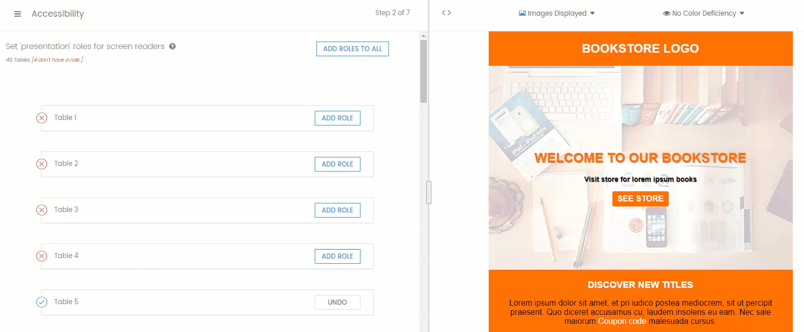
Without presentation roles, screen readers interpret tables as data and read the HTML code out loud to users — confusing! But by setting table roles to “presentation”, you provide instructions to read the table content in a way that makes sense to real people.
To do this, add the following code to each table:
role="presentation"
In context, this will look like this:
<table width="100%" border="0" cellpadding="0" cellspacing="0" style="min-width: 100%;" role="presentation">
Or Campaign Precheck will do this for you automatically.

When you add a role to a button, you tell a screen reader what it is and how to interact with it. To do this, add the following to each button:
role="button"
In context, this will look like this:
<div id="getMug" tabindex="0" role="button" aria-pressed="false">Download Your Free Guide!</div>
To learn more about ARIA tags and see additional examples, read this guide from W3C.
The language attribute tells screen readers how to pronounce and display your email. Without that attribute, it reads text in its default language, rather than the language your content is written in. Envato Tuts+ provides a great example of how a French phrase would be read with and without a language attribute.
So, if your email is written in French, you would use the following code:
lang="fr"
Here’s a full list of language codes to help you choose the right one.
Or, if you’re using Email on Acid’s accessibility tool, you can quickly choose the language from a dropdown menu and it’ll all be taken care of for you.
Text labels provide clarity to screen readers about elements like links and buttons. They should be concise and unique for each link so that subscribers know what they’re clicking on. Most importantly, they should also work well if read completely on their own.
Avoid using phrases like “learn more” and “click here.” Instead, be specific. Here are a few examples:
A text label would look something like this:
<p>Our guide provides helpful information about finding the right roast for you. <a href="whales.html">Download your free guide to coffee roasts.</a>.</p>

There are more than 110 million voice assistant users in the United States — between smartphones and smart speakers — and that number continues to increase. But what does this have to do with screen readers?
Voice assistants like Siri, Alexa, and Google Assistant interact with emails in a similar way to screen readers. Many of the steps you take to optimize for screen readers will also improve the way that personal assistants interact with your emails. This means that you can improve the experience for both those with disabilities and those without — it’s a win-win!
The rise of voice assistants is also a big step forward for accessibility as a whole. As the greater public continues to adopt these tools, they’ll be more widely accepted. More developers will optimize for them and more people will understand how they work. In the long run, this will make the internet more accessible for everyone.
Learn more about how digital assistants interact with email.
Of course, optimizing for screen readers is just one aspect of email accessibility. You should also consider things like font size, color contrast, layout, and content that can be easily understood by everyone. Read our email accessibility guide for more information.
It can seem a bit overwhelming to get everything right, but it’s absolutely worth it. That’s why Email on Acid includes accessibility tools as part of Campaign Precheck. It automates or simplifies the process for setting presentation roles, adding image alt text, enhancing contrast ratios, defining links, and more. Plus, you’ll also benefit from a variety of other tools that improve your email deliverability and overall success.