Email Development
Fixing the iPad “100% Width Gap” Email Bug

The Problem
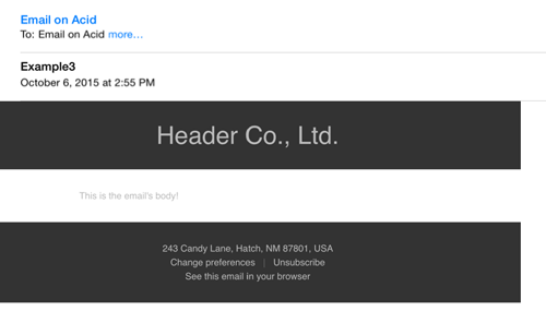
I recently came across an issue that appears to plague only iPads in the native “Mail” app, but affects all versions. The developer was using a table with a background color and 100% width to form their header and footer sections of the email. For some reason though, neither of these would stretch to the full width of the screen. A white gap of about 36 pixels took up the right-hand side of the screen. The gap is all the more visible because the Mail interface includes two light grey lines that extend all the way to the right edge of the screen. Here’s an example of the issue:
The Fix
A lot of people have discussed this issue in regards to the Safari app on iPads, but there are very few references to it occurring in the mail app. (That’s the native mail app for iOS, not the Gmail app.) Most of the listed fixes for Safari were built around applying a minimum width to the <body> tag, to make sure that it actually extended the full width of the screen. I had to play with the numbers a bit on this, but using a very specific media query (so as not to interfere with any other clients) and a min-width style, I was able to cure this problem!
Just drop this code into the style block of your email, in your <head> section.
                                @media screen and (device-width: 768px) and (device-height: 1024px) {
		body {min-width: 701px !important;}
	}
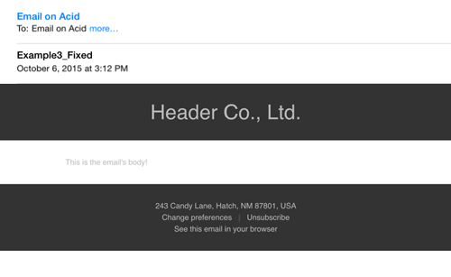
The media query above specifies the exact dimensions of the iPad, including mini and retina. 701 pixels was the value I found after doing a bit of experimentation which made the body extend the full width of the screen without creating a scrollbar. I included !important in case there was another min-width style on your body, but feel free to remove it if there’s nothing to overwrite. You can see the fix in action, below.
Are your emails looking tip-top?
Unsightly emails can have a significant impact on your marketing efforts. Make sure every email you send is buttoned up and pixel perfect by running a pre-deployment test in Email on Acid!
