Email Development
Filmstrip+ Interactive Email Technique: Adding Support For More Email Clients

Nov 29 2017 Update: This article has been updated to display a fallback on Gmail on Android as it no longer works on that client.
Two few weeks ago I wrote about the Filmstrip Technique that allowed interactive email to work in the Gmail app using windowed named anchors. However that technique didn’t work with Apple Mail and Outlook for the Mac, this article will go over a simple method to combine the traditional interactive techniques using checkboxes and radio buttons with the filmstrip technique to allow interactivity in more clients than ever before!

Filmstrip+ Clients Support
The following table shows support among the different email clients for both the windowed anchor technique which was covered in the original article and the for the :checked selector. I’ve also added CSS animation as well to demonstrate that our subset of clients that support the :checked selector also supports CSS animations. Since the presence of the :checked selector support generally means better CSS support overall for the clients we’d use opt to use the :checked selector for clients that support it so we can use more advanced CSS like CSS animations, which Gmail does not support.
| Email client | windowed anchor | :checked | CSS animation |
|---|---|---|---|
| Android 4.4 Native Client | |||
| Apple Mail | |||
| Gmail App (Android) | |||
| iOS Mail | |||
| Outlook for Mac | |||
| Samsung Native Client |
Combination Technique
Aside from supporting Gmail, a key advantage of the filmstrip technique is its simplicity. Designers can create different “states” of an interactive email as named frames and stack them like a filmstrip. Then using named anchors these frames can be displayed. You can read the technique here. However there is a way to leverage the :checked state of radio buttons to mimic the filmstrip technique. The technique is to give each frame its own radio button and instead of a link to a named anchor, to use a label that targets a radio button. The radio button will shift the margin of the first frame upwards by a multiple of the height of the window time the position of the frame in the strip just like how the position would shift using the filmstrip technique.
:checked implementation
Say you have two frames that are 200 pixels tall, if the user selects the second label, the second radio element is checked and the margin of the first frame is shifted up 200 pixels displaying the second frame. If you have 3 frames, youd shift the margin up by 400 pixels and so forth.
                                <style>
.frame{
  width:300px;
  height:200px;
}
#radio2:checked ~ .container > .frame:first-of-type{
   margin-top:-200px;
}
</style>

<input type="radio" name="choice id="radio1">
<input type="radio" name="choice id="radio2">

<div class="container frame" style="overflow:hidden;">
<div class="frame">
   <label for="radio1">Tab 1</label>
   <label for="radio2">Tab 2</label>
   This is Frame 1
</div>
<div class="frame">
   <label for="radio1">Tab 1</label>
   <label for="radio2">Tab 2</label>
   This is Frame 2
</div>
</div>
Combined Technique With Fallbacks
To combine the technique you’d have a set of both links and labels in your frames and you’d hide and display the links or labels depending on the capability of the email client. As mentioned, we’d only show the links in the Gmail app and labels elsewhere.
                                <!--[if !mso]><!-->
<div class="interactive" style="display:none;max-height:0;overflow:hidden;">
  INTERACTIVE CONTENT (PUT FILMSTRIP CODE HERE)
</div>
<!--<![endif]-->
<div class="fallback">
  FALLBACK CONTENT
</div>
We’ll also show the fallbacks on other email clients. Because we’re changing our targeting mechanism, the CSS to show the interactive and fallback is different.
                                <style>
  /* hide both buttons and labels */
  .interactive .buttons a,
  .interactive .buttons label{
    display:none;
  }

  @media screen and (-webkit-min-device-pixel-ratio: 0){
    /* Use :checked technique for:
       iOS, Outlook Mac, Apple Mail, Samsung
       - NOT Gmail */
    .cbox-check:checked + * .interactive{
      display:block!important;
      max-height:none!important;
    }
    .cbox-check:checked + * .fallback{
      display:none!important;
    }
    /* using labels */
    .interactive .buttons label{
      display:inline-block;
    }
    /* Blocker for AOL Mail
    https://www.emailonacid.com/blog/article/email-development/css-targeting-for-aol-mail
    */
    .cbox-check:checked + * div[class~="aolmail_interactive"]{
      display:none!important;
    }
    .cbox-check:checked + * div[class~="aolmail_fallback"]{
      display:block!important;
    }
  }

</style>
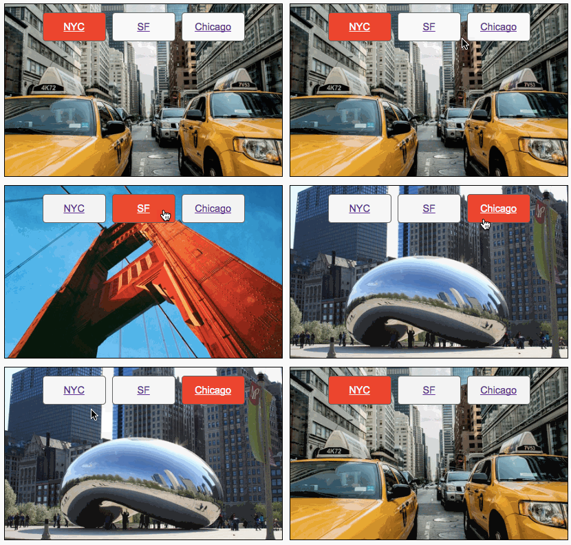
Tabs Example

View an example of the combined technique here.
Other Enhancements
By separating the interactivity into Gmail App, non-Gmail and static, we’re able to add advanced transitions and animations for the non-Gmail interactive clients. For example you could add a transition that shows the frames sliding up and down when you shift between them.
You can also add other animation and :checked based interactivity effects within the frames that aren’t supported by Gmail. You just need to make sure to hide these elements and only display them within the activation media query blocks.
Don’t Guess, Test!
At Email on Acid, testing is at the core of our mission. After you’ve finished setting up the perfect design for your campaign, ensure the email looks fantastic in EVERY inbox. Because every client renders your HTML differently, it’s critical to test your email across the most popular clients and devices.
Try us free for 7 days and get unlimited access to email, image and spam testing to ensure you get delivered and look good doing it!


