Outlook HTML Emails: How to Fix 11 Common Rendering Issues
If you’ve spent any time in the email world you’re probably aware of Outlook’s reputation. Often referred to as the problem child of the email world, Outlook has been the cause of many frustrations, missed deadlines, and headaches for email developers, designers, and marketers around the world.
Mention Outlook to an email developer and you’ll be met with rolling eyes and perhaps a few expletives. No matter how many Outlook coding guides you read, there’s always something to throw a wrench in the gears.
However, it doesn’t all have to be negative! Although Outlook stirs these deep emotions in us, it’s like that one friend we all have that you know is going to turn up 45 minutes later than expected, it may be incredibly frustrating but it’s also reliably frustrating.
Coding emails that look great on Outlook is a rite of passage for all email developers, Outlook pushes us to think outside the box to create beautiful emails that withstand its quirks. It's a playground where a perfectly aligned button becomes a badge of honor, and a table that refuses to cooperate transforms into a testament of our problem-solving skills. Sure, it may throw us a curveball now and then, but isn't that what makes life exciting?
Join us as we delve into the intricacies, share insights, and equip ourselves with the tools necessary to conquer the challenges presented by Outlook.
Table of content
-
01
Why Outlook emails don’t always display as expected -
02
Could a new Outlook for Windows change things? -
03
11 ways Outlook can break HTML emails - 1. Outlook adds random white lines to emails
- 2. Outlook lacks support for animated GIFs.
- 3. CSS background images not supported.
- 4. Outlook ignores margin and padding.
- 5. Outlook adds a border to table cells.
- 6. Outlook ignores link styling.
- 7. Resizing non-native images in Outlook.
- 8. Outlook ignores HTML item width and height.
- 9. Font stacks and Times New Roman.
- 10. Controlling line height in Outlook.
- 11. Email alignment issues in Outlook
-
04
The things we do for Outlook HTML emails. - Table-based layouts.
- MSO conditional statements.
- Extensive email testing
- ALT text
-
05
Avoid Outlook rendering issues with email previews
Why Outlook emails don’t always display as expected
To undertake the rite of passage that is creating emails that still look great in Outlook it’s important for us to understand why Outlook can be such a thorn in our side.
One of the main issues with Outlook is its inconsistent rendering across different versions. Outlook CSS support isn’t great and here’s why...
The desktop versions of Outlook, especially those predating Outlook 2013, employ the Word rendering engine instead of a dedicated HTML rendering engine. This engine, originally designed for word processing, has limitations in interpreting modern HTML and CSS techniques commonly used in email design.
Although Outlook is no longer the powerhouse it was once in terms of email client market share, usurped in recent years by Apple/iOS Mail and Gmail. It still commands a healthy average 5%* of the market particularly in corporate environments. It’s still very important to make your emails look great on Outlook.
*This is just an average. Your email lists may vary, we always recommend checking your own analytics to see who is opening your emails on which clients.
Could a new Outlook for Windows change things?
The introduction of a new Outlook for Windows has the potential to bring significant changes to the rendering challenges faced by email developers.
While specific details about the new version are not available, advancements in rendering technologies could alleviate some of the longstanding issues associated with Outlook's rendering inconsistencies. With Microsoft themselves saying they want to “bring consistency across our Windows and web codebases”.
While many email developers may be salivating at the thought of a new and consistent version of Outlook, that version has only been released in Beta thus far. Further to that, it will take some time for companies to implement the new version. We expect the rollout to be a long and slow process so for now we’ll have to continue fighting the good fight against the older versions of Outlook.
11 ways Outlook can break HTML emails
Let's explore best practices and strategies for optimizing HTML emails specifically for Outlook, enabling developers to overcome the challenges associated with it.
1. Outlook adds random white lines to emails
This is by far the most notorious and problematic Outlook issue that exists. Nothing beats finishing up your beautiful, intricate email design, passing it through your email rendering tests and seeing a random white line in your Outlook test.

While it may not be the most egregious design break, the way it seems to happen at random, and the fixes we have to employ, make it an almost rage-inducing bug. Despite Microsoft being fully aware of the bug, we’ve seen no fixes on Outlook’s end.
So, why do these white lines appear in your Outlook emails? Although we don’t know the exact reason for this odd behavior, the leading theory is that it has to do with heights that are odd numbers.
If these white lines are causing you a headache there are some potential quick fixes to help you get rid of them, at least temporarily:
Change up your font sizes and heights.
For some folks, the fix is as simple as changing font sizes from odd numbers to even numbers. For example, if you have a font size of 13px or 15px, try converting it to 14px.
You can also try manually changing heights, font sizes and line-heights to achieve the same outcome.
Add a ghost break.
Often adding a ghost break will temporarily fix the rogue white lines in Outlook. Similar to ghost columns, a ghost break is a line break that we add targeted only towards Outlook.
<!--[if true]><br> <![endif]-->Match the background color.
If you just need a very quick fix and your design allows for it, you can match the background color on your problem section to the containing section/table.
It’s the definition of painting over the cracks, but it certainly works for a quick, no-mess fix.
Add some Microsoft specific code
If you’ve exhausted your other options you can try this code snippet directly in your code’s head section. Here we’re targeting Outlook and collapsing table borders.
<!--[if (gte mso 9)|(IE)]>
 <style type="text/css">
 table {
 border-collapse: collapse;
 border-spacing: 0;
 mso-table-lspace: 0pt !important;
 mso-table-rspace: 0pt !important; }
 </style>
 <![endif]-->
This may have a more drastic effect on how your email renders, so if you’re going to try this out it’s important to thoroughly test your email on all versions of Outlook.
Outlook white lines still got you down?
If none of the above helped fix your white lines or if you’re interested to read more about how and why these lines occur we wrote an in-depth article taking a deeper dive into it. We also recommend checking out this brilliant article from our friends over at ActionRocket.
2. Outlook lacks support for animated GIFs.

Does Outlook support GIFs? That depends on the version in which your animation is opened. Outlook and its lack of support for animated GIFs has long-been a sore point for many designers.
While the newer versions of Outlook now have GIF support, the older Windows desktop versions (2007-2016) will still only render the first frame of an animated GIF.
If your GIF includes a call-to-action or any information that is vital to the email’s messaging, you should always try to include it in the first frame. If that isn’t possible you can always employ this technique to show a GIF in most email clients, but hide it and show a static fallback image in Outlook.
3. CSS background images not supported.
A while back Microsoft added CSS background image support to Outlook 365 and Outlook.com, but we still lack support for these in most desktop versions of Outlook, and we don’t anticipate this being changed any time soon.
If you want your background images to work on Outlook 2016 and other older desktop versions you’ll need to dive into the world of Vector Markup Language (VML).
VML will allow you to get those beautiful background images working on Outlook but will add a layer of complexity to your email coding process. Ultimately, each email is different and often your email designs will still work without your background images loading, it’s down to you to decide if the extra effort of VML is worth if for your specific needs.
4. Outlook ignores margin and padding.
One of the persistent challenges faced by email developers when coding for Outlook is its tendency to ignore margin and padding properties.

Certain versions of Outlook will remove padding in a lot of situations, though you may have more luck with margins. It’s also important to remember that every desktop version of Outlook won’t support the styling of <div> tags, so if you’re using <div>s for your layout remember to employ the ghost column technique, wrapping the divs in Outlook specific tables to allow you to style those for Outlook.
How you handle your spacing in your email code is important and if you’re having trouble getting the spacing you want in Outlook you can take a deeper dive into margins and padding in HTML email.
5. Outlook adds a border to table cells.
A bug in Outlook 2016 adds a 1-pixel border around table cells in emails. This may not be a major problem unless you need your email template to line up perfectly.
To get rid of this extra border, use “border-collapse: collapse;” embedded or inline. This CSS property indicates whether cells have a shared or separate border. Setting the property to the collapse value means it combines to a single border.
6. Outlook ignores link styling.
In certain cases Outlook will not apply the link styling you’ve applied to your hyperlinks.
Specifically, Outlook will strip the styling from <a> tags without an href value or links that don’t have http:// or https://, which can be annoying if you’re using them as anchors to navigate the email, using mailto links, or using placeholder links for testing purposes.
If you need to test an email before you have live URLs for that email, consider using a placeholder link that includes a http:// or httsp:// protocol.
If you find that Outlook is stripping your styles from a mailto or internal anchor link, simply wrap the <a> tag in a <span> and apply your styling to the surrounding span.
7. Resizing non-native images in Outlook.
Outlook will always try to render your images at their native dimensions which can be annoying when you’re creating larger images and scaling them down, a common technique for high DPI devices.
While most email clients will respect your CSS, Outlook will not respect CSS to resize images. That’s why it’s important when resizing images to define the attributes in HTML for Outlook. You’ll only need to define the width, Outlook will resize the height accordingly to maintain the proper image proportions.
<-- This image will be resized to 300px in Outlook -->

 <img src="https://www.emailonacid.com/images/photo.jpg" width="300" style="width:300px;" />

 <-- This image will NOT be resized in Outlook -->
 <img src="https://www.emailonacid.com/images/photo.jpg" style="width:300px;" />
If you’re seeing images that don’t look great in Outlook ensure you check that you’ve defined the correct width in the HTML.
8. Outlook ignores HTML item width and height.
As we’ve already mentioned, Outlook doesn’t support styling inside of <div> tags.
So, when an email renders in Outlook, the <div> sections will assume the height of the text inside of them, and 100% width, even if you specify a height/width for them in code.
Once again, the fix for Outlook HTML emails is to use tables instead. We have seen this with a few other elements, but the <div> situation is the most common problem.
9. Font stacks and Times New Roman.
When it comes to font rendering, Outlook presents a unique challenge for email developers due to its limited support for web fonts and reliance on font stacks. Unlike most email clients, Outlook does not have built-in support for downloading and displaying custom web fonts directly from external sources.
Further to this, if you include a custom font at the top of your font stack, Outlook will ignore all of your fallback fonts and instead display Times New Roman. (Thanks, Outlook!)
- Fix 1: Replace the stack using attribute selectors.
- Fix 2: Wrap text in a span.
- Fix 3: Add MSO conditional code.
- Fix 4: Specify a custom font in a media query.
Fix 1 was the most popular among email geeks who submitted their own solutions to Email on Acid. It works because Outlook ignores attribute selectors. This code will tell the email client to replace any style that includes the custom font with the correct stack:
 <html>
   <head>
     <link rel="stylesheet" type="text/css" href="http://fonts.googleapis.com/css?family=Tangerine">
     <style>
       div {font-family: Helvetica, sans-serif, 'Tangerine';}
       [style*="Tangerine"] { font-family: 'Tangerine', Helvetica, serif !important; }
     </style>
   </head>
   <body>
     <div style="font-family: Helvetica, sans-serif, 'Tangerine';font-size: 48px;">Making Email Beautiful!</div>
     <div style="font-family: Helvetica, serif;font-size: 48px;">Helvetica</div>
     <div style="font-family: 'Times New Roman', serif;font-size: 48px;">Times New Roman</div>
   </body>
 </html>
If this fix didn’t work for you or if you’d like to take a more thorough look at font stacks in Outlook we wrote a comprehensive guide to font stacks and Outlook.
10. Controlling line height in Outlook.
At one time, emails were rendering taller than expected in Outlook.com because the client was controlling line-height using CSS. That’s not so much of an issue anymore.
Microsoft Office styles (MSO styles) will tighten up your lines just a bit. If your spacing seems off, give it a try. Add “mso-line-height-rule:exactly;” directly before the line-height style, inline or embedded.
11. Email alignment issues in Outlook
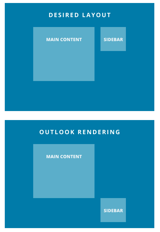
Another common problem with older desktop versions of Outlook is wonky alignment, specifically when trying to include two or more columns that are meant to stack nicely on mobile devices for your responsive designs.

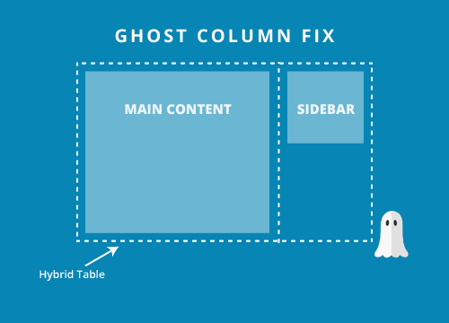
If you’re encountering issues like this with your layout on Outlook worry not! The solution is simple - we turn back to our trusty old friend the Ghost Column fix. By wrapping the problem columns in an Outlook specific ghost table we can constrain the columns so they display as intended.

To view the full code snippets or take a deep-dive into the world of ghost columns, check out our fluid hybrid design guide and our explanation of ghost tables.
The things we do for Outlook HTML emails.
In addition to the 11 common challenges discussed earlier, Outlook's peculiarities often require us to implement specific workarounds and adjustments. These additional steps are necessary to ensure optimal rendering and functionality in various versions of Outlook.
Table-based layouts.
If it wasn’t for Outlook we’d be able to ditch the tables and embrace the <divs>. Tables have long been the standard for email developers, but as email standards catch up to web standards, more and more developers are ditching table-based layouts in favour of divs with ghost tables. In fact, our very own email newsletters are coded with this method.
If you’re interested in breaking the mold and experimenting with emails without tables, you can check out this fantastic repo from Mark Robbins on getting off the table.
MSO conditional statements.
You’ll notice in the 11 tips and tricks above we often rely on MSO conditional code to get around Outlook’s tricky limited support.
MSO conditional statements are a fantastic tool allowing us to target Outlook desktop versions specifically, even allowing us to target specific versions. This allows us to create workarounds for Outlook that would otherwise have us pulling our hair out.
Extensive email testing
It’s important to test your email across every device or email client that your recipients may be opening on, but it’s especially important to test for Outlook.
Not only do we have to employ a lot of whacky work-arounds and clever conditional code to make our email look great on these versions of Outlook, there’s also a lot of them!
From Outlook.com, to Outlook 2010, to high DPI versions of Outlook 2016, a tool like Email on Acid’s testing tool lets you instantly see how your email is rendering across every version of Outlook.
Don’t leave your Outlook-specific fixes to guess work, ensure they look great on every version of Outlook and simplify your Outlook email troubleshooting.
ALT text
While we aren’t only adding ALT text for Outlook, it’s also extremely important for accessibility and any of your readers who have images disabled, it’s a key part of creating emails for Outlook as Outlook users will all have their images disabled by default. You still want your emails to convey your messaging even when the images are disabled.
Proper ALT text usage is often the key factor in getting your recipient to click that “allow images” button so they can see your email in all its glory.
Avoid Outlook rendering issues with email previews
The best way to avoid HTML emails that look bad in Outlook is to take a close look at how things render before you hit send. You can do that with Sinch Email on Acid.
Use our email readiness platform to check out Outlook HTML email previews that come from live clients and devices. These screenshots, which include email previews from 100+ clients and devices, are seeing the future of your campaigns in subscribers’ inboxes.
With Email on Acid, you get unlimited email testing with every paid plan. That includes much more than Outlook email previews. You’ll also get deliverability and accessibility checks as well image and URL validation and many other valuable features.
Don’t let Outlook rendering issues derail your email marketing efforts. Put your best campaigns forward with help from Email on Acid.


