Media Queries Demystified | CSS Min-Width and Max-Width | How Do They Work?
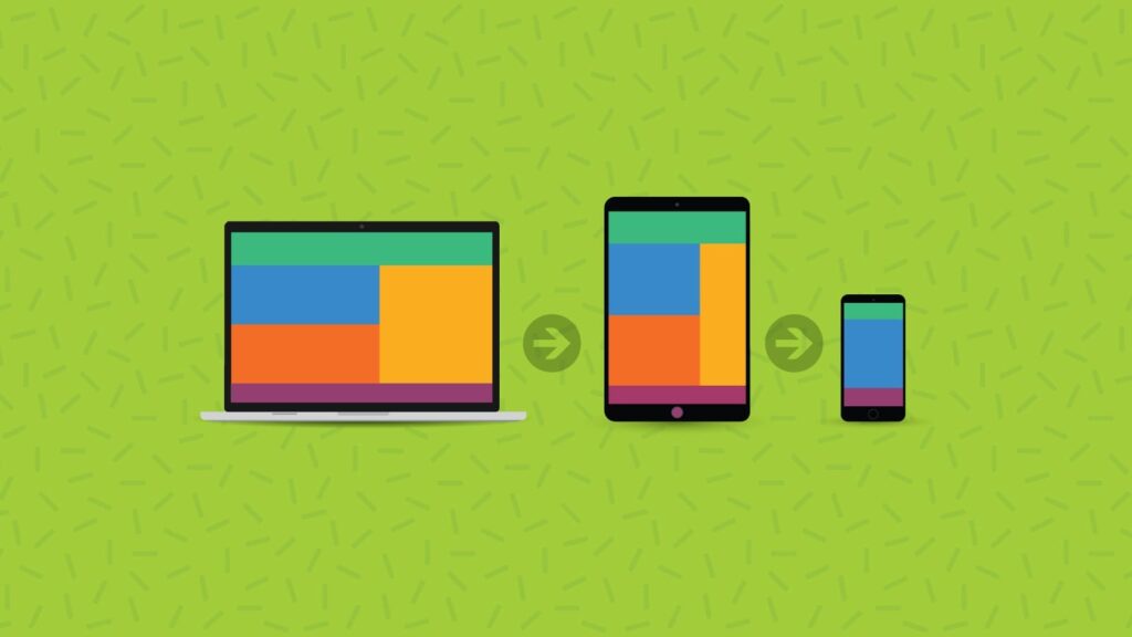
Media queries are an effective and reliable way for developers to code responsive email designs. Getting campaigns to display in a way that works across mobile devices with various screen sizes is crucial if you want to deliver an acceptable experience to every subscriber. But this task isn’t always easy… 2023 research from Sinch found … Continue reading Media Queries Demystified | CSS Min-Width and Max-Width | How Do They Work?