Email Development
Media Queries and Device Orientation

Email Development

Share to
It would be nice if all devices responded to media queries in exactly the same way, but they don’t. As discussed in our previous blog, screen resolution doesn’t determine how media queries respond on many devices. The retina display on the iPhone4S is a great example. It has a 640 by 960 resolution, but triggers media queries at 320px. That’s because of “pixel density.”
The iPhone4S packs almost double the number of pixels into the available space, creating a much higher definition image. It doesn’t create more screen real estate, though, unless you want your text to be so tiny it’s unreadable. That’s why the iPhone 4S is set to respond to media queries as if its screen were 320px wide. What’s interesting about that particular device is that it responds to media queries at 320px whether it’s in portrait or landscape orientation.
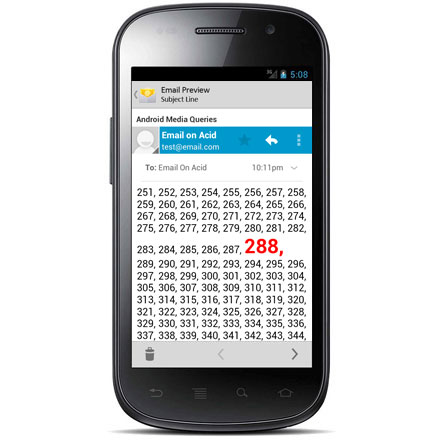
To find out, we made a simple media query test to find out what ‘width’ each device would respond to. In the process, we learned that some re-check media queries and re-render emails when orientation is changed whereas others do not. Check out our results below:
| ‘Device Widths’ for Mobile Email Clients | ||||
| Device | Portrait Width | Landscape Width | Changes on Orientation | Changes on Zoom |
| Samsung Galaxy S II – Android 4 | 288 | 501 | ||
| Samsung Galaxy Proclaim v2.3.6* | 314 | 473 | ||
| Android 2.3 | 320 | 527 | ||
| iPhone5 – iOS4 | 320 | 320 | ||
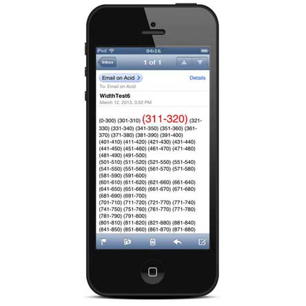
| iPhone4S – iOS5 | 320 | 320 | ||
| iPhone5 – iOS5 | 320 | 320 | ||
| Sprint HTC EVO 4.3″ – Android 2.3 | 369 | 615 | ||
| Motorola Xoom – Android 2.3 | 481 | 481 | ||
| Kindle 8.9″ HD – Android 2.3 | 600 | 900+ | ||
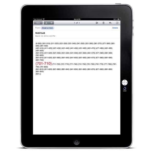
| iPad – iOS5 | 703 | 703 | ||
| Kindle 7″ HD – Android 2.3 | 800 | 800 | ||
*This result was given to us via email by a reader. Thanks for helping!
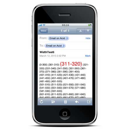
Check out our screen shots below and see for yourself. The number that has large, red text is the pixel range that each screen fell into.

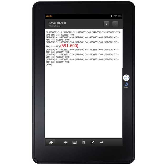
Do you have a device that’s not listed on our chart? We’d love your help! Here’s our handy media query width test. You can use it to check the width on your device. Send us a pic of what you found (and include the device name and OS) and we’ll add it to our list. Each screenshot that fills in a new row on our chart has a chance to win some sweet Email on Acid swag!
Remember: Gmail doesn’t support media queries, so this test won’t work in mobile Gmail apps.
Stop switching back and forth between platforms during pre-deployment and QA. With Sinch Email on Acid you can find and fix problems all in one place. Double check everything from content to accessibility and deliverability. Plus, with accurate Email Previews on more than 100 of the most popular clients and devices, you can confidently deliver email perfection every time.
Author: Kyle Lapaglia
When you visit any website, it may store or retrieve information on your browser, mostly in the form of cookies. This information might be about you, your preferences or your device and is mostly used to make the site work as you expect it to. The information does not usually directly identify you, but it can give you a more personalized web experience. Because we respect your right to privacy, you can choose not to allow some types of cookies. Click on the different category headings to find out more and change our default settings. However, blocking some types of cookies may impact your experience of the site and the services we are able to offer.
Cookie Statement
These cookies are necessary for the website to function and cannot be switched off in our systems. They are usually only set in response to actions made by you which amount to a request for services, such as setting your privacy preferences, logging in or filling in forms. You can set your browser to block or alert you about these cookies, but some parts of the site will not then work.
These cookies do not store any personally identifiable information.
Cookie details
| Cookie Subgroup | Cookies | Cookies used |
|---|---|---|
| eu5.mm.sdi.sinch.com | ASP.NET_SessionId | First Party |
| community.sinch.com | AWSALB , LiSESSIONID | First Party |
| appengage.sinch.com | dd_cookie_test_ | First Party |
| tickets.sinch.com | atlassian.xsrf.token , JSESSIONID | First Party |
| cockpit2.sinch.com | SESSION | First Party |
| engage.sinch.com | instapage-variant-xxxxxxxx | First Party |
| dashboard.sinch.com | cookietest | First Party |
| brand.sinch.com | PHPSESSID , AWSALBCORS | First Party |
| sinch.com | __cf_bm , OptanonConsent , TEST_AMCV_COOKIE_WRITE , OptanonAlertBoxClosed , onesaasCookieSettings, QueryString, functional-cookies, performance-cookies, targeting-cookies, social-cookies lastExternalReferrer, lastExternalReferrertime, cookies, receive-cookie-deprecation _gdvisitor, _gd_session, _gcl_au, _fbp, _an_uid, _utm_zzses, lpv | First Party |
| mediabrief.com | __cf_bm | Third Party |
| recaptcha.net | _GRECAPTCHA | Third Party |
| cision.com | __cf_bm | Third Party |
| techtarget.com | __cf_bm | Third Party |
These cookies allow us to count visits and traffic sources so we can measure and improve the performance of our site. They help us to know which pages are the most and least popular and see how visitors move around the site. All information these cookies collect is aggregated and therefore anonymous.
If you do not allow these cookies we will not know when you have visited our site, and will not be able to monitor its performance.
Cookie details
| Cookie Subgroup | Cookies | Cookies used |
|---|---|---|
| community.sinch.com | ValueSurveyVisitorCount | First Party |
| buzz.sinch.com | instap-spid.8069 , instap-spses.8069 | First Party |
| appengage.sinch.com | _dd_s | First Party |
| sinch.com | AMP_TLDTEST , rl_page_init_referrer , rl_trait , _vis_opt_s , __q_state_dp56h9oqwhna9CoL , cb_user_id , __hstc , rl_anonymous_id , rl_user_id , initialTrafficSource , _vwo_uuid , _vwo_uuid_v2 , rl_page_init_referring_domain , _hjIncludedInSessionSample_xxx , apt.uid , __hssrc , test_rudder_cookie , cb%3Atest , __hssc , rl_group_trait , _hjAbsoluteSessionInProgress , _vwo_referrer , _vwo_sn , _vis_opt_test_cookie , _hjFirstSeen , _hjTLDTest , _hjSession_xxxxxx , s_sq , _vwo_ds , rl_group_id , _vis_opt_exp_n_combi , s_cc , _gclxxxx , cb_anonymous_id , cb_group_id , apt.sid , rl_session , _uetvid , AMP_899c7e29a9 , _hjSessionUser_xxxxxx | First Party |
| brand.sinch.com | AMP_TEST | First Party |
| engage.sinch.com | no-cache , instap-spses.85bb , instap-spid.85bb | First Party |
| www.sinch.com | d-a8e6 , s-9da4 | First Party |
| nr-data.net | JSESSIONID | Third Party |
| sinch-en.newsroom.cision.com | _ga, _gid | Third Party |
| sinch.in | _ga_xxxxxxxxxx, _gat_UA-XXXXXX-X, _gid, _ga | Third Party |
| g.fastcdn.co | instap-spses.85bb | Third Party |
| hello.learn.mailjet.com | pardot, visitor_id, visitor_id##### | Third Party |
| www.googletagmanager.com | userId | Third Party |
| hello.learn.mailgun.com | visitor_id#####, visitor_id | Third Party |
| dev.visualwebsiteoptimizer.com | _vwo_ssm | Third Party |
| box.com | box_visitor_id | Third Party |
| app.box.com | z, cn | Third Party |
| sinch-tfn.paperform.co | laravel_session | Third Party |
| go.sinch.in | visitor_id#####, visitor_id | Third Party |
| Qualified | __q_local_form_debug | Third party |
| Rudderstack | rudder.inProgress, rudder.3156dd1f-7029-4600-ae54-baf147d9af20.queue, rudder.3156dd1f-7029-4600-ae54-baf147d9af20.ack, rudder.3156dd1f-7029-4600-ae54-baf147d9af20.reclaimStart, rudder.3156dd1f-7029-4600-ae54-baf147d9af20.reclaimEnd, | Third party |
| 6sense | _6senseCompanyDetauls, _6signalTTL | Third party |
| Appcues | apc_local_id, apc_user | Third party |
These cookies may be set through our site by our advertising partners. They may be used by those companies to build a profile of your interests and show you relevant adverts on other sites. They do not store directly personal information, but are based on uniquely identifying your browser and internet device.
If you do not allow these cookies, you will experience less targeted advertising.
Cookie details
| Cookie Subgroup | Cookies | Cookies used |
|---|---|---|
| investors.sinch.com | visitor_id | First Party |
| community.sinch.com | VISITOR_BEACON , LithiumVisitor | First Party |
| sinch.com | _uetsid , ajs_user_id , _gcl_aw , ajs_group_id , AMCV_ , __utmzzses , _fbp , _gcl_au , AMCVS_ | First Party |
| go.latam.sinch.com | visitor_id##### , pardot | First Party |
| linkedin.com | li_gc, bcookie, lidc, AnalyticsSyncHistory, UserMatchHistory, li_sugr | Third Party |
| pi.pardot.com | lpv151751, pardot | Third Party |
| hsforms.com | _cfuvid | Third Party |
| google.com | CONSENT | Third Party |
| sinch.in | _gclxxxx, _gcl_au | Third Party |
| www.linkedin.com | bscookie | Third Party |
| bing.com | MUID, MSPTC | Third Party |
| www.facebook.com | Third Party | |
| hello.learn.mailgun.com | pardot | Third Party |
| www.youtube.com | TESTCOOKIESENABLED | Third Party |
| dev.visualwebsiteoptimizer.com | uuid | Third Party |
| g2crowd.com | __cf_bm | Third Party |
| pardot.com | visitor_id#####, visitor_id | Third Party |
| tracking.g2crowd.com | _session_id | Third Party |
| hubspot.com | __cf_bm, _cfuvid | Third Party |
| doubleclick.net | test_cookie, IDE | Third Party |
| youtube.com | CONSENT, VISITOR_PRIVACY_METADATA, VISITOR_INFO1_LIVE | Third Party |
| go.sinch.in | pardot | Third Party |
| liadm.com | lidid | Third Party |
| www.google.com | _GRECAPTCHA | Third Party |
These cookies enable the website to provide enhanced functionality and personalisation. They may be set by us or by third party providers whose services we have added to our pages. If you do not allow these cookies, then some or all of these services may not function properly.
Cookie details
| Cookie Subgroup | Cookies | Cookies used |
|---|---|---|
| portal.sinch.com | pnctest | First Party |
| partner.appengage.sinch.com | _dd_s | First Party |
| investors.sinch.com | First Party | |
| community.sinch.com | LithiumUserInfo , LithiumUserSecure | First Party |
| tickets.sinch.com | selectedidp | First Party |
| engage.sinch.com | ln_or | First Party |
| cockpit2.sinch.com | CSRF-TOKEN , NG_TRANSLATE_LANG_KEY | First Party |
| sinch.com | apt.temp-xxxxxxxxxxxxxxxxxx , hubspotutk , ajs%3Acookies , cf_clearance , ajs%3Atest , __tld__ , __q_domainTest , pfjs%3Acookies , ajs_anonymous_id | First Party |
| auth.appengage.sinch.com | AUTH_SESSION_ID , KEYCLOAK_3P_COOKIE , KEYCLOAK_3P_COOKIE_SAMESITE , KC_RESTART , AUTH_SESSION_ID_LEGACY | First Party |
| www.recaptcha.net | _GRECAPTCHA | Third Party |
| boxcdn.net | __cf_bm | Third Party |
| d2oeshgsx64tgz.cloudfront.net | cookietest | Third Party |
| sinch-np.paperform.co | XSRF-TOKEN, laravel_session | Third Party |
| vimeo.com | __cf_bm, vuid | Third Party |
| sinch-ca-sc.paperform.co | XSRF-TOKEN, laravel_session | Third Party |
| box.com | site_preference | Third Party |
| app.box.com | bv | Third Party |
| sinch-tfn.paperform.co | XSRF-TOKEN | Third Party |
| cision.com | cf_clearance | Third Party |
These cookies are set by a range of social media services that we have added to the site to enable you to share our content with your friends and networks. They are capable of tracking your browser across other sites and building up a profile of your interests. This may impact the content and messages you see on other websites you visit. If you do not allow these cookies you may not be able to use or see these sharing tools.
Cookie details
| Cookie Subgroup | Cookies | Cookies used |
|---|---|---|
| community.sinch.com | ln_or | First Party |
| sinch.in | _fbp | Third Party |
| youtube-nocookie.com | CONSENT | Third Party |
| youtube.com | YSC | Third Party |