Email Development
Media Queries and Device Orientation
Email Development
It would be nice if all devices responded to media queries in exactly the same way, but they don’t. As discussed in our previous blog, screen resolution doesn’t determine how media queries respond on many devices. The retina display on the iPhone4S is a great example. It has a 640 by 960 resolution, but triggers media queries at 320px. That’s because of “pixel density.”
The iPhone4S packs almost double the number of pixels into the available space, creating a much higher definition image. It doesn’t create more screen real estate, though, unless you want your text to be so tiny it’s unreadable. That’s why the iPhone 4S is set to respond to media queries as if its screen were 320px wide. What’s interesting about that particular device is that it responds to media queries at 320px whether it’s in portrait or landscape orientation.
To find out, we made a simple media query test to find out what ‘width’ each device would respond to. In the process, we learned that some re-check media queries and re-render emails when orientation is changed whereas others do not. Check out our results below:
| ‘Device Widths’ for Mobile Email Clients | ||||
| Device | Portrait Width | Landscape Width | Changes on Orientation | Changes on Zoom |
| Samsung Galaxy S II – Android 4 | 288 | 501 | ||
| Samsung Galaxy Proclaim v2.3.6* | 314 | 473 | ||
| Android 2.3 | 320 | 527 | ||
| iPhone5 – iOS4 | 320 | 320 | ||
| iPhone4S – iOS5 | 320 | 320 | ||
| iPhone5 – iOS5 | 320 | 320 | ||
| Sprint HTC EVO 4.3″ – Android 2.3 | 369 | 615 | ||
| Motorola Xoom – Android 2.3 | 481 | 481 | ||
| Kindle 8.9″ HD – Android 2.3 | 600 | 900+ | ||
| iPad – iOS5 | 703 | 703 | ||
| Kindle 7″ HD – Android 2.3 | 800 | 800 | ||
*This result was given to us via email by a reader. Thanks for helping!
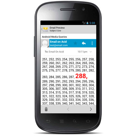
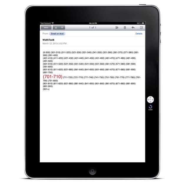
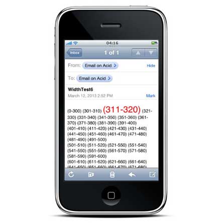
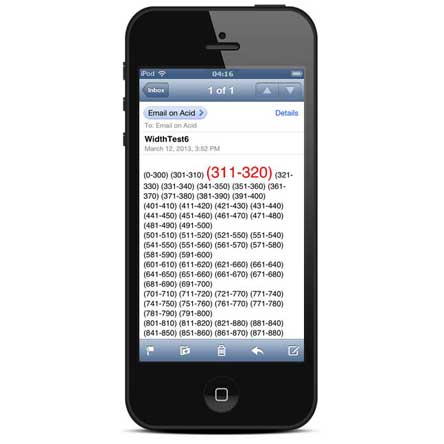
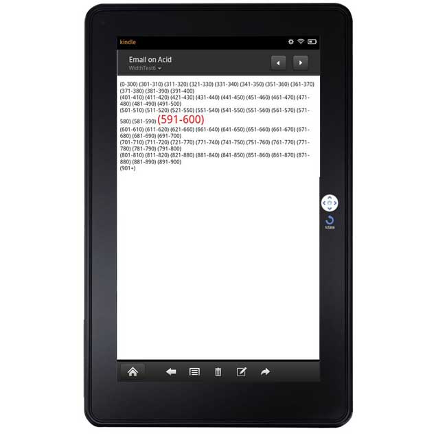
Check out our screen shots below and see for yourself. The number that has large, red text is the pixel range that each screen fell into.

Do you have a device that’s not listed on our chart? We’d love your help! Here’s our handy media query width test. You can use it to check the width on your device. Send us a pic of what you found (and include the device name and OS) and we’ll add it to our list. Each screenshot that fills in a new row on our chart has a chance to win some sweet Email on Acid swag!
Remember: Gmail doesn’t support media queries, so this test won’t work in mobile Gmail apps.