Email Development
Darktober in Review: Recapping our Dark Mode Email Exploration
Email Development

The sun is setting noticeably earlier these days. It must be the end of Darktober!
We’re wrapping up our month-long exploration of dark mode and email marketing with a look back at what we shared and learned throughout October. It turned out to be a hot topic among email developers and designers. We plan to keep the conversations and the content coming in the future.
If you missed anything, we’re not going to leave you in the dark. Keep reading to find out more about what went down during Darktober!
This was the “main event” for the month, and it lived up to expectations due in part to participation from all of you in the email community.
Thanks to everyone who registered for our webinar with veteran email developers, Annett Forcier of Email Boutique, Anne Tomlin of Emails Y’all, and our very own expert, Ed Ball. We had an excellent discussion on potential solutions for email teams trying to tackle dark mode challenges. There was also a lot of great advice being shared between attendees in the live chat. It’s one reason you’ll want to plan to join our upcoming webinars live!
Our roundtable of experts covered everything from tips for dealing with black logos to image swaps and using @media queries with different email clients. One of the bigger topics we discussed during the webinar was whether or not email developers should try to hack dark mode.

Both Ed and Ann believe we should strive to design for dark mode rather than look for ways to hack it. They say trying to force emails to display in light mode is the wrong decision for UX. That’s because subscribers who switch settings to dark mode want to view emails that way. They may have a legitimate reason, so why not meet their needs?
While Annett didn’t disagree with the idea of designing for dark mode, she also pointed out that there are situations when a hack is needed. Annett showed us how she (sometimes) forces the background to show up as a certain color on popular email clients.
Essentially, if you code a linear background using the same hex color, it will force the background into whatever color you specify. Here’s the example she shared:
                                Style="
 background-color:#e6d7c0;
 background-image: lineargradient(#e6d7c0,#e6d7c0);"
Annett got a little backlash on Twitter after sharing this hack, but she says she’ll do whatever it takes to ensure an email renders the way her clients intend.
Annett adds that this hack also works well for buttons as it forces email clients to stick to your brand’s preferred colors. Ed confessed to occasionally using hacks like this as well, but he suggests keeping email designs simple from the start so that there’s less to worry about.
This only scratches the surface of everything we covered in the webinar! You can get it all when you view the recording of Designing Emails for Dark Mode.
Near the end of the month, we partnered with Action Rocket to host a live Twitter chat on dark mode and email marketing. After seeing how interested and engaged people were during the webinar, we knew the chat would be full of amazing ideas and advice.
You didn’t let us down! Check out some top tweets:
I think it’s more important than any other accessibility feature. We did small team/company survey and it’s around 40/60% dark more usage. Because it’s a “cool” feature.
— G(ülben) 💌 (@itsybeadsykitty) October 28, 2020
A2: I switched to dark mode on my Mac to save my eyes and we use Outlook at work so seeing what a mess that made to the emails I was getting motivated me to code for #darkmode. I now specify font, background and images as a minimum #DarkModeChat
— Matt Lawrence 📣 (@mattjlawrence) October 28, 2020
#DarkModeChat A3 – from a process perspective there can be conflict over who is responsbile for the dark mode decisions. Designer or developer? In the end it’s a bit of both, but getting everyone on same page for the first time can be tricky.
— Mia Greenberg-Heaton (@miagheaton) October 28, 2020
A4: Implement some quick wins, like getting your logo dark-mode-ready — and then show your team how much of a difference those changes can make for your audience. Then, ask for the resources needed to do even more.
— Taxi for Email (@TaxiforEmail) October 28, 2020
A5. Super happy with #emailweekly in Dark mode – we tracked everything we did on our blog too. https://t.co/MDvn1dFbQ7 #DarkModeChat
— EmailJay (@emailjay_) October 28, 2020
Check out the Action Rocket and Email on Acid Twitter accounts for more and use the hashtag #DarkModeChat if you still want to chime in!
As part of the Twitter chat, we also asked people to submit their best dark mode email designs for a chance to win a prize package full of swag from Email on Acid and Action Rocket.
The winning email design came from Andrea Davidson (@AnotherAndrea2) a creative designer at Kernel. Andrea submitted this design after updating one of Kernel’s email templates for dark mode.
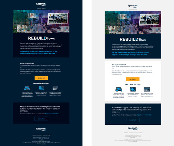
I think this email from one of our recent campaigns turned out really stellar in both light and dark mode.
We totally agree, Andrea! Thanks for the submission and enjoy your email swag.
Several new articles on dark mode and email went up on our blog during Darktober. That included an original graphic highlighting essential dark mode info.
Email experts Ed Ball and Danny Carranza told us about the importance of dark mode email testing and how it works with the Email on Acid platform. Plus, we took a closer look at the debate over the dark mode user experience and the validity of its purported benefits.
To cap off our Darktober articles, Action Rocket designer Ben Clay showed us some of his favorite dark mode email designs. Ben was a bit of a dark mode skeptic, but he’s grown to appreciate the aesthetic it creates.
Similar to Ed’s advice for developers on keeping things simple, Ben discovered brands that stick to a basic color palette tend to translate better between light and dark modes. For example, check out the striking black and white email from fashion brand Burberry:
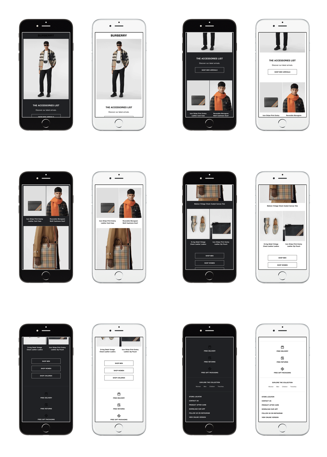
The importance of designing with dark mode in mind should now be something an email designer is constantly considering. Moving with the times of digital design, we need to be open-minded and upfront with clients who think dark mode won’t affect their subscribers.
Darktober may be over, but this is far from the end of the story for dark mode and email marketing.
What are your thoughts on the topic? Do you have questions or opinions to share? Got any expert tips to share with fellow email geeks?
Leave a comment below and let us know!
