Email Development
Dark Mode Email Design: Who Stands Out in the Inbox?
Email Development

Whenever I think or talk about dark mode I have a strange tendency to remember Star Wars. I have always been against dark mode and when asked the question “Why?” — I couldn’t actually give a plausible explanation.
Maybe it’s just my age and the thought of change. Maybe I just consider it a fad that will eventually die out, or maybe it goes deeper and stems back to my pure fear of Darth Vader. Either way, I decided to dip a toe into the “dark side” and navigate through my inbox to explore who has embraced it and is now catering to their dark mode audiences.
Dark mode is becoming increasingly popular, with a range of potential audiences now converted to viewing their emails this way. This has created a real challenge for designers like myself and ultimately changed how we approach designing for this new environment. Now, whether or not I like dark mode for email is beside the point. Dark mode looks like it’s here to stay, and the more I learn about it the more I understand why.
I wanted to start with Nike. They’re such a renowned brand, and in my opinion, a brand that really delivers when it comes to the design of their emails. With this in mind, it wasn’t a surprise to see that they had put some serious thought into dark mode — essentially targeting their whole audience.
Nike’s email designs are always very clean and precise, of which I’m a huge fan. It’s because of this that their email designs seem to translate seamlessly into dark mode. Their original designs are usually black and white so the transition for them is very simple. Now this will not be the case for many brands once a more colorful color palette is introduced. But it does show us that using a predominantly black and white theme will have its rewards when it comes to dark mode — certainly something to keep in mind!

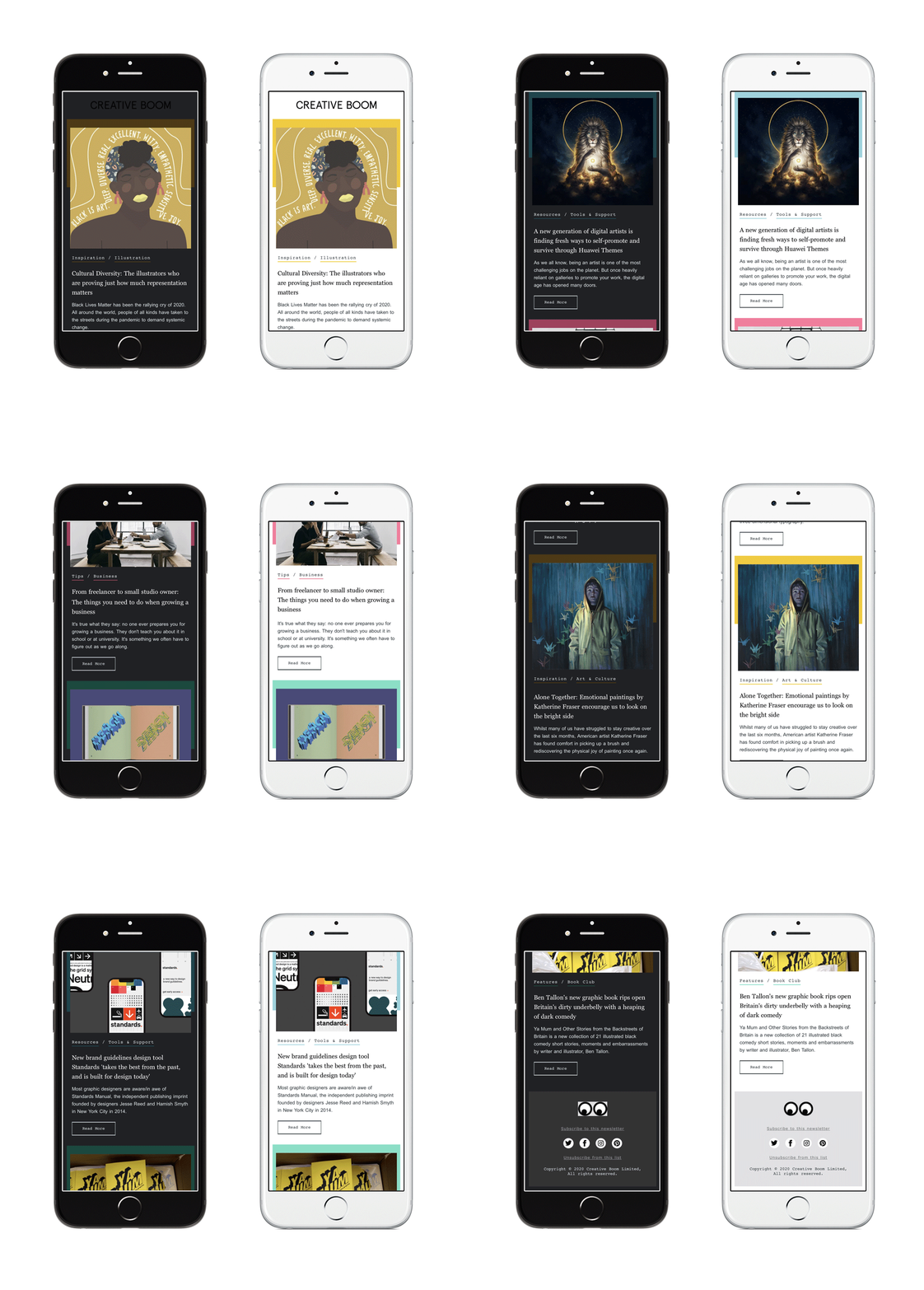
Creative Boom is an online magazine oozing with fun and personality. They are all about celebrating the creative world and inspiring their creative community. So, I thought it would be pretty fitting to include them. Their weekly newsletters are full of interesting and inspiring content. But will these magical emails that I so dearly love, stand the test of dark mode … of course they did!
Creative Boom’s newsletter designs almost look as good in black as they do white. I also wanted to use this example as a way of showcasing how colors will alter once opened in dark mode. Everything about the newsletter is flawless. The leading hero, the padding, the hierarchy, everything is so well crafted throughout the design. My only tiny comment is that the eyes in the footer have not been saved out as a transparent GIF.
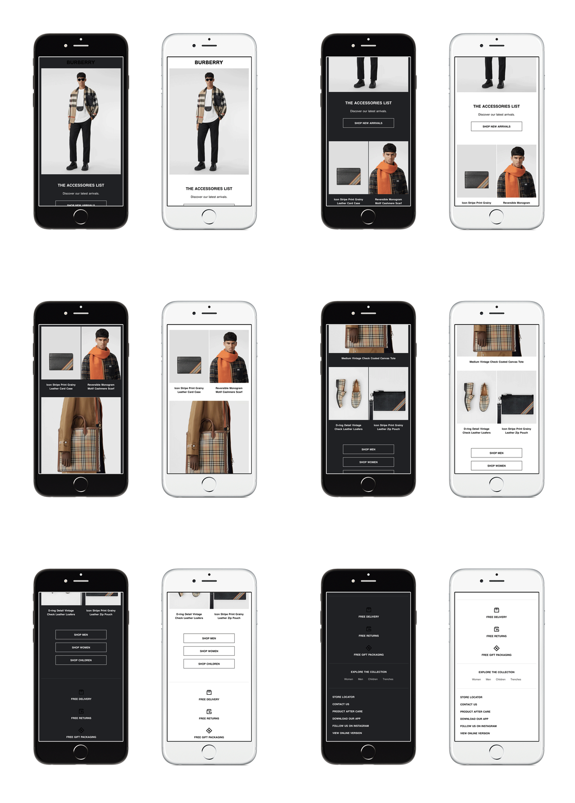
High-end fashion brands like Burberry will always have very clean and simple email designs. Like Nike, that makes it very easy to implement dark mode. Burberry also shows why it is important to always save out icons and logos as transparent pngs. The last thing you want is a big ugly white box sitting behind your icons and logos on a dark background. These are small but important ways of making the design look sleek and polished.
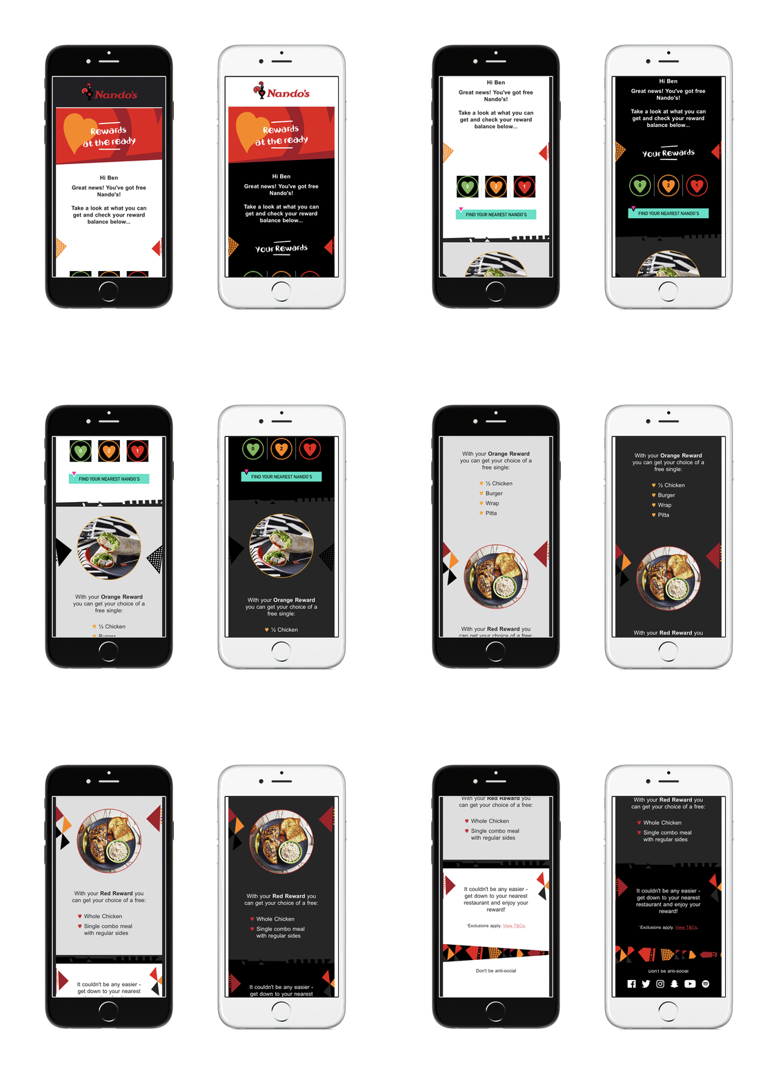
This post would not be complete without mentioning Nandos! As one of my biggest design loves, I receive a lot of their emails in my inbox. Now, I wouldn’t usually have a bad word to say about them, but I have picked them out to discuss how not to design for dark mode.
Their clever, bright, and bold branding usually grabs my attention. Unfortunately, this doesn’t translate very well for dark mode. At first glance, the aesthetics look great, but when you look closer at the design there are some elements missing. Firstly, the ‘YOUR REWARDS’ header disappears completely, and secondly, the social icons in the footer are no longer there.
These are two vital aspects of the email which certain subscribers won’t see. That creates a negative brand experience in comparison to the light mode recipients.
It’s extremely important for brands to do their research and understand the proportion of subscribers who are viewing in dark mode to understand if it’s worth their time. If you are going to put the effort into creating dark mode designs, then ensure as a minimum that no important information is left out.
As an honest dark mode skeptic, I wanted to review how these global brands tackled the design challenges of dark mode within their email communications. I have been pleasantly surprised to see the ones who have taken the plunge seem to be reaping the benefits.
Not only that, but as a subscriber, I’ve found myself beginning to embrace the ‘dark side’, who’d have thought it?! With a better understanding of the health benefits, it’s understandable why many users would opt for it. Dark mode is easier on the eyes through reduced screen brightness, which in turn can sometimes improve the content legibility.
The importance of designing with dark mode in mind should now be something an email designer is constantly considering. Moving with the times of digital design, we need to be open-minded and upfront with clients who think dark mode won’t affect their subscribers.
Throughout Darktober and into 2021, our aim at Action Rocket is to get you “dark mode ready.” We are helping brands see how dark mode affects them — from a quick review to in-depth audits as well as supporting updates to your email design systems and bespoke templates. We have you covered! Just email hello@actionrocket.co and we will be in touch.
To learn more about how dark mode is impacting the world of email marketing, check out Pathwire’s dark mode for email survey