Email Development
Why Component-Driven Design Systems are the Future of Email Coding
Email development takes a ton of time and effort. Plus, let’s be honest, it can also be frustrating because it requires such meticulous coding at times. But I’m here to tell you there is a better way.
Actually, Avi Goldman from Parcel and I are here to tell you about that. Avi joined me for a keynote presentation on Day 2 of Email Camp 2022. In our presentation on The Future of Email Creation, we explained how to create an email design system that will save you tons of time and headaches.
What is an email design system?
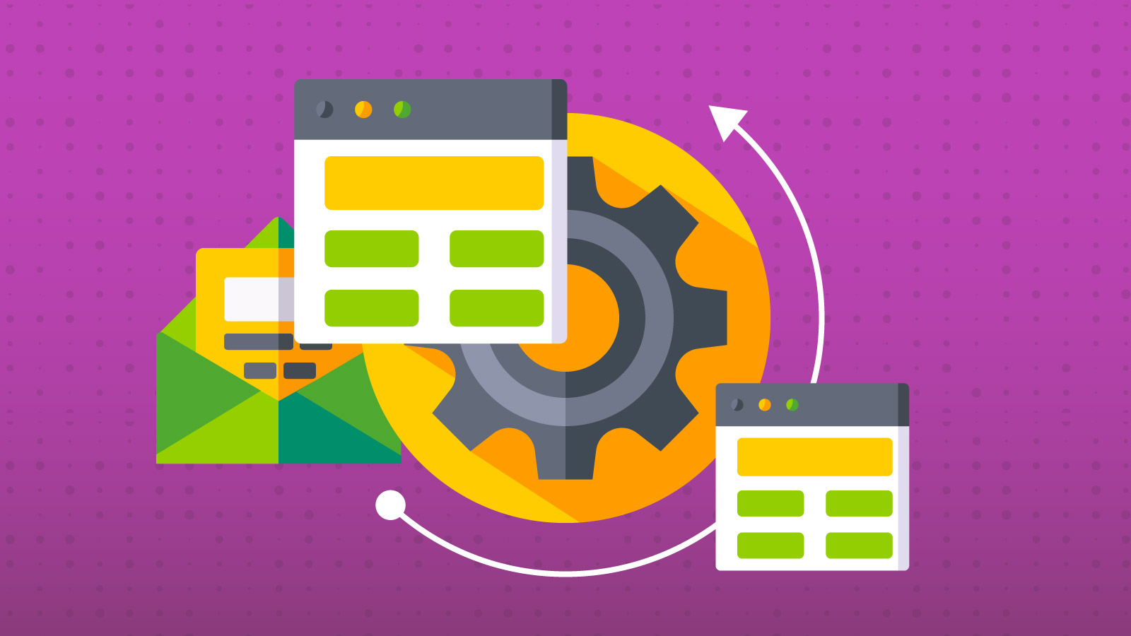
An email design system is a defined process for email development that is reusable, standardized, and composable. When you build it right, you can easily apply different brand styles and add or remove certain elements to build emails faster.
Here’s our big takeaway from the presentation:
Email design systems let you efficiently build more emails in less time with fewer errors.
Does that sound too good to be true? Watch our presentation below and find out how Avi and I worked together and used the Parcel email editor for a super-charged email design system.
How email developers try to stay sane
There are several different ways that email developers attempt to make their everyday coding a little easier. Let’s look at some of the pros and cons of these methods.
1. Code snippets
Code snippets are reusable blocks of code that you can stick in your emails whenever the situation arises. Need an email footer? Grab the snippet and paste it into your email editor. Code snippets let you reuse code, but they’re a lot of manual work when there are changes.
Let’s say something in your email footer changes. Now you’ve got to find every email with that code snippet and update it manually. Snippets scale well, but manual maintenance is a real chore.
2. Partials
Partials are pre-tested code blocks that support modular email design and help you maintain consistency. They allow you to easily swap out certain email elements across campaigns, but they lack flexibility.
For example, let’s say your brand’s logo in the header usually links to the homepage. However, to support a special marketing effort, it needs to point to a different page for a time. There’s no easy way to update that link in a logo partial without some manual, repetitive code editing.
3. Drag-and-drop editors
For email marketers without a lot of coding experience, a drag-and-drop email builder is a valuable tool. However, these low-code and no-code solutions are unlikely to be tools that email developers will want to use. We prefer to code, thank you. It’s sort of our thing.
Drag-and-drop email editors have their place, but they limit what you can do with design and development. So, you may not be able to use them to bring all your email marketing ideas to life.
4. Custom-built email solutions
You can also design a system that’s tailored to your email development needs. That’s great if you’ve got the time and software engineering experience to pull it off. Custom solutions do provide plenty of flexibility and scalability, but they also require a lot of maintenance to keep them updated.
Custom-built email solutions may solve a lot of your development problems, but they can also be very expensive to build, especially without the right in-house talent and resources.
Introducing the component-driven email design system
Now I want to tell you about the kind of custom email design system that we built for the Sinch Email brands (along with some help and advice from Avi). We used Parcel to create a design system that uses components to make coding for multiple brands, languages, and ESPs a whole lot easier.
What are components?
Components are reusable blocks of code that support specific use cases and can help you quickly switch between different styles for various brands.
The biggest difference between components in comparison to using code snippets or partials for email development is that, if you change anything about a component, it automatically changes across every email in which the component is found.
Email components could include:
- Headers
- Footers
- Buttons
- Rows
- Columns (for different layouts)
- Image placeholders
- And much more…
You then pair these email components with the different brand styles so that you can use the email design system to switch between them with minimal effort.
Examples of brand styles include:
- Logos
- Fonts
- Brand colors
- Boilerplate copy
- Static links (homepage and social media)
Tools for a component-driven email design system
If you’ve ever used Figma as a tool for communicating between designers and developers, then you’re already familiar with components. And you can totally use Figma to create a component-driven email design system.
There are also a few solutions out there that were built for email development and support coding with components.
For example, Parcel is what I’m using to build and implement components in our new email design system. Check out Parcel’s documentation on using components to learn more.
The Mailjet Markup Language (MJML) is a responsive email framework that’s built around the idea of using components to do more with less code. Check out my Notes from the Dev interview with Nicole Hickman to get started with some MJML basics.
There’s also Maizzle, which a lot of email developers out there really love. It’s a component-based email framework that makes use of Tailwind CSS.
Benefits of email components
Whatever email development tools you choose to use, you’re going to find that a component-driven email design system offers some huge rewards. To explain, Avi used CTA buttons as an example during our presentation…
“We don’t have to concern ourselves with all of the code when we’re actually using it. Instead, we’re able to switch just the top-level property and insert all the different variants and combinations that the button supports without worrying about the underlying code. That’s really what components are driving towards.”

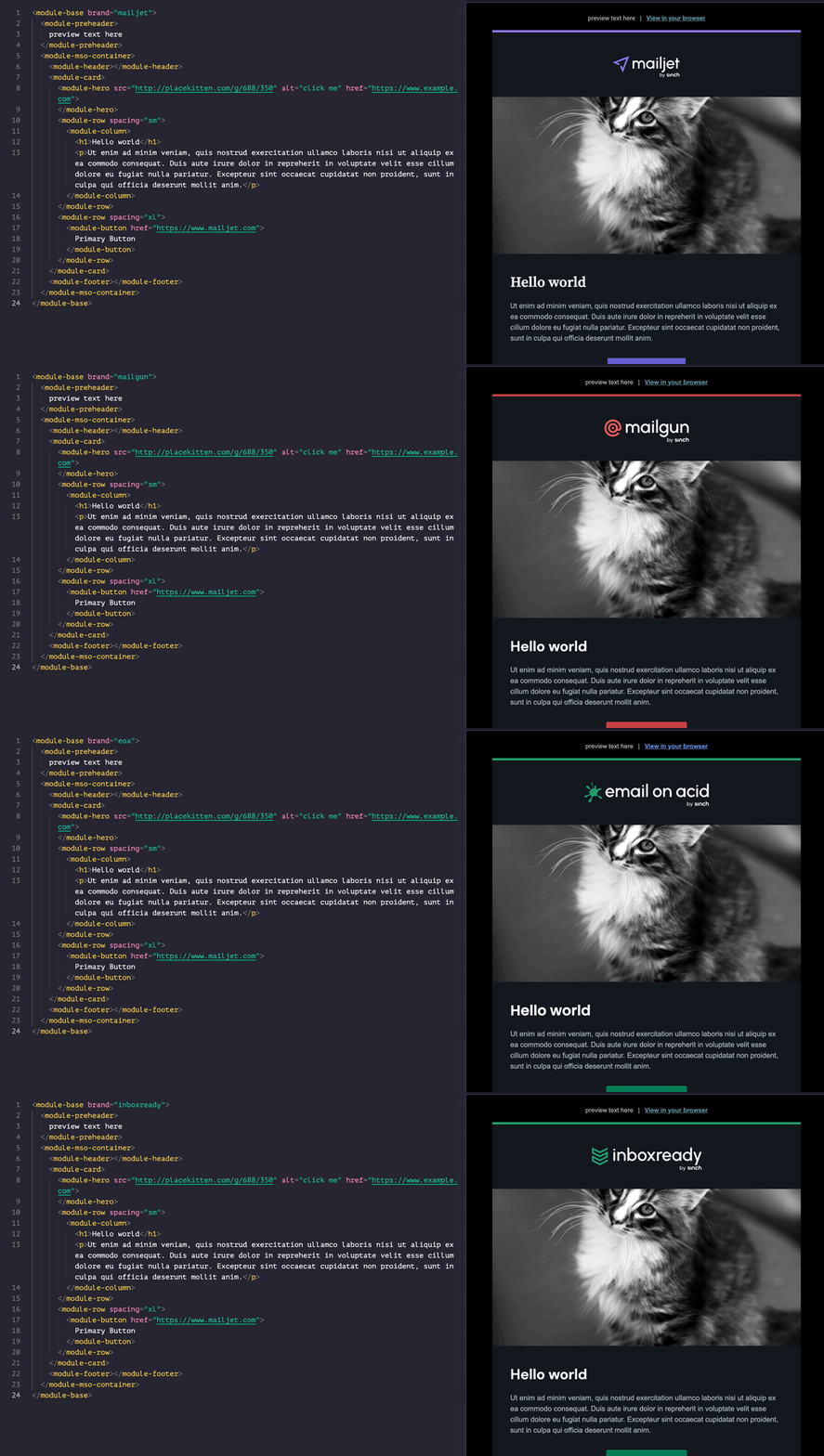
We showed Email Camp attendees a campaign I put together using just 24 lines of code. It actually generated hundreds of lines of code, but our components simplified everything. That includes how easy it was to code the email for four different brands.
As you can see, with a simple attribute change, we can transform the style of an email from one brand to another. Logos, colors, fonts, everything changes with ease.
Here’s more of what I was able to accomplish after our component-driven email design system was in place:
- 53 variants of an email in only three days (Kids, don’t try this at home)
- 20 new emails coded in just two days
- Added a new brand to the email design system in one afternoon
The value really starts to come in with all the time you save. If you’re spending less time updating the mundane, everyday email code, you have more time to be innovative and experiment with email development ideas.
Of course, to enjoy these kinds of benefits, you’re going to have to do a little work first.
Starting an email design system
Before I even got to the point of coding email components, there was a lot of planning and designing involved. That meant teamwork and brainstorming. Find out how I worked with others on my team in our article on how to start building an email design system.
As a developer, you may need to lead the email design system project. No matter what, you’re going to find yourself at the center of everything. But you’ll also need to get input from marketers, designers, and decision-makers.
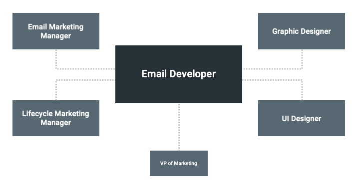
Here are some essential steps for defining what goes into your email design system:
1. Email inventory
Dig up every email automation and campaign you have running and take stock of it all. What do you like or dislike? What’s missing or outdated and what needs to change? Have you learned anything from A/B testing?
2. Research and ideation
Look at what other brands are doing that you may want to emulate. Talk about your big ideas and how they might fit into the design system. This is where developers may need to come in and explain some of the limitations of email, including differences between web and email development.
3. Email design system rules
By definition, a system is going to have a set of rules and processes you follow. That includes how your emails will stick to brand guidelines, and where you’re allowed to deviate from those standards. For example, if your brand’s font isn’t universally supported among email clients, what will your font stack look like?
Other email design system rules include:
- Mobile and desktop breakpoints
- Column widths
- Margins and padding
- Styles for different heading levels (h tags)
- Styles of body copy
- Styles for bulleted lists
4. Email component design
Once your plan is in place, someone can start designing all the reusable assets for emails before a developer codes the components. You may want a designer to build wireframes of email templates you can follow. And it’s essential to have your design team run their work by the email team for review and approval.
After all of this, it’s time for the magic of coding components to begin. Or, depending on how you look at it, time for the hard work to start.
The email design system interface
“Design the interface.” That’s what Avi reminded me of repeatedly as I worked to put our component-driven system in place.
Your interface is essentially the base of code you’re using to build emails. Think of it like an outline for email coding. When you consciously design the interface, you understand all the components and how they fit together.
If you try to get the interface to fit your backend code, you’re going to run into problems. Trust me on this one. I learned the hard way.
Email testing and quality assurance (QA) are also part of this process. First test how components render on their own. Then, test how it looks in a full email. This helps you figure out if problems are on the component or template level.
I also suggest starting simple. Begin with a single-column layout and expand on your email design system from there. Be prepared for multiple iterations too. You’ll come up with better ways to do things all the time. So, don’t expect to be perfect on your first shot at creating an email design system interface.
The big challenge: Style guides and configuration
This is where building an email design system gets complicated and messy. However, it’s also where you’ll see the biggest payoff once your work is done.
The challenge is that there is a lot to keep in mind. By the time I brought a third ESP into the mix and had to customize all my links, I realized that everything needed to be global.
As you configure your design system, think about future-proofing it. Make sure it can scale if your email program gets bigger or you need to add a new brand.
Here are some quick tips:
- Be thoughtful about nesting categories
- Global styles should always live at the top level to support scalability
- Include specific brand information in your global styles and configuration
- Put email service provider personalization in global styles so you can simply declare the right ESP (if using multiple providers)
- Be sure shared values are in sync:
- Static links
- Logos
- Copy
- Colors
Once you have all of this configured, all you need to do is state the brand, and your email will switch everything to the right shared values and global styles. Yes, getting to this point is going to take some effort. But just think of how much time you’ll save in the long run. Take it from me – this is worth it.
What’s your next step?
If you need to convince your team or your manager that building a component-driven email design system is a project worth pursuing, feel free to use our presentation as a way to show them how it works and what it can do.
You may also want to benchmark the time it takes for email production now versus after your new design system is up and running. Then you can say, “I told you so.”
Just be aware that this will take time and you will probably make mistakes. Thankfully, you can always rely on tools like Sinch Email on Acid to ensure you’re putting your best email forward. In addition to testing components and templates, our email testing workflow helps you check everything from accessibility and deliverability to typos and UTM parameters. And of course, you can preview how your emails render on the most popular clients and devices.
If you missed Email Camp 2022, you’ll find session recordings on Mailjet’s YouTube channel. This year we were joined by big-time email geeks like Chad White of Oracle, Jay Oram from ActionRocket, and an email developer panel featuring me, Anne Tomlin, and Shani Nestingen.
You can also be one of the first to know about our next Email Camp event. Subscribe to get updates and we’ll tell you about dates, scheduled speakers, and more.
