Email Development
Tutorial: Animated Image Carousel for Email with Ken Burns Effects – Part 2

This is a follow up to the Animated Image Carousel for Email tutorial. In this article, we will go over how to add pan and zoom effects, commonly referred to as the Ken Burns effect, to the animated carousel. However, you can also use these techniques by themselves as well.
The Ken Burns effect is what many people see on screensavers that display a series of images with slow zooming or panning effects.

See the completed example here.
Like the original animated carousel, this example only works with email clients that support CSS animations such as iOS Mail (iPhone, iPad) and Apple Mail. Other clients will see the fallback content.
The implementation is pretty straightforward, so let’s dive in!
Using CSS Transforms
Zoom Effect
We can implement a slow zoom effect by using the scale() CSS transform. Enlarging the image to a size larger than its native size may make the image look slightly blurry, so a solution is to use a larger image than the space you intend to fit it in. When it’s scaled up, it will be scaled to its native size.
                                .zoom {
  -webkit-animation: effect-zoomin 3s linear infinite;
}

@-webkit-keyframes effect-zoomin
{
   from {
      -webkit-transform: scale(1);
    }
    to {
      -webkit-transform: scale(1.2);
    }
}
Pan Effect
We can implement a slow pan effect by using the translateX() CSS transform. The image needs to be a bit enlarged (so you have space to pan without showing gaps), so you’ll apply a scale effect to enlarge the image.
                                @-webkit-keyframes effect-panleft
  {
     from {
        -webkit-transform: translateX(20px) scale(1.2);
      }
      to {
        -webkit-transform: translateX(-20px) scale(1.2);
      }
  }
If you want the carousel to be responsive, then you need to use percentages instead of pixels so the panning will shift equally regardless of the size of the image.
However, in iOS9, translateX() animations using percentages with negative delays only start running after the user scrolls the email. Since we’re using negative animation delays (positive delay animations can go out of sync in iOS9), we’re forced to use an alternative: left margins. Technically, translate is a more “computationally efficient” method to move elements around and produces smoother animations, but I’ve seen that margins do as good a job. (If you combine zoom and pan effects, the smoothness of translate() becomes more apparent.
                                @-webkit-keyframes panleft
{
   from {
      -webkit-transform:scale(1.2);
      margin-left: 10%;
    }
    to {
      -webkit-transform:scale(1.2);
      margin-left: -10%;
    }
}
Integrating into the Carousel
We begin with the basic carousel that we have in this example that fades between images.
To synchronize each image’s effects with the swapping of the images, we set the effect to happen between the first 33% of the animation (for carousels with 3 images).
                                @-webkit-keyframes effect-zoomin
{
  0% {
    -webkit-transform: scale(1);
  }
  33.33%{
    -webkit-transform: scale(1.2);
  }
  100%{
    -webkit-transform: scale(1);
  }
}
However, because the carousel animation begins fading to the next image at 33%, we want the image to remain in the final state until the transition ends. Therefore, we set 38% as a point to make the image begin to revert back to its original state for the next cycle.
                                @-webkit-keyframes effect-zoomin
{
  0% {
    -webkit-transform: scale(1);
  }
  33.33%{
    -webkit-transform: scale(1.2);
  }
  38%{
    -webkit-transform: scale(1.2);
  }
  100%{
    -webkit-transform: scale(1);
  }
}
Now we apply the animation timings to the individual images.
                                .carousel.effects img{
  -webkit-animation-name: effect-zoomin;
  -webkit-animation-duration: 9s;
  -webkit-animation-timing-function: linear;
  -webkit-animation-iteration-count: infinite;
}
.carousel.effects a:nth-child(1) img{
  -webkit-animation-delay: -9s;
}
.carousel.effects a:nth-child(2) img{
  -webkit-animation-delay: -6s;
}
.carousel.effects a:nth-child(3) img{
  -webkit-animation-delay: -3s;
}
And finally, we make it so we can target the individual effects by setting the class name on the images, such as zoom-in, zoom-out, pan-right, pan-left:
                                .carousel.effects img.zoom-in{
  -webkit-animation-name: effect-zoomin;
}
.carousel.effects img.zoom-out{
  -webkit-animation-name: effect-zoomout;
}
.carousel.effects img.pan-right{
  -webkit-animation-name: effect-panright;
}
.carousel.effects img.pan-left{
  -webkit-animation-name: effect-panleft;
}
Animation Timing Functions
Other than the duration, a key attribute of an animation is the timing function. The animation-timing-function (in our case -webkit-animation-timing-function) property can make the animation speed up or slow down as it goes from one point to another in an animation. The timing function is based on what is called a Bezier function, which you can learn more about in this article.
Some of the more popular values of the property include: linear, ease, ease-in and ease-out. Linear means there’s no acceleration throughout the animation. Ease speeds up and then slows down the animation. Regardless of the choice of function, the animation takes the same amount of time going from one point to the next.
For our pan and zoom effects the ‘linear’ or ‘ease-out’ function (where the animation slows down before the transition to the next image) probably work best. Although ‘ease’ is the default value, I prefer using linear because I feel that it works best when the animation fades at the end.
Carousel HTML
With our updated CSS (from above), we use the same HTML of the original carousel. We can enable the effects by giving the carousel div the class name “effects”.
                                <div class="carousel fade responsive effects" style="overflow:hidden;display:none;max-height:0px;">
  <div class="car-cont" style="position:relative;width:500px;height:320px;">
    <a href="#tba"><img class="zoom-in" src="https://freshinbox.com/examples/animated-carousel/images/car-castle.jpg" border="0"></a>
    <a href="#tba"><img class="zoom-out" src="https://freshinbox.com/examples/animated-carousel/images/car-meadow.jpg" border="0"></a>
    <a href="#tba"><img class="pan-right" src="https://freshinbox.com/examples/animated-carousel/images/car-coast.jpg" border="0"></a>
  </div>
</div>
Here’s the final code (Click on the View Code link).
Using Background Images
You can also implement Ken Burns effects using background images as well. When using background images, instead of using scale and margin, you’d use background-size and background-position.
Other Effects And Applications
So far we’ve used opacity, scale and translate in our examples. CSS3 offers us a lot more cool effects that we can use – a big one is CSS filters. CSS filters offers a further set of effects such as grayscale, blur, sepia, saturate, opacity, brightness, contrast, hue-rotate, and invert.
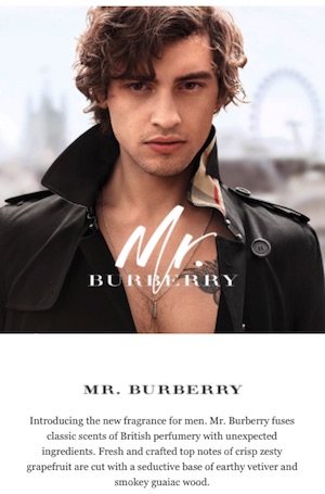
Check out this cool email by Burberry that uses a combination of the above-mentioned effects.

Coming Next
I hope this tutorial piques your interest in experimenting with CSS animations!
The next article in this series will go over how to make the carousel slide from one image to the next instead of fading.
All tutorials in this series
Animated Image Carousel for Email
Animated Image Carousel for Email with Ken Burns Effects
Animated Image Carousel for Email with Sliding Transitions
Implementing Navigation Controls in Image Carousels for Email
Don’t Guess, Test!
At Email on Acid, testing is at the core of our mission. After you’ve finished setting up the perfect design for your campaign, ensure the email looks fantastic in EVERY inbox. Because every client renders your HTML differently, it’s critical to test your email across the most popular clients and devices.
Try us free for 7 days and get unlimited access to email, image and spam testing to ensure you get delivered and look good doing it!


