Email Development
Bulletproof Buttons for Office 365 (and Everything Else)
The Problem
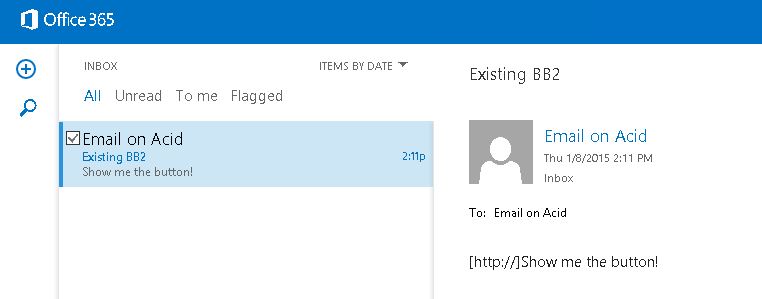
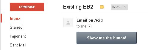
A number of bulletproof button designs have been in use for quite a while now. We especially like the bulletproof button generator from Stig and Campaign Monitor. However, these “bulletproof” buttons actually have a few chinks in their armor: mostly Office 365 and Lotus Notes. You can see in this example that the old style of the bulletproof button isn’t quite working any more. In Office 365, it doesn’t even appear to be a link!
The button should look more like this.
The Fix
It’s 2015, and it’s time for a new bulletproof button! In order to fix this in Office 365, we returned to the email coder’s best friend: tables. By putting the button into a simple table, we’re able to much more closely control the appearance of the button. In this example, you can see that this button works in Outlook 365.

This button works in Earthlink, unlike the older versions. It also works in Lotus Notes, showing as a little short in 6.5 and 7. Still, this is better than the standard button, which doesn’t even show in earlier versions and shows only as hyperlinked text in the later versions. To make Lotus Notes 6.5 and 7 respect the width of the button, we had to apply the dimensions of the button to the table as well.
You’ll find these dimensions in 4 places:
- In the VML section
- In the Table tag
- In the TD tag
- In the A tag (as line-height and width)
                                <center>
<div style="margin: 0 auto;"><!--[if mso]>
 <v:rect xmlns:v="urn:schemas-microsoft-com:vml" xmlns:w="urn:schemas-microsoft-com:office:word" href="#" style="height:50px;v-text-anchor:middle;width:250px;" arcsize="16%" strokecolor="#ed7014" fill="t">
    <v:fill type="tile" src="https://www.emailonacid.com/images/orange_btn_bg.jpg" color="#ed7014" />
    <w:anchorlock/>
    <center style="color:#ffffff;font-family:sans-serif;font-size:18px;font-weight:bold;">Click the Button!</center>
  </v:rect>
<![endif]-->
<div style="margin: 0 auto;mso-hide:all;">
<table align="center" cellpadding="0" cellspacing="0" height="50" width="250" style="margin: 0 auto; mso-hide:all;">
	<tbody>
		<tr>
			<td align="center" bgcolor="#ed7014" height="50" style="vertical-align:middle;color: #ffffff; display: block;background-color:#ed7014;background-image:url(https://www.emailonacid.com/images/orange_btn_bg.jpg);border:1px solid #ed7014;mso-hide:all;" width="250">
				<a class="cta_button" href="#" style="font-size:16px;-webkit-text-size-adjust:none; font-weight: bold; font-family:sans-serif; text-decoration: none; line-height:50px; width:250px; display:inline-block;" title="Button">
					<span style="color:#ffffff">Click the Button!</span>
				</a>
			</td>
		</tr>
	</tbody>
</table>
</div>
</div>
</center>
Being Centered
One challenge we faced was getting the button to center in all clients. You won’t always want the button to be centered, but we found this much more difficult than right or left align, so I have included this in my example button. I used both the <center> tag and align=”center” on the table inside to make sure that it works in all clients.
Pixel Perfect Emails
How do we find fixes like the one I detailed above? Lots and lots of testing! If you’d like to get started with email testing, join our 7 day free trial today!
