Email Development
Unleash Creative Ideas for Interactive Emails

Picture this: You open an email from a favorite brand, expecting the usual promo stuff, but instead, you find an interactive game or a product preview you can play around with.
Fun, right? This kind of inbox experience not only grabs your attention but also makes you want to spend more time with the email. Not to mention – that particular brand probably earned a few bonus points in your book. That’s the power of interactive emails.
For brands, adding interactive elements to emails is a great way to stand out in a sea of sameness. Not only do interactive emails create a unique and engaging experience, but they also boost engagement and brand recall. In this article, we’ll explore some ideas for interactive email campaigns that you can use to captivate your audience and make your emails the highlight of their inbox – and maybe even their day.
Why send interactive emails?
Let’s be real: Standing out in an overcrowded inbox is tough. But interactive emails can give you a leg up. They aren’t just about looking cool. They’re about creating a more memorable touchpoint with your brand.
It’s like the difference between watching a movie and playing a video game; one is passive, and the other is an experience. When subscribers can interact with your email, the campaign comes to life. People will be more likely to remember your brand and engage with your emails the next time.
Interactive elements can even make your subscribers feel special and valued because they become an active participant. Interactivity in emails provides a sense of novelty and fun, making the email not just another piece of promotional content but an event. Plus, these emails can help gather useful data about what your subscribers like, helping you tailor future communications.
Hear more about why interactive emails are the future of the inbox and how they can freshen up your email strategy in this video interview with developer Mark Robbins.
9 ideas for interactive email campaigns
Sometimes we all need a little inspiration to get the creative juices flowing. What we’ve got here are some of most common ways to bring interactivity into an email campaign. Take these ideas, use your imaginations, and make them your own.
1. The basics: rollover and hover effects
Starting simple is sometimes the best way to go, and rollover or hover effects are a perfect entry point into the world of interactive emails. Use these effects on buttons, images, or text, giving your emails a subtle yet engaging twist. For instance, a CTA button might change color when hovered over, or an image might reveal a different version when you mouse over it. It’s a small touch, but it can make your emails feel dynamic and polished.
Why bother with these effects? For one, they make your emails more visually engaging and can highlight important elements, guiding the user’s attention. Plus, they’re a great way to give a sneak peek of something more. The only catch? These effects work best on desktop. Mobile devices, which don’t have a hover state, won’t get the full experience. So, always have a solid fallback—like a different image or a clear CTA that stands out on its own.
Example code snippet for email button hover effect:
                                <a href="#" style="display:inline-block; text-decoration:none; background-color:#007BFF; color:#ffffff; padding:10px 20px; border-radius:5px; transition:background-color 0.3s;" onmouseover="this.style.backgroundColor='#FF0000'" onmouseout="this.style.backgroundColor='#007BFF'">

  Hover Over Me

</a>
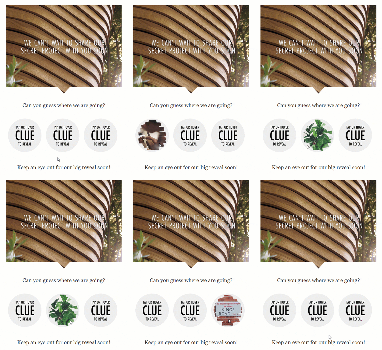
For another way to pull off rollover effects in email, check out this episode of Notes from the Dev featuring tips from Nout Boctor Smith. In this case, you have two images and hide one of them on rollover. It ends up looking something like this interactive email, which uses the effect to reveal clues and play a little game with subscribers.
2. Interactive product previews
Imagine being able to showcase your products in different colors or styles directly in the email. That’s what interactive product previews can do. They let subscribers play around with options, like choosing different shades of a t-shirt or trying out different lenses for sunglasses, all without leaving their inbox.
A good example of this kind of interactive email at work comes from this Google campaign for Pixel Buds. It allowed users to see different angles and colors of the product.
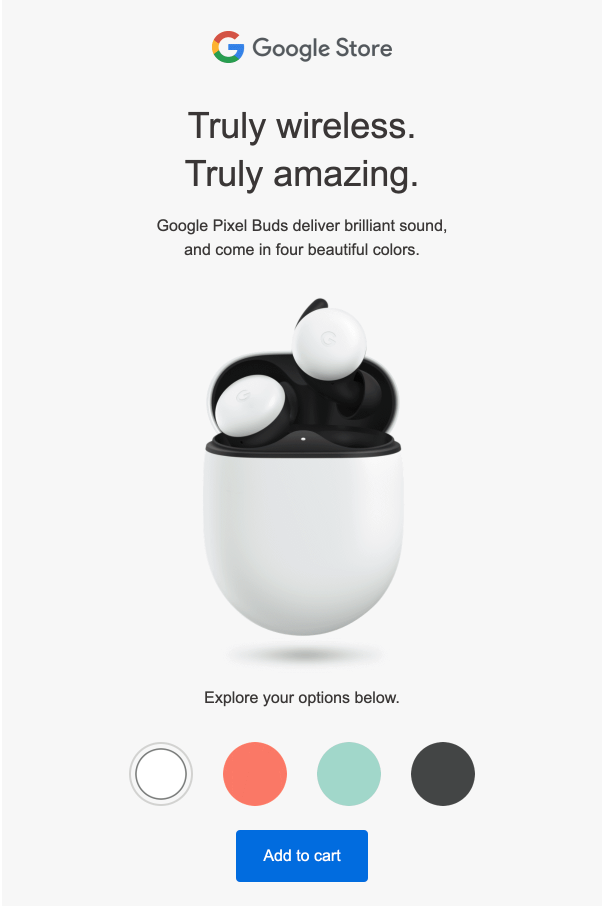
Why is this awesome? It makes shopping feel more personal and hands-on, even in the inbox. It’s like giving subscribers a mini e-commerce experience before they visit your website. This can boost engagement and help move subscribers further down the purchase funnel, as they’re more likely to click through and buy after interacting with the product options.
3. Interactive longform content
Got a lot to say but don’t want to overwhelm your readers? Interactive elements like accordions and dropdowns are your best friends. They let you pack a lot of information into an email without making it look like a wall of text. Users can click to expand sections they’re interested in, keeping the email clean and scannable while still providing depth.
The BBC nailed this with their “A Perfect Planet” email, which our friends at ActionRocket designed and developed. They used expandable sections to provide additional content without overwhelming the reader.
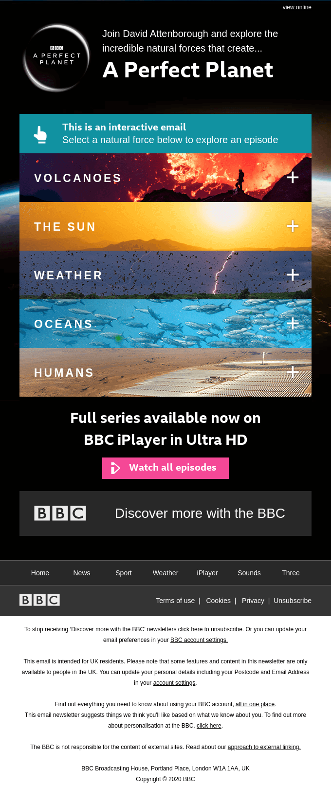
This approach is fantastic for newsletters or educational content where you have lots of information but want to keep the design sleek. It also gives subscribers control over what they see, making them feel more involved in the experience.
The code below uses a popular email development process known as the checkbox method. It should work in Apple Mail and Gmail, but you’ll need to figure out another solution for Outlook.
Example Code Snippet for Accordions in an Email
                                <!DOCTYPE html>
<html>
<head>
    <style>
        /* Container for the accordion */
        .accordion-container {
            width: 100%;
            max-width: 600px;
            margin: 0 auto;
            border: 1px solid #ddd;
            border-radius: 5px;
            overflow: hidden;
        }
        /* Hidden checkbox */
        .accordion-toggle {
            display: none;
        }
        /* Label for the checkbox, which acts as the accordion trigger */
        .accordion-label {
            display: block;
            cursor: pointer;
            padding: 10px;
            background-color: #007BFF;
            color: #ffffff;
            text-align: center;
            font-weight: bold;
            border-bottom: 1px solid #ddd;
            position: relative;
        }
        .accordion-label span {
            float: right;
            font-size: 32px; /* Larger icon size */
            line-height: 32px;
            width: 32px;
            height: 32px;
            text-align: center;
            display: inline-block;
            border-radius: 50%;
            background-color: #ffffff;
            color: #007BFF;
            margin-left: 10px;
            transition: background-color 0.3s, color 0.3s;
        }
        /* Content of the accordion */
        .accordion-content {
            display: none;
            padding: 10px;
            background-color: #f1f1f1;
        }
        /* Show content when checkbox is checked */
        .accordion-toggle:checked + .accordion-label + .accordion-content {
            display: block;
        }
        .accordion-toggle:checked + .accordion-label span {
            background-color: #007BFF;
            color: #ffffff;
        }
    </style>
</head>
<body>
    <div class="accordion-container">
        <!-- Hidden checkbox -->
        <input type="checkbox" class="accordion-toggle" id="accordion-toggle">
        <!-- Label acting as the clickable header -->
        <label class="accordion-label" for="accordion-toggle">
            Click to Expand <span>+</span>
        </label>
        <!-- Content to be shown/hidden -->
        <div class="accordion-content">
            <p>This is the expanded content. It can include text, images, or any other HTML elements.</p>
        </div>
    </div>
</body>
</html>
The tried-and-true checkbox method works for a few different interactive email purposes. To learn more about how to use it, watch this episode of Notes from the Dev where Megan Bushoyzen shows us how she coded an interactive campaign for Email Camp.
4. Image carousels for email
Another simple way to add a little interactivity while simultaneously saving space is with an image carousel. It’s surprising that you don’t see image carousels used more often in emails. There are plenty of ways to put them to use.
For example, let’s say you’d like to feature multiple photos in the hero image space of your campaign. You could use a carousel to showcase different product angles. You could feature a collection of photos from a big event. Get the idea?

Here’s a tutorial on coding animated image carousels for email like the one above, which uses a fade effect to transition between the images. We also have some tips on coding an interactive carousel with clickable navigation. Plus, check out this handy tool from FreshInbox that generates image carousel code for you.
5. Forms, testimonials, and product reviews
Why not let your subscribers do a little work for you? Including forms directly in your emails is a great way to collect feedback, testimonials, or even product reviews. You can ask for a quick rating, gather suggestions, or even collect zero-party data (like preferences and interests) that helps personalize future emails.
This interactive element makes subscribers feel heard and valued, which is crucial for building loyalty. It’s a win-win: you get valuable insights, and they get to share their opinions without having to jump through hoops. And let’s be honest, who doesn’t like giving their two cents?
Coding an interactive form for emails is a bit more advanced. So, we’ll save that for another tutorial another day. However, while they won’t work everywhere, the good news is that interactive forms are fairly well supported among the major email clients.
You can also use AMP for Email to include forms as well as comment boxes and star ratings in in your emails.
6. Gamification for interactive emails
Gamification is like adding an unexpected jolt of fun to your emails. Whether it’s a mini-game, a scratch-off for a discount, or a little quiz, adding a playful element can significantly increase engagement. For instance, a “spin the wheel” game can entice subscribers to click through to see what prize they might win.
Games and quizzes aren’t just fun – they also encourage subscribers to spend more time with your brand, increasing the chances they’ll take action, like making a purchase.
Plus, if you do them regularly, gamified emails create a sense of anticipation, making subscribers look forward to your next fun-filled campiagn. And if the interactive element isn’t fully supported by the email client, you can always include a link with a “view in browser” option to ensure everyone gets to play.
Our old friend Jay Oram cashed in on the Wordle craze and figured out a way to build the game for email inboxes. Check out his episode of Notes from the Dev for more.
For more ideas on email gamification check out these articles and videos:
- Notes from the Dev: Rock, Paper, Scissors
- Scratch-off game for email
- Magic 8-ball for email
- Tic Tac Toe with AMP for Email
7. Animations in email
Animations can add a touch of magic to your emails. Whether it’s a subtle fade-in effect, a bouncing CTA button, or a more elaborate animated sequence, these elements can make your emails feel more lively and engaging. You could even trigger animations on click, giving subscribers a little surprise when they interact with certain parts of the email.
Animations are great for drawing attention to key areas, like new product launches or special promotions. They can also make your email feel more modern and polished. Just be sure to test them across different devices and email clients, as not all support animations equally well.
For a festive touch, check out this tutorial on creating an email with a falling snow animation.
8. Quizzes and surveys
Quizzes and surveys in emails are not just for fun – they’re powerful tools for engagement and data collection. Whether you’re testing your subscribers’ knowledge, gathering opinions on new products, or simply trying to learn more about their preferences, quizzes and surveys can be a great addition to your email strategy.
They’re engaging because they require active participation. Subscribers aren’t just passively reading; they’re interacting and sharing their thoughts. This can lead to deeper engagement and provide you with valuable insights. Plus, people love quizzes! They’re a great way to make your emails feel more interactive and personalized.
Check out our tutorial on building interactive email quizzes or find out how to use AMP for Email to build polls and surveys.
9. Interactive email hotspots
Hotspots in email are often clickable elements that reveal something such as an image or additional information. This type of interactivity is sometimes called a “positioned information overlay.” But come on – hotspot sounds way cooler.
Here’s how Jay Oram used hotspots to help people learn about leaves. Get his advice on coding interactive hotspots for email.

One use case for hotspots in interactive email could be exploring a product’s features and benefits using an image. Interactive maps are another way you could use hot spots to enhance an email. You could also use them on charts and graphs or in an infographic.
Interactive email challenges
Interactive emails are awesome, but they come with their own set of challenges. Not all email clients support interactive elements, which can lead to a less-than-ideal experience for some subscribers. For example, Outlook has been known to be a bit of a stickler for interactivity, often stripping out some of the cooler features. Even Gmail can have limitations, depending on the complexity of the interactive elements.
That’s where fallbacks come in. Interactive email fallbacks are a backup plan for when an element doesn’t work. It ensures that even if the fancy interactive parts don’t display, the email still functions and communicates its message. For instance, if an interactive carousel isn’t supported, you can show a static image instead. Fallbacks are crucial for maintaining a consistent experience across different platforms.
Tools and solutions for interactive emails
Creating interactive emails doesn’t have to be rocket science, thanks to some handy tools and frameworks. One of the most exciting developments in this space is AMP for Email. AMP (Accelerated Mobile Pages) is a framework initially developed for faster web experiences, and it’s now making waves in the email world. With AMP for Email, you can create dynamic, interactive content directly in your emails. Think of it as bringing a bit of the web into the inbox. You can use it for things like real-time data updates, interactive forms, and even in-email shopping experiences.
Apple Mail and other clients using WebKit as their rendering engine generally have good support for interactive elements, including CSS animations and basic JavaScript-like functionality. This makes them fertile ground for trying out some of the more advanced interactive features. However, always remember to test thoroughly, as each client can behave slightly differently.
Tools like MailModo make creating interactive emails more accessible, offering drag-and-drop interfaces that simplify the process. Our team has also enjoyed using NiftyImages for features like countdown clocks, polls, maps, and other types of dynamic email content.
Investing time and resources into creating high-quality, interactive emails is great, but none of that matters if they don’t work as intended. That’s why thorough testing is essential. It ensures that your emails look and function correctly across all devices and clients, giving you the confidence to hit “send” without worrying about potential issues.
While Sinch Email on Acid provides an excellent way to test email client rendering, we should point out that testing interactive emails still requires some manual work. That’s because platforms like ours deliver screenshots of emails. To effectively test an interactive email, you’ve got to interact with it in different environments.
However, automated email testing can help you take a quick look at a static version of your email, and it lets you know if your fallbacks are working in clients where your interactive campaign isn’t supported.
Sinch Email on Acid provides a comprehensive platform for testing your emails, helping you catch any problems before your subscribers do. Whether it’s checking for rendering issues or ensuring that your interactive elements have proper fallbacks, testing is the key to a successful email campaign.


